8.6 Combining Views: When Are the Worst Times?
We have looked at absences by month, by day of the week, and by reason — three separate slices. A natural question is whether the slices interact: are the bad days in March the same days that are bad in July, or do they shift? Bar charts can’t show that easily, because we’d have to plot one bar per (month, weekday) combination — sixty bars in a row, with no good way to scan across them.
The right tool for “compare a metric across two categorical dimensions at once” is a heat map. Each cell of a grid represents one combination of the two categories, and the cell is colored by the value of the metric.
work |>
  filter(`Month of absence` > 0) |>
  mutate(
    Month   = factor(month.abb[`Month of absence`], levels = month.abb),
    Weekday = factor(c("Sun", "Mon", "Tue", "Wed",
                       "Thu", "Fri", "Sat")[`Day of the week`],
                     levels = c("Mon", "Tue", "Wed", "Thu", "Fri"))
  ) |>
  group_by(Month, Weekday) |>
  summarise(total_hours = sum(`Absenteeism time in hours`),
            .groups = "drop") |>
  ggplot(aes(x = Weekday, y = Month, fill = total_hours)) +
  geom_tile(color = "white") +
  scale_y_discrete(limits = rev(month.abb)) +
  scale_fill_viridis_c(option = "magma", direction = -1) +
  labs(
    title = "Total hours absent by month and weekday",
    x = NULL, y = NULL, fill = "Hours"
  ) +
  theme_minimal()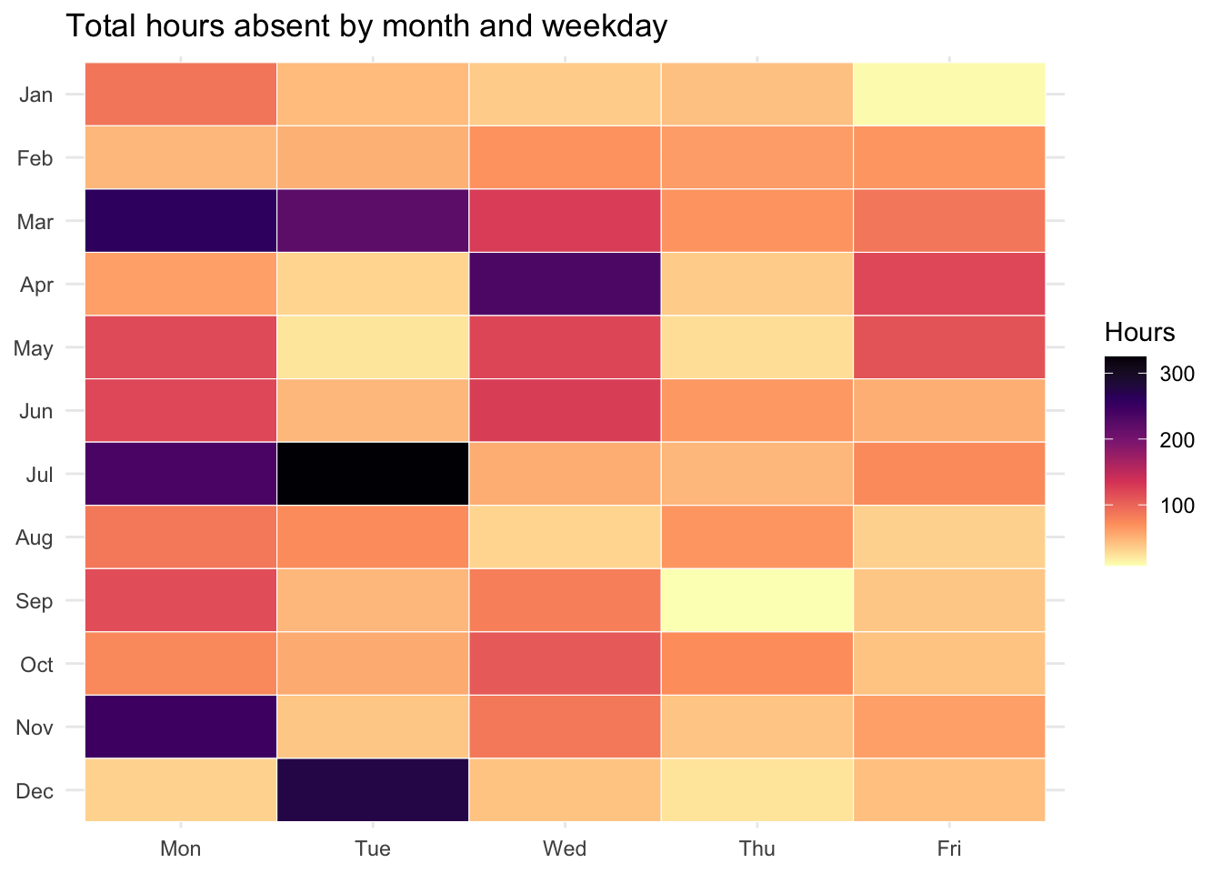
Several design decisions here are worth surfacing:
geom_tile(color = "white")draws each cell as a rectangle with a thin white border, which separates adjacent cells without adding visual noise.scale_y_discrete(limits = rev(month.abb))flips the y-axis so January is at the top and December at the bottom — calendar order reading down. The default would put January at the bottom, which is technically fine but reads awkwardly.scale_fill_viridis_c(option = "magma", direction = -1)uses one of the viridis color palettes. Viridis palettes are designed to be perceptually uniform — equal differences in the data map to equal differences in perceived color — and to remain readable under the most common forms of color blindness. The defaultggplot2blue-to-red gradient is much weaker on both counts. Whenever you map a continuous variable to color, prefer a viridis palette over a hand-picked gradient.direction = -1flips the scale so darker means more, which most readers will find intuitive.- No legend numbers spelled out as labels. The continuous scale bar on the right communicates magnitude visually; spelling out “low / medium / high” labels would be redundant and would invite false precision.
8.6.1 What the chart tells us
The heat map confirms what the bar charts hinted at, and adds something new:
- March and July are the hot months, just as the seasonality chart showed. But the heat map reveals that the “hot” within those months is not uniform across the week — Tuesday through Thursday account for most of the load, while Mondays and Fridays in those same months are noticeably cooler.
- January is uniformly cool, top to bottom of the row. There is no day of the week that drives a January spike — the whole row is faint. Whatever is causing low January absences (genuine seasonality, under-reporting, holiday lag) seems to apply across all weekdays equally.
- Friday tends to be the lightest day in most months, even in months where Monday is heavy. That is consistent with the day-of-week chart we built earlier, but seeing it side-by-side with the monthly pattern makes it easier to spot the months where this rule doesn’t hold.
Each chart we have built has answered a question the previous one couldn’t. The seasonality bar chart told us which months. The weekday bar chart told us which days. The histogram told us how long, the box plot told us who (by reason category), and the heat map told us when, in two dimensions at once. That progression — pick the right chart for the question, then move to the next question — is the working core of exploratory data analysis.