8.4 How Long Is a Typical Absence?
So far we have looked at totals — how many absences, how many hours — sliced by month and by day of the week. Both questions are about aggregates. A different and equally important question is about the shape of the distribution: when an employee is absent, how long does that absence usually last? Are most absences short, with a few unusually long ones? Or is the duration spread out evenly?
Aggregates can hide the answer. A month with 800 total absent hours could come from 200 four-hour absences, or from a small handful of week-long ones. The right tool for this question is a histogram, which divides a continuous variable into bins and counts how many observations fall in each bin.
work |>
  filter(`Absenteeism time in hours` > 0) |>
  ggplot(aes(x = `Absenteeism time in hours`)) +
  geom_histogram(binwidth = 4, fill = "steelblue", color = "white") +
  labs(
    title = "Distribution of absence duration",
    x = "Hours absent (per event)",
    y = "Number of events"
  ) +
  theme_minimal()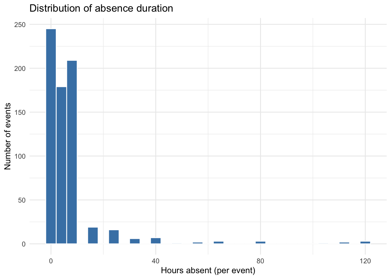
A few design choices in this code worth pointing out:
filter(Absenteeism time in hours> 0)drops zero-hour records. They are not real absences and would inflate the leftmost bin in a misleading way.binwidth = 4sets each histogram bar to four hours wide, which corresponds roughly to half a workday. This is a deliberate choice: the right bin width is the one that makes the shape of the distribution clear without smoothing away meaningful features. Withbinwidth = 1the chart would be jagged and hard to read; withbinwidth = 20it would lose the distinction between short and very short absences. The defaultbinwidthinggplot2is rarely the right answer — always think about what bin width matches the natural granularity of your data.color = "white"for the bar outline gives a clean separation between bars without adding chart junk.
8.4.1 What the chart tells us
The distribution is heavily right-skewed: most absences are short — clustered in the 0-to-8 hour range, which is one workday or less — with a long tail of much longer absences stretching out past 100 hours. This is a recognizable shape; it shows up whenever a process has a “normal” mode plus rare large events (sick days plus the occasional surgery; small claims plus the occasional catastrophe).
Two practical implications:
- The mean is misleading on its own. Right-skewed distributions have means that are pulled up by the tail. Reporting an “average absence duration” without a sense of the spread will overstate what a typical absence looks like. The median is usually a better single-number summary for skewed data.
- Long absences deserve separate attention. The cluster of short absences and the long tail are likely driven by different causes (a contagious cold vs. a surgery vs. parental leave). Lumping them into one model can paper over patterns that matter — something we will return to in Chapter 12 on anomaly detection.