7.5 The Grammar of Graphics and ggplot2
7.5.1 Why a Grammar?
Most people learn visualization by memorizing chart types: “use a bar chart for comparisons, a scatter plot for correlations.” This works for simple cases, but it breaks down when you need a visualization that does not fit a standard template — a faceted scatter plot with a regression line per group, or a stacked area chart with custom annotations.
The Grammar of Graphics, developed by Leland Wilkinson, takes a fundamentally different approach (Wilkinson 2005). It decomposes any statistical graphic into a set of independent components — data, aesthetics, geometric objects, scales, coordinate systems, facets, and themes — that can be combined in any configuration. This is like the difference between memorizing phrases in a foreign language and learning its grammar: once you understand the grammar, you can construct any sentence, including ones you have never seen before.
R’s ggplot2 package, created by Hadley Wickham, implements this framework and is one of the most widely used visualization tools in data science (Wickham 2016). Understanding the Grammar of Graphics through ggplot2 also builds transferable knowledge — the same concepts apply in Python’s plotnine, JavaScript’s Vega-Lite, and even in the design logic behind GUI tools like Tableau.
7.5.2 The Building Blocks
Every ggplot2 visualization is built from these components:
| Component | What It Does | Example |
|---|---|---|
| Data | The dataset being visualized | mtcars |
| Aesthetics | Maps variables to visual properties | aes(x = wt, y = mpg, color = cyl) |
| Geoms | The visual elements representing data | geom_point(), geom_boxplot(), geom_bar() |
| Scales | Controls how data values map to aesthetics | scale_fill_brewer(), scale_y_log10() |
| Facets | Creates small multiples by subsets | facet_wrap(~gear) |
| Coordinate Systems | The space in which data is plotted | coord_flip(), coord_polar() |
| Themes | Controls non-data appearance | theme_minimal(), theme_gray() |
The power of this approach is composability: you build a plot by adding layers with +, and each layer can be inspected, modified, or removed independently. A complex visualization is just a simple visualization with more layers — not a different type of object.
7.5.3 Step-by-Step Example
We build a visualization incrementally using the mtcars dataset, adding one Grammar of Graphics element at each step.
1. Data and Aesthetics — Set up the canvas with data mappings:
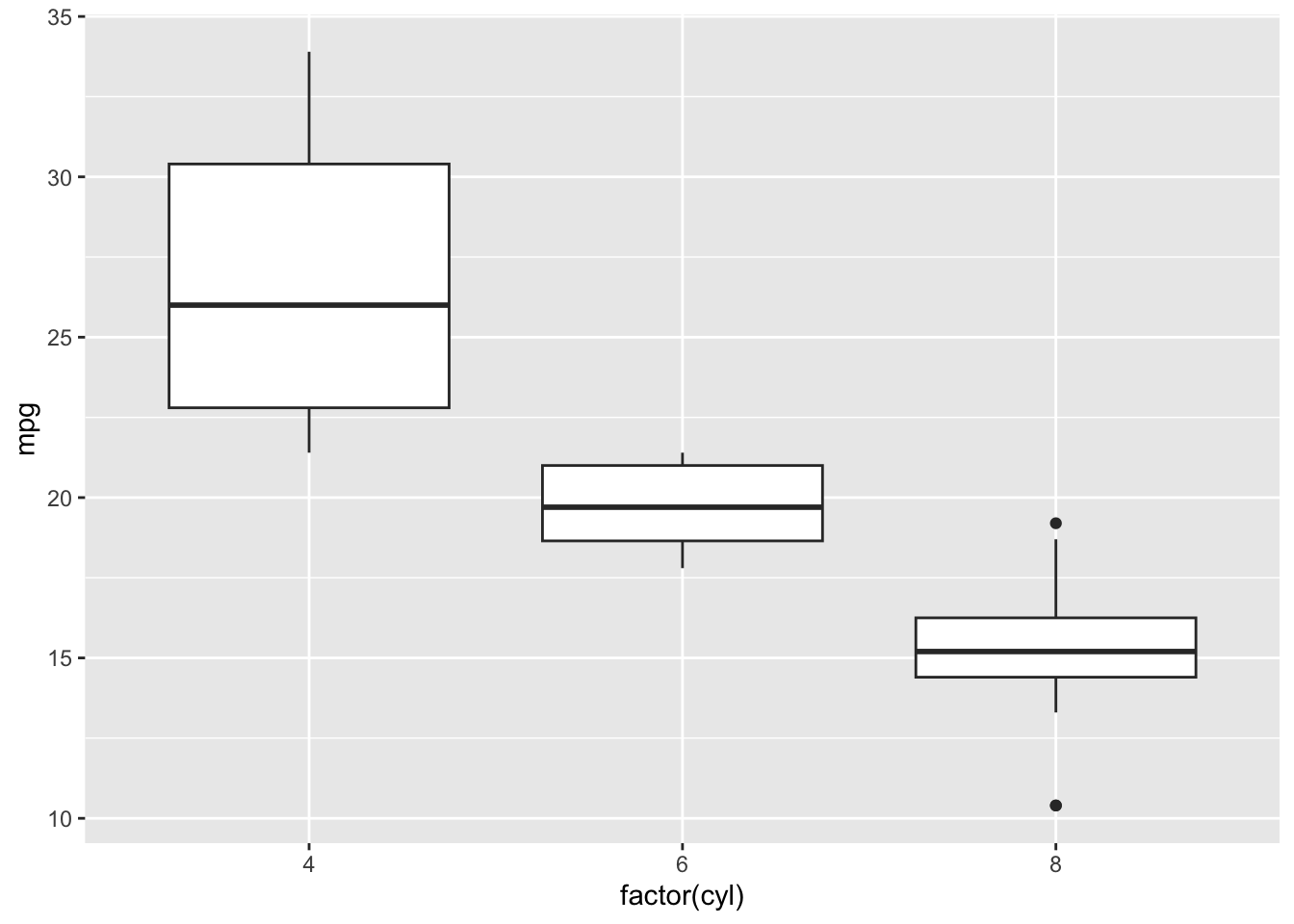
2. Add a Geom — A boxplot compares distributions across groups:
3. Customize Scales — Add color and transform the y-axis:
ggplot(mtcars, aes(x = factor(cyl), y = mpg, fill = factor(cyl))) +
  geom_boxplot() +
  scale_fill_brewer(palette = "Pastel1") +
  scale_y_log10()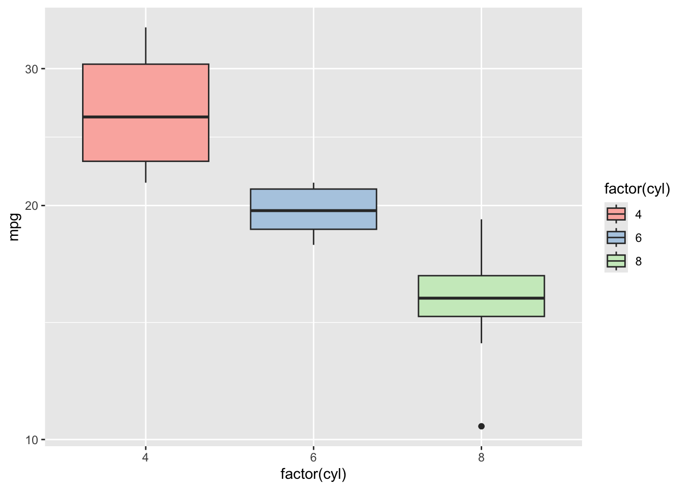
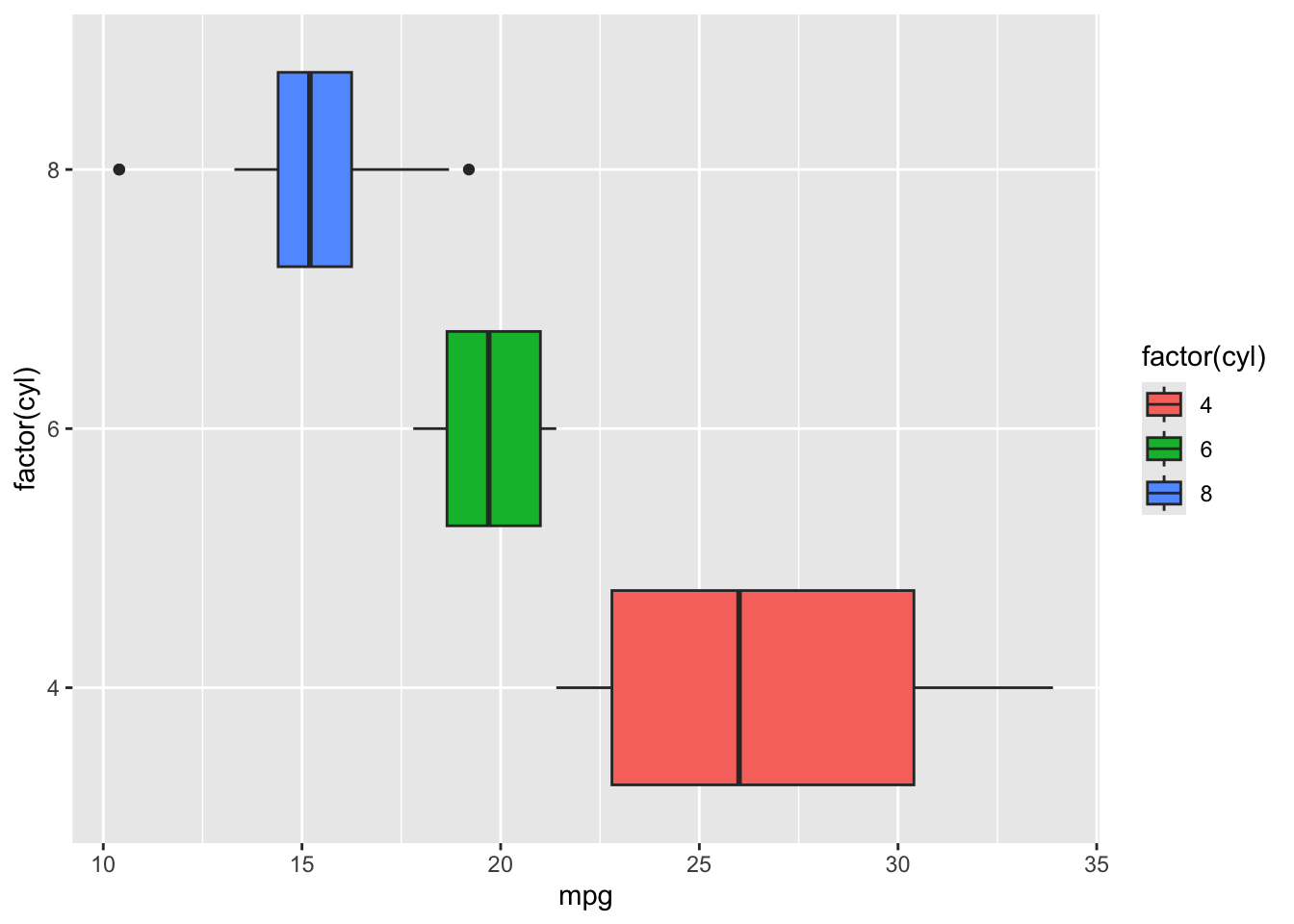
4. Coordinate Systems — Flip the axes for a horizontal layout:
5. Faceting — Create separate panels by number of gears:
ggplot(mtcars, aes(x = factor(cyl), y = mpg, fill = factor(cyl))) +
  geom_boxplot() +
  facet_wrap(~gear)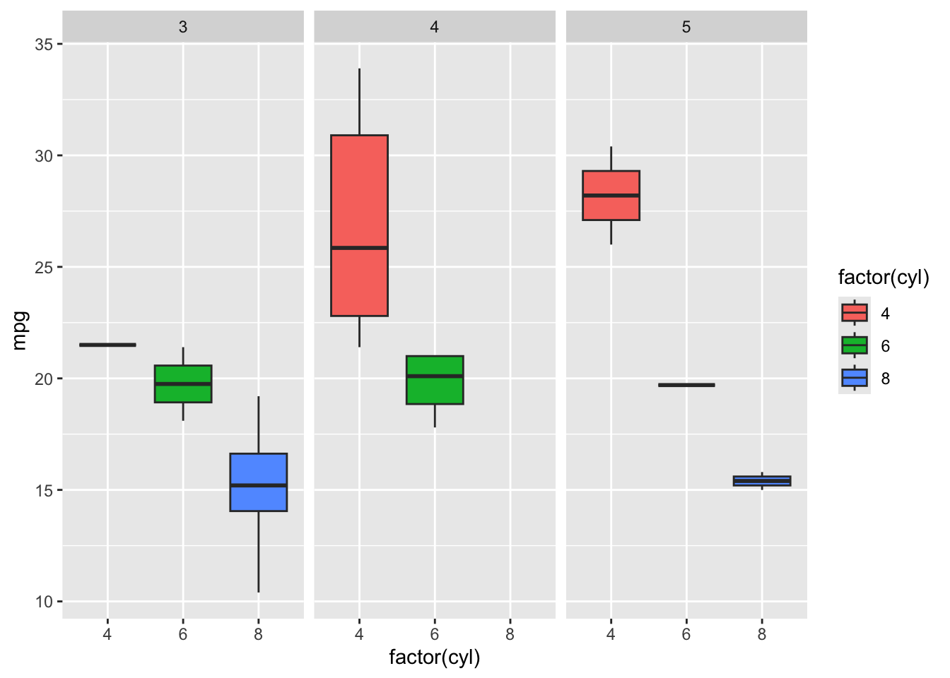
6. Themes — Apply a clean, minimal theme:
ggplot(mtcars, aes(x = factor(cyl), y = mpg, fill = factor(cyl))) +
  geom_boxplot() +
  facet_wrap(~gear) +
  theme_minimal() +
  labs(title = "MPG by Cylinders and Gears",
       x = "Cylinders", y = "Miles per Gallon", fill = "Cylinders")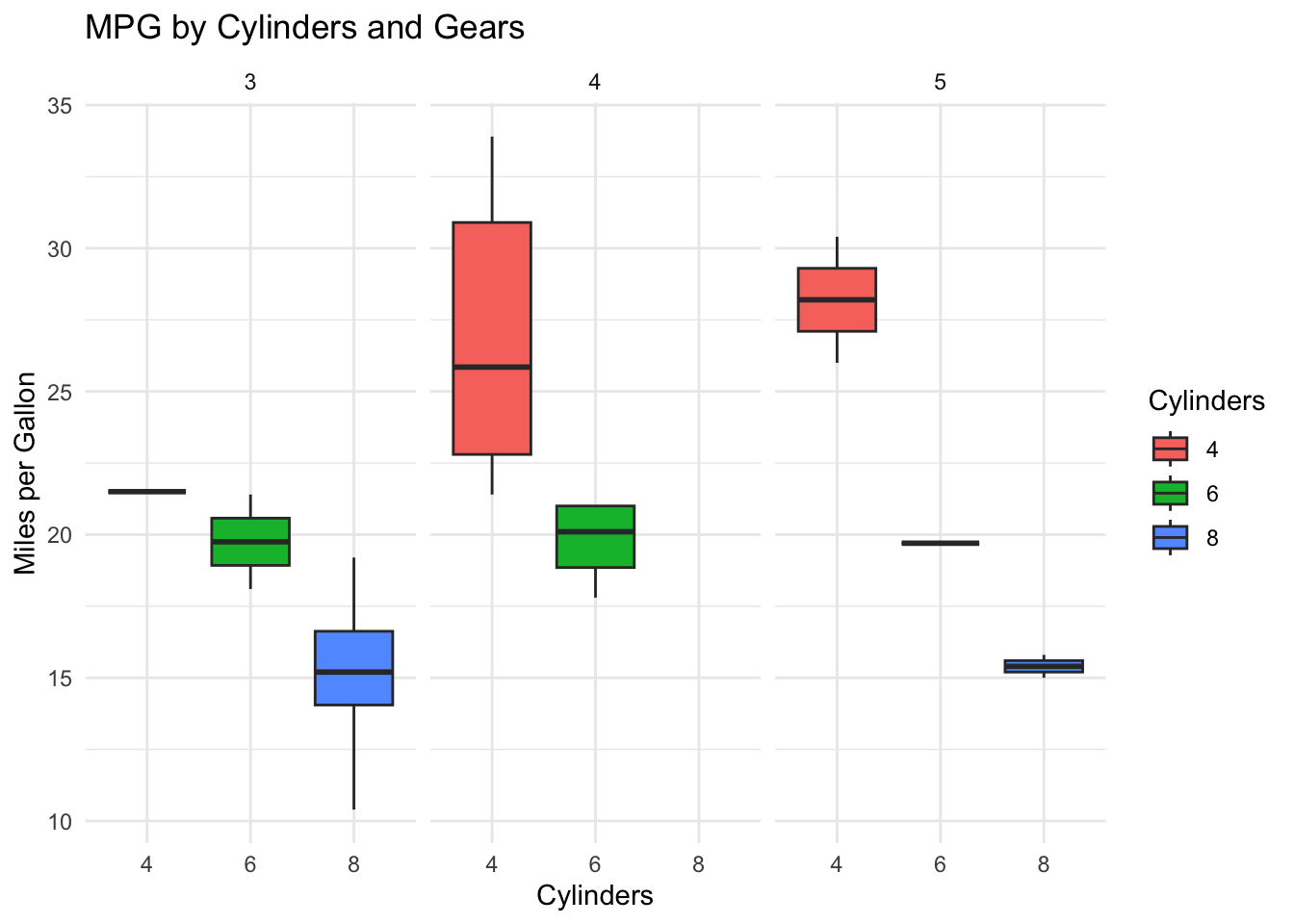
This layered approach — starting simple and adding complexity one element at a time — is how you should approach building visualizations in practice. Each addition can be evaluated independently, making it easy to iterate toward an effective design.
7.5.4 Beyond ggplot2: The Visualization Tool Landscape
ggplot2 is not the only visualization tool you will encounter in BI. Understanding how it fits into the broader landscape helps you choose the right tool for each situation.
Tableau is the most widely used GUI-based visualization platform in business. It uses a drag-and-drop interface to create interactive dashboards and is designed for explanatory visualization — presenting findings to stakeholders. Tableau’s underlying logic is influenced by the Grammar of Graphics: it separates data, visual encodings (called “marks” and “channels”), and layout, though it exposes these through menus rather than code. Tableau excels at interactive dashboards and is often the tool of choice for BI analysts who need to publish visualizations for non-technical audiences.
Microsoft Power BI is Tableau’s primary competitor and has grown rapidly due to its tight integration with the Microsoft ecosystem. Power BI connects natively to Excel, SQL Server, and SharePoint, and dashboards can be shared through Microsoft Teams — making it a natural choice for organizations already using Microsoft 365. Power BI uses DAX (Data Analysis Expressions) as its formula language and M (Power Query) for data transformation, both of which serve roles analogous to R’s dplyr. Its lower price point relative to Tableau has made it the most widely adopted BI visualization tool by market share.
Plotly (available in R via the plotly package) extends ggplot2 visualizations with interactivity — hover tooltips, zooming, and panning — without requiring web development skills. The ggplotly() function can convert any ggplot2 plot into an interactive version with a single line of code:
pacman::p_load("plotly")

p <- ggplot(mtcars, aes(x = wt, y = mpg, color = factor(cyl))) +
  geom_point(size = 2) +
  theme_minimal() +
  labs(x = "Weight (1000 lbs)", y = "MPG", color = "Cylinders")

ggplotly(p)
In the HTML version of this book, you can hover over points to see their values, zoom into regions, and pan across the plot. This interactivity is especially valuable for exploratory analysis and for dashboards where users need to investigate specific data points.
Python’s visualization ecosystem — including matplotlib, seaborn, and plotnine (a Grammar of Graphics implementation) — serves a similar role in Python-based workflows. Students who learn ggplot2 will find plotnine immediately familiar.
The key insight is that the Grammar of Graphics is not specific to ggplot2 — it is a way of thinking about visualization that transfers across tools. An analyst who understands data, aesthetics, geoms, and scales can work effectively in any of these platforms, because the underlying logic is the same even when the interface differs.