8.3 Visualizing Absenteeism by Month
To visualize the distribution of absenteeism metrics over the months using a bar chart, it’s necessary to restructure our data into a “long” format. A long data frame, or long format, organizes data such that each row represents a single observation for one variable, and each column represents a different variable. This contrasts with the “wide” format, where multiple observations for various variables are spread across many columns for the same unit, such as a time period or subject.
The long format is needed when using ggplot2, a popular data visualization package in R. This format simplifies the mapping of aesthetics like x, y, color, and fill to variables because each aesthetic can be directly linked to a column in the data frame. It’s especially useful for comparing multiple metrics across a categorical axis, such as months in our case.
For our specific task of plotting the distribution of absenteeism metrics — total number of absences and total hours of absenteeism — over the months, converting our data to long format is crucial. This allows each month’s data to have corresponding entries for both metrics, enabling us to plot them on the same bar chart. We can use the month for the x-axis and the metric values for the y-axis, while differentiating the metrics using color or fill. By pivoting the data frame from wide to long format, we ensure that our visualization is not only more dynamic but also more informative, effectively illustrating and comparing the two different metrics within the same graphical context.
The following code transforms the Absenteeism.Month data into a suitable format for visualization, and creates a bar chart to compare the metrics of absenteeism across different months.
Month.Plot <- Absenteeism.Month |>
  pivot_longer(-Month.of.absence) |>
  ggplot(aes(y = value, x = Month.of.absence, fill = name)) +
  geom_bar(position = "dodge", stat="identity") +
  scale_x_discrete(limits = month.abb)

Month.Plot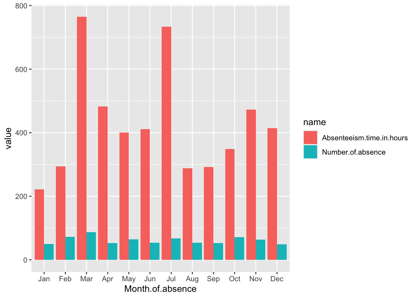
Breaking Down the Code
Data Preparation: A.
Month.Plot <- Absenteeism.Month |>: This line indicates that the plot will be created using theAbsenteeism.Monthdata frame. The assignment toMonth.Plotsuggests that the output of the plotting operations will be stored in this variable. B.pivot_longer(-Month.of.absence) |>: This function is used to transform the data from a wide format to a long format. The-Month.of.absenceargument specifies that all columns exceptMonth.of.absenceshould be pivoted into two new columns: one for the variable names (name) and one for the values (value). Essentially, this step prepares the data for plotting by ensuring that each row contains a month, a metric name, and a metric value.Plotting with ggplot2: A.
ggplot(aes(y = value, x = Month.of.absence, fill = name)): This initiates the plot with ggplot2, specifying how aesthetics are mapped:y = value: The y-axis will represent the values of the metrics, which could be the number of absences or the total hours of absenteeism, depending on the row.x = Month.of.absence: The x-axis will display the months.fill = name: Thefillaesthetic determines the color of the bars, which will vary based on the metric name (e.g., total number of absences or total absenteeism hours). This helps differentiate the metrics visually in the chart. B.geom_bar(position = "dodge", stat="identity"): This adds bar geometry to the plot. Theposition = "dodge"argument places bars next to each other rather than stacking them, which is useful for comparing two metrics within the same month. Thestat="identity"argument tells ggplot that the heights of the bars should directly correspond to the data values in thevaluecolumn. B.scale_x_discrete(limits = month.abb): This modifies the x-axis to use discrete limits based onmonth.abb, which are the abbreviated names of the months. This ensures that the months are displayed in a standard abbreviated format and in their natural order.
Displaying the Plot:
Month.Plot: This line isn’t part of the code block for creating the plot but is likely used elsewhere to actually display or print the plot stored in theMonth.Plotvariable.