8.4 Improve the Plot
Use a facet to make the plot more readable.
The scales of the two metrics in the plot—number of absences and total hours of absenteeism—are different, which can make it challenging to effectively compare the number of absences directly against the hours due to scale discrepancies. To address this issue and enhance the clarity of the visualization, we can employ the use of facets, or subplots, that separate the two metrics into distinct panels.
In ggplot2, adding facets to an existing plot is straightforward and does not require repeating the entire code used to create the original plot. Instead, facets can be added incrementally to the existing plot object. Here’s how it’s done:
The existing plot stored in Month.Plot can be modified by adding a facet_wrap layer. This function is used to create a separate plot or panel for each metric, allowing each to have its own y-axis scale. The code snippet:
Month.Plot <- Month.Plot +
  facet_wrap(~name, ncol = 1, scales = "free_y") +
  theme(legend.position = "none")
Month.Plot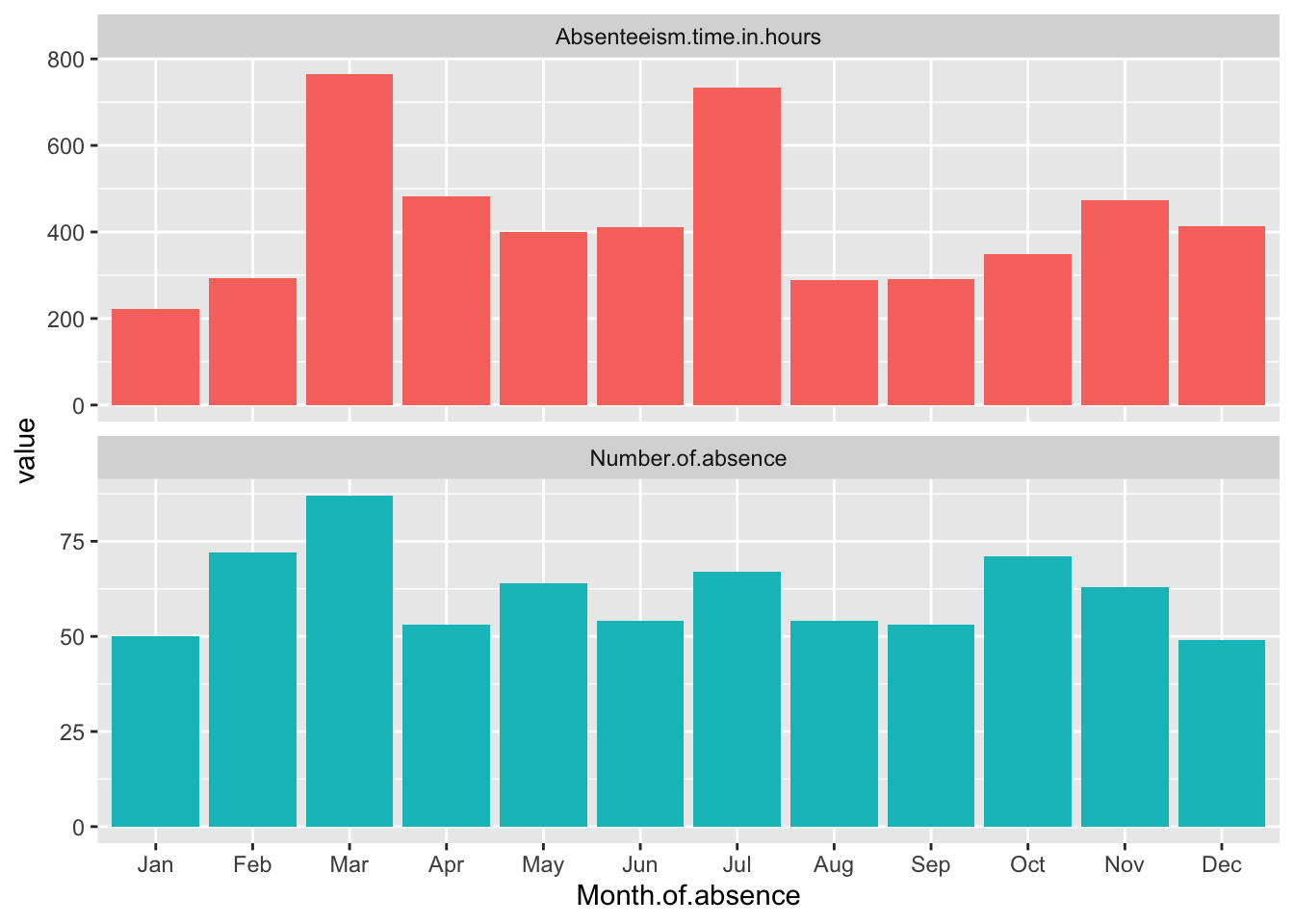
This code adds the facet_wrap function to the existing Month.Plot. The ~name tells ggplot to create a separate panel for each unique value in the name column, which corresponds to the different metrics. Setting ncol = 1 arranges the panels in a single column, and scales = "free_y" allows each panel to have its own y-axis scale, tailored to the range of values for that particular metric. This approach significantly improves the ability to discern patterns in each metric without the distraction of disproportionate scales. theme(legend.position = "none") removes the legend. The final line in the snippet simply displays the updated plot.
Standardize the data
Standardizing data by month is a method used to normalize the values of various metrics within the dataset so that they can be compared on a common scale. This is particularly useful when the original scales of the metrics differ significantly, making it difficult to visually compare them directly. By standardizing, each metric is rescaled so that its distribution has a mean of zero and a standard deviation of one, within each month. This approach reduces the effect of the absolute magnitude of the metrics, focusing instead on their variation and trends over time.
In the context of the Absenteeism.Month dataset, we can standardize the metrics before plotting. This involves adjusting each value of ‘Number of absences’, ‘Absenteeism time in hours’, and ‘Full Day’ so that these values reflect how many standard deviations they are from the mean of that specific metric for each month. This transformation is done using the scale() function in R, which standardizes a vector to have a mean of zero and a standard deviation of one.
Month.Plot <- Absenteeism.Month |>
  mutate(
    Number.of.absence = scale(Number.of.absence),
    Absenteeism.time.in.hours = scale(Absenteeism.time.in.hours)
  ) |>
  pivot_longer(-Month.of.absence) |>
  ggplot(aes(y = value, x = Month.of.absence, fill = name)) +
  geom_bar(position = "dodge", stat="identity") +
  scale_x_discrete(limits = month.abb) +
  facet_wrap(~name,ncol = 1,scales = "free_y") +
  theme(legend.position = "none")

Month.Plot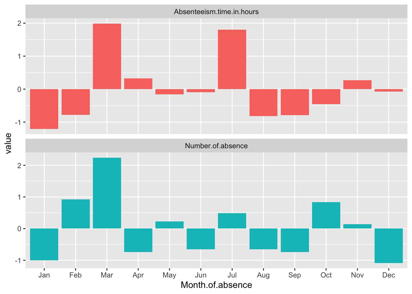
Breaking Down the Code
Mutate with Scale: The code uses the
mutate()function to apply thescale()function to ‘Number of absences’, ‘Absenteeism time in hours’, and ‘Full Day’. This modifies each of these metrics to their standardized values across the months.Pivot Data: After standardizing, the data is pivoted from wide to long format using
pivot_longer(-Month.of.absence). This makes the data suitable for ggplot2 by creating a long format where each row represents a single observation for a specific metric in a specific month, suitable for individual plotting.Plotting: The plotting command starts with
ggplot(), specifyingMonth.of.absenceas the x-axis and the standardized values (value) as the y-axis.geom_bar(position = "dodge", stat="identity")is used to create side-by-side bars for each metric within each month, which makes it easier to compare the metrics directly.Adjust Month Display and Add Facets:
scale_x_discrete(limits = month.abb)ensures that the x-axis labels display month abbreviations in their proper sequence.facet_wrap(~name, ncol = 1, scales = "free_y")adds facets to the plot, creating separate panels for each metric, with each panel having its own y-axis scaled independently. This allows each standardized metric to be displayed in a manner that highlights differences within and across months without the scales interfering with each other.Display the Plot: Finally, the updated
Month.Plotobject, which now contains the ggplot2 plot with standardized data and facets, is displayed.
This method enhances the clarity of the visual representation by allowing us to focus on the relative changes in absenteeism metrics across months, independent of their original measurement scales.