7.3 Visualization by Relationship Type
The examples below demonstrate how to match chart types to the data relationship you want to show, using ggplot2. Each example includes the R code so you can see how the visualization is constructed.
7.3.1 Correlation: Scatter Plot
A scatter plot reveals the association between two continuous variables.
data(mtcars)

ggplot(mtcars, aes(x = wt, y = mpg)) +
  geom_point(color = "blue") +
  theme_minimal() +
  labs(title = "Correlation: MPG vs. Weight",
       x = "Weight (1000 lbs)",
       y = "Miles per Gallon")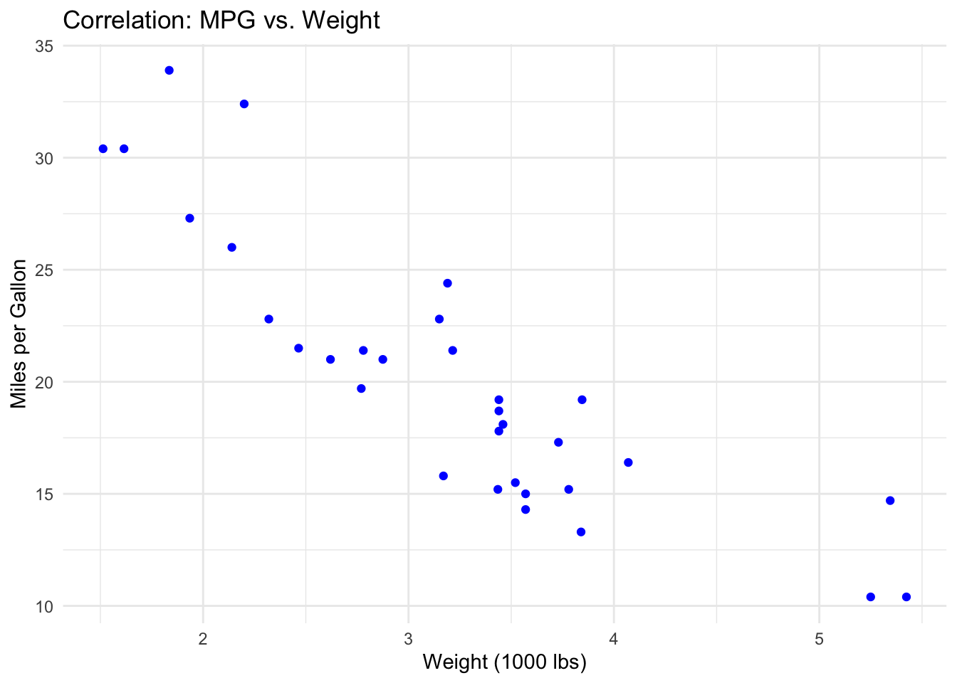
Each point represents one car. The downward-sloping pattern indicates a negative correlation: as weight increases, fuel efficiency decreases. Points that fall far from the general trend (e.g., a heavy car with high MPG) would be worth investigating as potential outliers or unusual cases.
7.3.2 Distribution: Histogram
A histogram shows how values are spread across a range, revealing the center, spread, and shape of a distribution.
data(diamonds)

ggplot(diamonds, aes(x = carat)) +
  geom_histogram(fill = "cyan", color = "black", bins = 30) +
  theme_minimal() +
  labs(title = "Distribution of Diamond Weight",
       x = "Carat",
       y = "Frequency")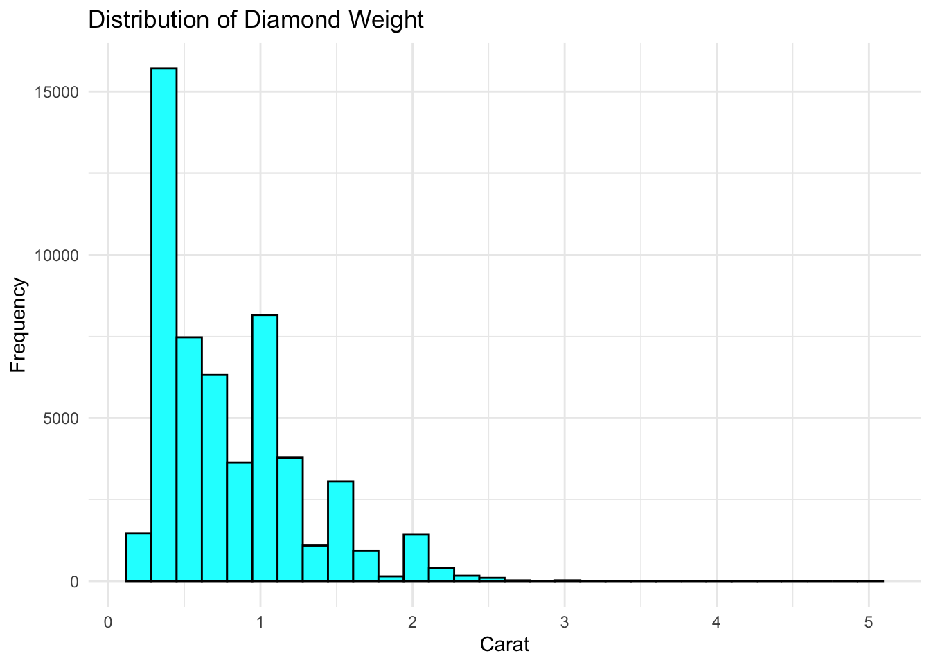
The x-axis shows diamond weight in carats; the y-axis shows how many diamonds fall in each bin. This distribution is right-skewed — most diamonds are small (under 1 carat), with a long tail of larger stones. The peaks (modes) suggest common weight targets in diamond cutting.
7.3.3 Comparison: Bar Chart
Bar charts compare values across categories — one of the most common chart types in business reporting.
# Average MPG by number of cylinders
mpg_by_cyl <- mtcars |>
  group_by(cyl) |>
  summarize(avg_mpg = mean(mpg))

ggplot(mpg_by_cyl, aes(x = factor(cyl), y = avg_mpg, fill = factor(cyl))) +
  geom_col() +
  theme_minimal() +
  labs(title = "Average MPG by Cylinder Count",
       x = "Cylinders", y = "Average MPG") +
  theme(legend.position = "none")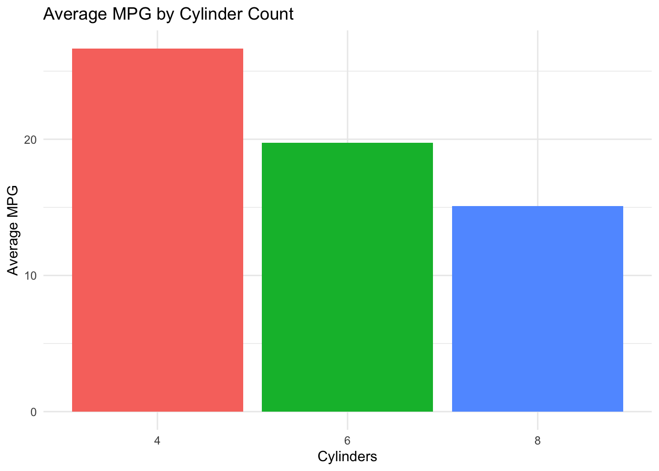
Each bar represents the average MPG for cars with that cylinder count. The descending pattern shows that more cylinders are associated with lower fuel efficiency. Bar height makes direct comparison easy — you can immediately see that 4-cylinder cars average roughly twice the MPG of 8-cylinder cars.
7.3.4 Comparison: Line Chart
Line charts show trends over time — the bread and butter of business dashboards and KPI tracking.
# Simulated monthly revenue for two product lines
set.seed(42)
revenue <- data.frame(
  Month = rep(1:12, 2),
  Product = rep(c("Product A", "Product B"), each = 12),
  Revenue = c(cumsum(rnorm(12, 5, 2)) + 50,
              cumsum(rnorm(12, 3, 2)) + 40)
)

ggplot(revenue, aes(x = Month, y = Revenue, color = Product)) +
  geom_line(linewidth = 1) +
  geom_point() +
  theme_minimal() +
  labs(title = "Monthly Revenue by Product Line",
       x = "Month", y = "Revenue ($K)")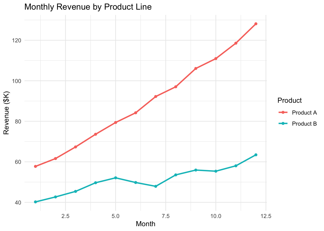
The x-axis shows time (months); each line traces one product’s revenue. Where lines diverge, one product is growing faster. Where they are parallel, both are growing at similar rates. The points at each month make individual values readable, while the lines emphasize the trend.
7.3.5 Comparison: Box Plot
Box plots compare distributions across categories, showing medians, quartiles, and outliers side by side.
set.seed(123)
sales_data <- data.frame(
  Sales_Team = factor(rep(c('Team A', 'Team B', 'Team C'), each = 40)),
  Performance = c(rnorm(40, mean = 100, sd = 15),
                  rnorm(40, mean = 110, sd = 20),
                  rnorm(40, mean = 90, sd = 25))
)

ggplot(sales_data, aes(x = Sales_Team, y = Performance, fill = Sales_Team)) +
  geom_boxplot() +
  theme_minimal() +
  labs(title = "Comparison of Sales Team Performance",
       x = "Sales Team",
       y = "Performance Score",
       fill = "Team")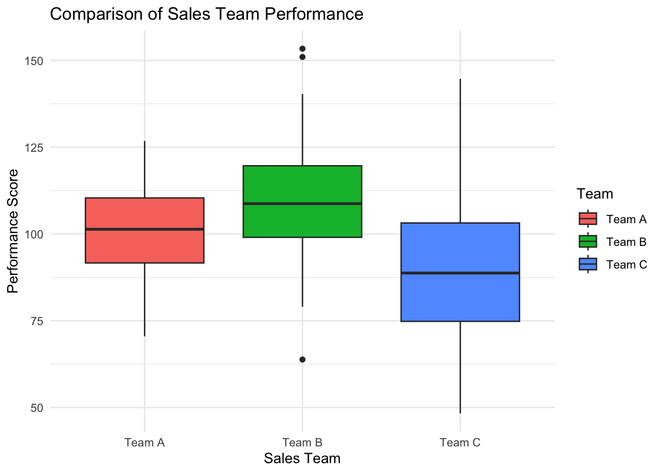
Each box shows the middle 50% of scores (the interquartile range), with the line inside marking the median. “Whiskers” extend to the most extreme non-outlier values, and dots beyond them are outliers. Here, Team B has the highest median but also the most variability (widest box), while Team C has the lowest median and several low-performing outliers.
7.3.6 Composition: Stacked Bar Chart
Stacked bar charts show how parts contribute to a whole.
# Raw counts by category and component
comp_raw <- data.frame(
  Category = rep(c("Q1", "Q2", "Q3"), each = 3),
  Source = factor(rep(c("Online", "In-Store", "Wholesale"), times = 3)),
  Sales = c(20, 25, 15, 35, 30, 10, 15, 20, 30)
)

# Convert to proportions within each quarter
comp_data <- comp_raw |>
  group_by(Category) |>
  mutate(Proportion = Sales / sum(Sales))

ggplot(comp_data, aes(x = Category, y = Proportion, fill = Source)) +
  geom_col(position = "stack") +
  theme_minimal() +
  labs(title = "Sales Composition by Channel and Quarter",
       x = "Quarter", y = "Proportion")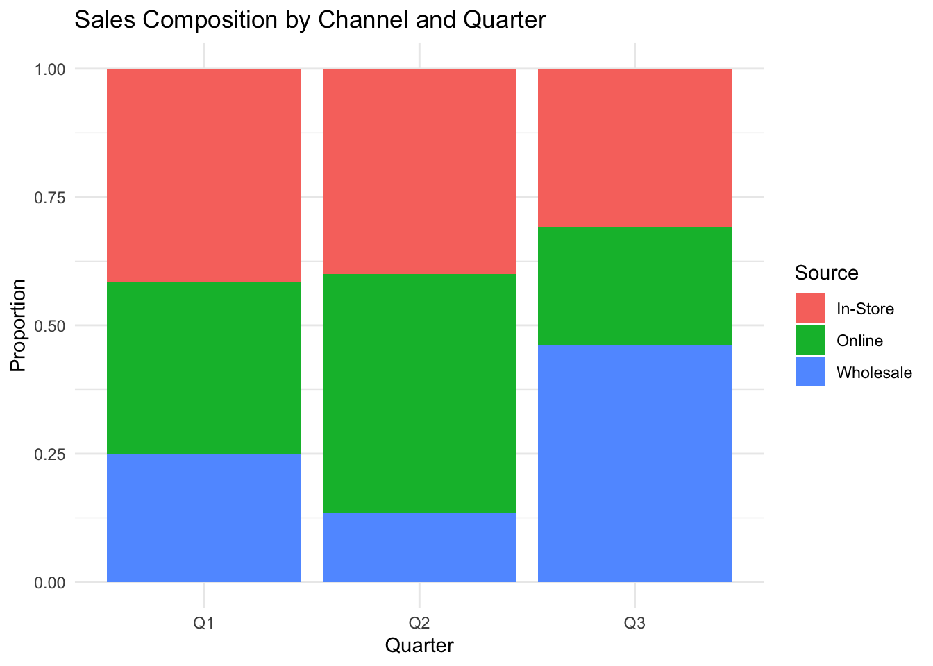
Each bar represents a quarter, and the colored segments show the proportion contributed by each sales channel. Reading vertically, you can see how the channel mix shifts over time — for example, whether online sales are growing as a share of total revenue. The total bar height is always 1.0 (100%), making proportional comparison the focus rather than absolute values.
7.3.7 Complex Relationships: Heat Map
Heat maps visualize patterns across two dimensions using color intensity, useful for spotting clusters and gradients in large datasets.
# Simulated employee absence data: hours absent by month and department
set.seed(123)
absence_heat <- expand.grid(
  Month = month.abb,
  Department = c("Sales", "Engineering", "HR", "Marketing", "Finance")
)
absence_heat$Hours <- rpois(nrow(absence_heat), lambda = rep(c(12, 8, 15, 10, 6), each = 12))
absence_heat$Month <- factor(absence_heat$Month, levels = month.abb)

ggplot(absence_heat, aes(x = Month, y = Department, fill = Hours)) +
  geom_tile(color = "white") +
  scale_fill_gradient(low = "#f0f7fb", high = "#2980b9") +
  theme_minimal() +
  labs(title = "Employee Absence Hours by Month and Department",
       x = "Month", y = "Department", fill = "Hours")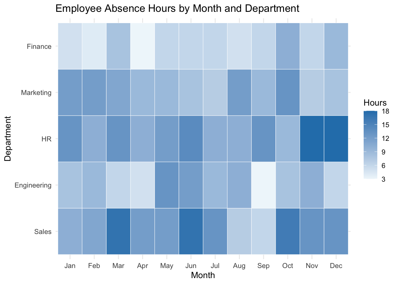
Each cell represents one department-month combination, with darker colors indicating more absence hours. Scan for patterns: do certain departments have consistently high absence? Are there months where absence spikes across all departments? This heat map makes it easy to spot both department-specific issues and organization-wide seasonal patterns at a glance.