4.4 Your First Visualizations
4.4.1 Distribution of Absenteeism Hours
A histogram shows how a single variable is distributed — how often different values occur. Let’s look at the distribution of absenteeism hours:
ggplot(work, aes(x = `Absenteeism time in hours`)) +
  geom_histogram(binwidth = 4, fill = "steelblue", color = "white") +
  labs(
    title = "Distribution of Absenteeism Hours",
    x = "Hours Absent",
    y = "Number of Absence Events"
  ) +
  theme_minimal()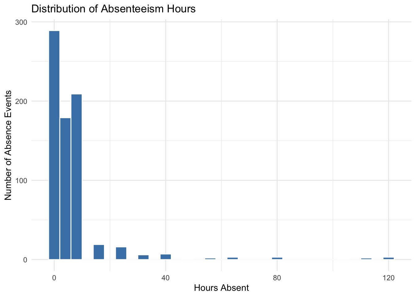
Figure 4.1: Distribution of absenteeism hours across all 740 absence events.
The histogram confirms what the summary statistics suggested: most absences are short (under 8 hours — roughly one workday or less), but there is a long right tail with a few very long absences. This kind of skewed distribution is common in real-world data and will influence how we analyze and model the data in later chapters.
4.4.2 Most Common Reasons for Absence
A bar chart is a good way to visualize categorical data. Let’s see which reasons for absence appear most frequently:
work |>
  count(`Reason for absence`) |>
  mutate(`Reason for absence` = factor(`Reason for absence`)) |>
  ggplot(aes(x = reorder(`Reason for absence`, -n), y = n)) +
  geom_col(fill = "steelblue") +
  labs(
    title = "Frequency of Absence Reasons",
    x = "Reason Code",
    y = "Number of Events"
  ) +
  theme_minimal() +
  theme(axis.text.x = element_text(size = 7, angle = 90, hjust = 1))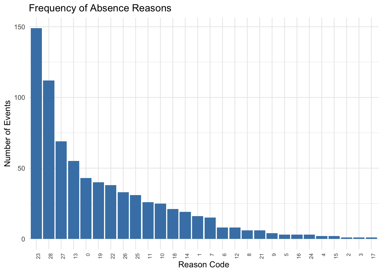
Figure 4.2: Frequency of each absence reason code in the dataset.
Recall from Chapter 2 that codes 1–21 are ICD medical categories and codes 22–28 are non-medical reasons. Some reasons appear far more frequently than others. The most common reasons stand out immediately — these are worth investigating further when we explore the data in greater depth in Chapters 7 and 8.
4.4.3 Absenteeism by Day of the Week
Do certain days of the week see more absenteeism? A boxplot can show the distribution of absenteeism hours for each day:
work |>
  mutate(Day = factor(
    `Day of the week`,
    levels = 2:6,
    labels = c("Mon", "Tue", "Wed", "Thu", "Fri")
  )) |>
  ggplot(aes(x = Day, y = `Absenteeism time in hours`)) +
  geom_boxplot(fill = "steelblue", alpha = 0.7) +
  labs(
    title = "Absenteeism Hours by Day of the Week",
    x = "Day of the Week",
    y = "Hours Absent"
  ) +
  theme_minimal()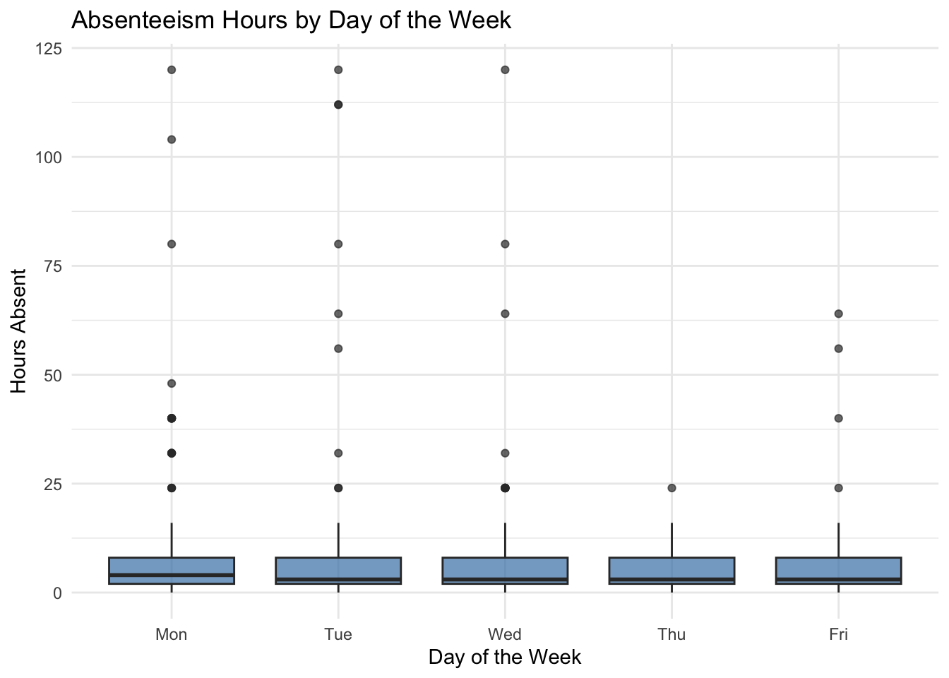
Figure 4.3: Distribution of absenteeism hours by day of the week.
The boxplots show the median (the line inside each box), the interquartile range (the box itself, spanning the 25th to 75th percentiles), and outliers (individual points beyond the whiskers). Look for differences in the medians across days and for days with more extreme outliers.
4.4.4 Absenteeism by Month
We can also examine whether absenteeism varies across months. A boxplot by month reveals seasonal patterns:
work |>
  filter(`Month of absence` > 0) |>
  mutate(Month = factor(
    `Month of absence`,
    levels = 1:12,
    labels = c("Jan", "Feb", "Mar", "Apr", "May", "Jun",
               "Jul", "Aug", "Sep", "Oct", "Nov", "Dec")
  )) |>
  ggplot(aes(x = Month, y = `Absenteeism time in hours`)) +
  geom_boxplot(fill = "steelblue", alpha = 0.7) +
  labs(
    title = "Absenteeism Hours by Month",
    x = "Month",
    y = "Hours Absent"
  ) +
  theme_minimal()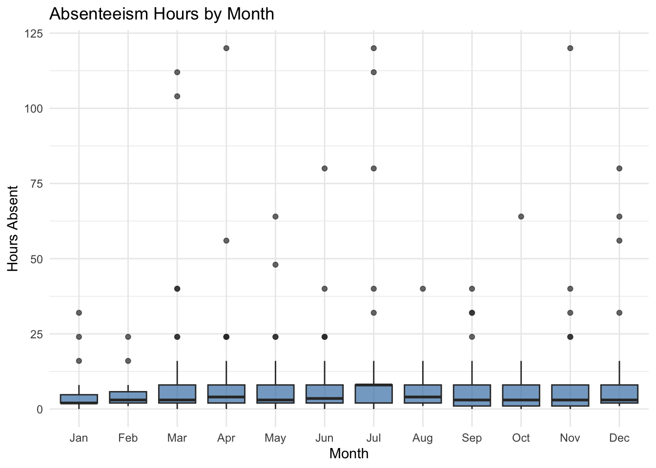
Figure 4.4: Distribution of absenteeism hours by month of the year.
Look for months with higher medians or more outliers — these could indicate seasonal patterns in absenteeism that are worth investigating further.