14.4 Building to Spec
With the spec written, the project becomes an exercise in implementation. Each line of R code in this section is traceable to a requirement: a transformation called for by the data spec, an analysis answering a key question, or an artifact producing a named deliverable. Working in this direction is the defining feature of spec-driven development.
14.4.1 Building the project-ready dataset
The first step is to load the raw absence-event data and aggregate it to the employee level, using the pipeline established in Chapter 6 with two modifications dictated by the spec: we retain ID (needed for Deliverable 3) and we keep Service time and Distance from Residence to Work as candidate predictors.
absenteeism_raw <- read_delim(
  "https://ljkelly3141.github.io/datasets/bi-book/Absenteeism_at_work.csv",
  delim = ";"
)

mode_value <- function(x) {
  ux <- unique(x)
  ux[which.max(tabulate(match(x, ux)))]
}

employee_data <- absenteeism_raw |>
  group_by(ID) |>
  summarise(
    Age                                 = first(Age),
    `Service time`                      = first(`Service time`),
    `Body mass index`                   = first(`Body mass index`),
    Education                           = first(Education),
    `Distance from Residence to Work`   = first(`Distance from Residence to Work`),
    `Most common reason for absence`    = mode_value(`Reason for absence`),
    `Number of absence`                 = sum(`Reason for absence` != 0),
    `Absenteeism time in hours`         = sum(`Absenteeism time in hours`)
  ) |>
  mutate(
    Education = factor(Education) |>
      fct_recode(
        "high school"        = "1",
        "graduate"           = "2",
        "postgraduate"       = "3",
        "master and doctor"  = "4"
      )
  )
The aggregation collapses 740 absence events into 36 employee-level records. Notice the differences from Chapter 6: ID is preserved on the left of the summarise(), Service time and Distance from Residence to Work are kept as candidate predictors, and Number of absence now counts only events with a recorded reason (excluding the zero-reason rows that Chapter 6 left in). The helper mode_value() returns the most frequent value of a vector — useful when the BRS asks for an employee’s modal reason rather than a numeric average.
14.4.2 Deriving the chronic-absenteeism flag
The BRS defines a “chronic” employee as one whose average absenteeism exceeds 40 hours per quarter. The dataset covers eight quarters — July 2012 through July 2014 — so each employee’s per-quarter rate is their cumulative absenteeism divided by 8. This is an analytical decision worth documenting: a different choice (for example, dividing by Service time * 4 to amortize over the full tenure) would produce a different Chronic distribution and should be disclosed in the executive summary.
employee_data <- employee_data |>
  mutate(
    `Hours per quarter` = `Absenteeism time in hours` / 8,
    Chronic             = `Hours per quarter` > 40
)| Chronic | n | Share |
|---|---|---|
| FALSE | 31 | 86.1% |
| TRUE | 5 | 13.9% |
The class balance is itself a finding the analyst must report. A model trained on a heavily imbalanced outcome needs different handling than one trained on a balanced outcome, and the BRS’s 70% accuracy KPI must be evaluated against the appropriate baseline (always predicting the majority class, in this case).
14.4.3 Deliverable 1: Exploratory analysis
Key Questions 1 and 3 of the BRS call for visual insight into which employee characteristics drive absenteeism and how absences are distributed across time and reason. We address them with one employee-level and one event-level visualization.
ggplot(employee_data, aes(x = Education, y = `Hours per quarter`)) +
  geom_boxplot(fill = "steelblue", alpha = 0.5) +
  geom_hline(yintercept = 40, linetype = "dashed", color = "red") +
  labs(
    title    = "Quarterly absenteeism by education level",
    subtitle = "Dashed line: 40-hour chronic threshold",
    y        = "Hours per quarter",
    x        = NULL
  ) +
  theme_minimal()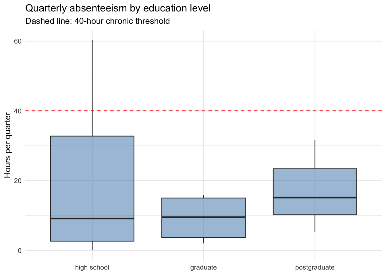
The chronic threshold (red dashed line) sits at or above the median for every education group, but the upper tail is heavier for high-school and graduate employees than for postgraduate or master-and-doctor employees. This is a defensible visual answer to Key Question 1: education is associated with absenteeism, but the relationship is in the spread rather than the central tendency.
absenteeism_raw |>
  filter(`Day of the week` %in% 2:6) |>
  mutate(
    `Day of the week` = factor(
      `Day of the week`,
      levels = 2:6,
      labels = c("Mon", "Tue", "Wed", "Thu", "Fri")
    )
  ) |>
  group_by(`Day of the week`) |>
  summarise(`Total hours` = sum(`Absenteeism time in hours`)) |>
  ggplot(aes(x = `Day of the week`, y = `Total hours`)) +
  geom_col(fill = "steelblue") +
  labs(
    title = "Total absenteeism by day of the week",
    y     = "Total hours absent (across all events)",
    x     = NULL
  ) +
  theme_minimal()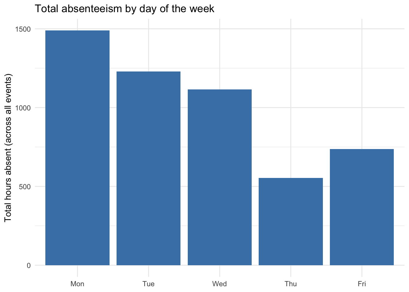
Monday absenteeism dominates the week, consistent with widely reported workplace patterns. This answers Key Question 3 and gives HR a concrete operational hook for the wellness program.
14.4.4 Deliverable 2: Predictive model
The model targets the binary Chronic outcome. The BRS forbids protected characteristics as predictors and requires accuracy >= 70% on a held-out test set. We use logistic regression because it is interpretable, fast, and produces calibrated probabilities — all properties the BRS’s non-technical audience requires.
set.seed(42)
n          <- nrow(employee_data)
train_idx  <- sample(seq_len(n), size = floor(0.7 * n))
train_data <- employee_data[train_idx, ]
test_data  <- employee_data[-train_idx, ]

model <- glm(
  Chronic ~ Age + `Service time` + `Body mass index` +
            Education + `Distance from Residence to Work`,
  data   = train_data,
  family = binomial()
)
The formula deliberately omits gender, ethnicity, and religion (the BRS’s protected-characteristic constraint), and omits any post-outcome variables such as Number of absence or Hours per quarter that would leak the target.
| Term | Estimate | Std. Error | z value | Pr(>|z|) |
|---|---|---|---|---|
| (Intercept) | 10.831 | 11.591 | 0.934 | 0.350 |
| Age | -0.839 | 0.804 | -1.044 | 0.296 |
Service time
|
0.677 | 0.562 | 1.205 | 0.228 |
Body mass index
|
0.316 | 0.652 | 0.486 | 0.627 |
| Educationgraduate | -16.098 | 5634.924 | -0.003 | 0.998 |
| Educationpostgraduate | -17.053 | 6097.895 | -0.003 | 0.998 |
Distance from Residence to Work
|
-0.026 | 0.068 | -0.387 | 0.699 |
Test-set accuracy is computed by classifying any employee with predicted probability above 0.5 as chronic:
test_data <- test_data |>
  mutate(
    `Predicted probability` = predict(model, newdata = test_data, type = "response"),
    `Predicted chronic`     = `Predicted probability` > 0.5
  )

accuracy <- mean(test_data$`Predicted chronic` == test_data$Chronic)
The held-out accuracy of 81.8% is the value evaluated against the BRS’s 70% KPI. A blunt honesty point belongs in the deliverables: with only 36 employees in the dataset, the test set holds 11 records, so accuracy moves in increments of roughly 9 percentage points and a single misclassified employee shifts the metric materially. The project notebook should report this — and the model itself should be presented as a proof of concept rather than a deployable scoring engine — even though the BRS’s nominal KPI may be met. Pretending otherwise would violate the spec’s reproducibility and honesty constraints far more seriously than missing the accuracy threshold.
14.4.5 Deliverable 3: Ranked risk list
The risk list applies the trained model to every employee — not just the held-out test set — and sorts the result by predicted probability of chronic absence. This is the artifact HR will use to target wellness outreach.
risk_list <- employee_data |>
  mutate(
    `Predicted probability` = predict(model, newdata = employee_data, type = "response")
  ) |>
  arrange(desc(`Predicted probability`)) |>
  select(
    ID,
    `Predicted probability`,
    `Hours per quarter`,
    Chronic,
    Age,
    Education,
    `Service time`,
    `Body mass index`
)| ID | Predicted probability | Hours per quarter | Chronic | Age | Education | Service time | Body mass index |
|---|---|---|---|---|---|---|---|
| 11 | 61.7% | 56.250 | TRUE | 33 | high school | 13 | 30 |
| 13 | 59.7% | 22.875 | FALSE | 31 | high school | 12 | 25 |
| 28 | 58.2% | 43.375 | TRUE | 28 | high school | 9 | 24 |
| 29 | 58.2% | 2.625 | FALSE | 28 | high school | 9 | 24 |
| 3 | 39.8% | 60.250 | TRUE | 38 | high school | 18 | 31 |
| 32 | 36.8% | 2.000 | FALSE | 49 | high school | 29 | 36 |
| 14 | 34.5% | 59.500 | TRUE | 34 | high school | 14 | 25 |
| 6 | 28.5% | 9.000 | FALSE | 33 | high school | 13 | 25 |
| 27 | 17.5% | 3.375 | FALSE | 27 | high school | 7 | 21 |
| 19 | 12.5% | 0.750 | FALSE | 32 | high school | 12 | 23 |
Two cautions belong on the cover page when this list is delivered. First, the Chronic column shows the known outcome, not a prediction; rows where it is TRUE confirm the model is identifying employees the data already flags. Second, the predicted probability is calibrated against this sample’s class balance and should not be read as a literal individual probability — it is an ordering tool, not a scientific assessment of any one person. The BRS’s “interpretable to non-technical stakeholders” requirement is satisfied not by hiding these caveats but by stating them in plain language alongside the list.
14.4.6 Deliverable 4: Executive summary
The fourth deliverable is a one-page document for senior leadership. It is not a new analytical artifact — it is a communication artifact that translates the previous three deliverables into language and density appropriate for an executive audience. R Markdown and Quarto both support parameterized one-pagers that render directly from this notebook to PDF or DOCX, ensuring the numbers in the summary always match the analysis.
A workable structure for the one-pager:
One-page executive summary outline
- Headline finding (one sentence). “Employees in high-school and graduate education tiers show heavier upper-tail absenteeism than postgraduate employees, and Mondays drive a disproportionate share of total absent hours.”
- What HR should do (three bullets). Monday-focused intervention pilot; education-tier-aware wellness outreach; review of the 40-hour chronic threshold for next year’s report.
- Who is at risk (one chart). The top-10 risk list, with employee identifiers redacted before circulation.
- What we did and what we did not do (two bullets). The model uses health, education, distance, and tenure; it does not use gender, ethnicity, or religion. The proof-of-concept caveat (n = 36) is stated.
- Next steps (one paragraph). What a follow-on engagement would require — a larger dataset, longitudinal tracking, and integration with HR’s existing absence-management system.
The summary is the document the HR director will actually read. Every sentence in it should be defensible by reference to a specific deliverable above. Anything that cannot be defended is not in the summary; anything in the summary must be in the analysis. This bidirectional traceability is the point of spec-driven development — and it is what we verify in the next section.