8.2 When Do Absences Happen? Seasonality by Month
Our first business question comes straight from Chapter 2: does absenteeism vary by season? A staffing manager who can answer that question can plan coverage, schedule training in low-absence months, and look for the cause of any spikes.
Two metrics are worth tracking each month:
- The number of absence events — how often someone misses work.
- The total hours absent — how much working time is lost.
These can tell different stories. A month with many short absences and a month with a few long ones might both produce the same total hours, but they call for different management responses.
We start by aggregating the event-level data to one row per month:
absences_by_month <- work |>
  filter(`Month of absence` > 0) |>
  group_by(`Month of absence`) |>
  summarise(
    n_absences = n(),
    total_hours = sum(`Absenteeism time in hours`)
  ) |>
  mutate(
    Month = factor(month.abb[`Month of absence`], levels = month.abb)
  ) |>
  select(Month, n_absences, total_hours)
A few notes on this code:
filter(Month of absence> 0)drops rows where the month is0. In the source data,0is used for records where no absence occurred, so those rows would not belong in a monthly absence count.group_by()+summarise()is the standard dplyr pattern for aggregation: group rows that share a key, then collapse each group to a single summary row.factor(month.abb[...], levels = month.abb)converts the numeric month codes (1,2, …) into ordered three-letter labels (Jan,Feb, …). Settinglevels = month.abbexplicitly ensures the months plot in calendar order rather than alphabetical order — a small but easy mistake to make with character data.
Here is the resulting summary:
| Month | Number of absences | Total hours absent |
|---|---|---|
| Jan | 50 | 222 |
| Feb | 72 | 294 |
| Mar | 87 | 765 |
| Apr | 53 | 482 |
| May | 64 | 400 |
| Jun | 54 | 411 |
| Jul | 67 | 734 |
| Aug | 54 | 288 |
| Sep | 53 | 292 |
| Oct | 71 | 349 |
| Nov | 63 | 473 |
| Dec | 49 | 414 |
To see this in your console, run absences_by_month.
8.2.1 A first plot
The data is in tidy form with one row per month, but we have two metrics we want to compare across months. The cleanest way to plot both at once with ggplot2 is to reshape the data into long format — one row per (month, metric) combination — using pivot_longer():
absences_by_month |>
  pivot_longer(
    cols = c(n_absences, total_hours),
    names_to = "metric",
    values_to = "value"
  ) |>
  ggplot(aes(x = Month, y = value, fill = metric)) +
  geom_col(position = "dodge") +
  labs(
    title = "Monthly absences: counts vs. total hours",
    x = NULL, y = NULL, fill = "Metric"
  ) +
  theme_minimal()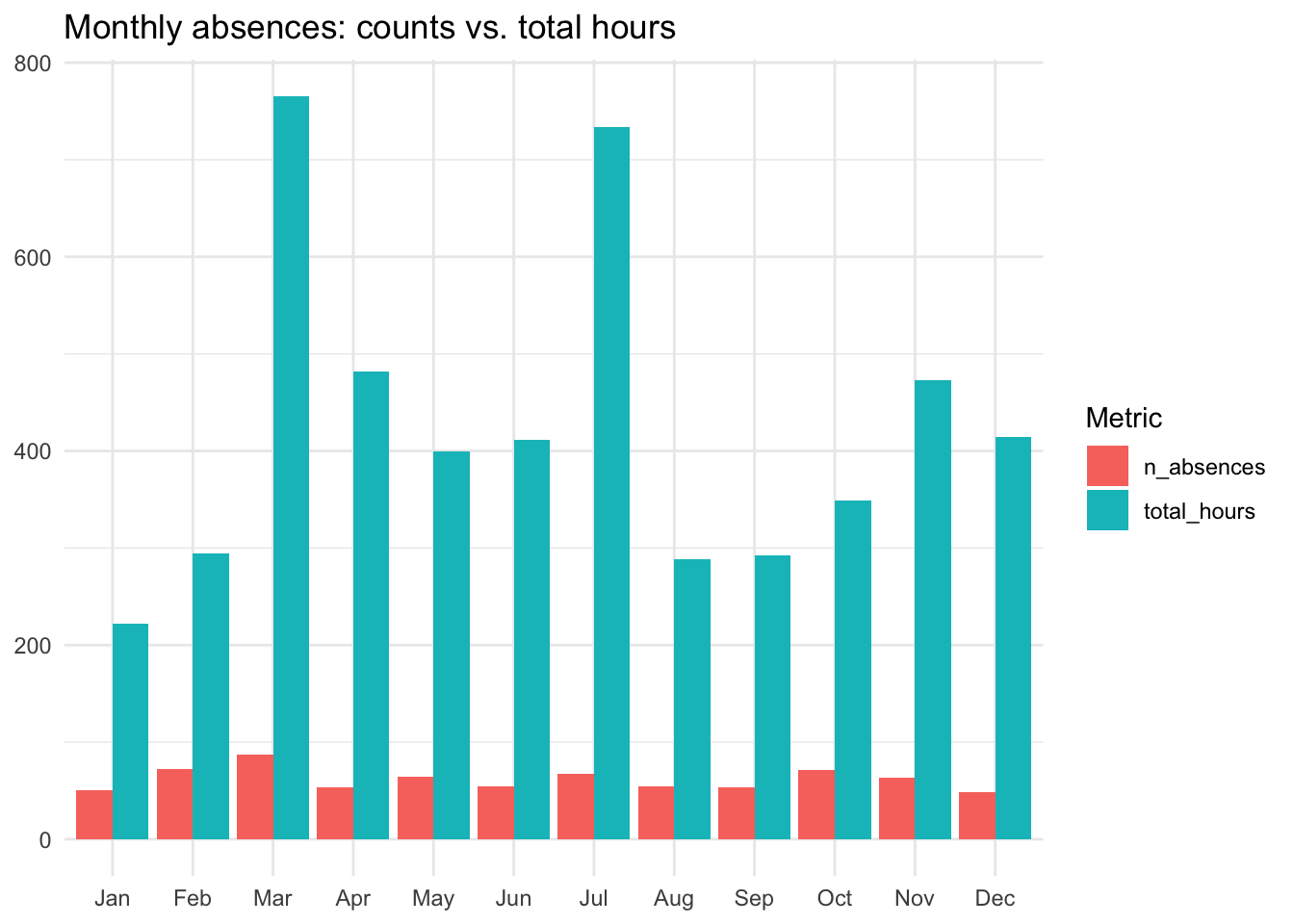
This works, but it has a problem you can see immediately: the Total hours bars dominate, and the Number of absences bars look almost flat by comparison. That is not because absences are uniform across months — it is because hours and counts live on completely different scales. Plotting them on a shared axis hides the variation in the smaller series.
8.2.2 Fixing the scale problem with faceting
There are two reasonable fixes:
- Plot the two metrics in separate panels with their own y-axes (faceting with free scales).
- Standardize both metrics to a common scale so the bars become directly comparable in units of “standard deviations from the monthly mean.”
We will use faceting first, because it is simpler and preserves the original units — number of absences and total hours — so the y-axis is something a reader can interpret without doing math. Standardization is genuinely useful, but it changes the y-axis into a unitless quantity that needs explanation; we will treat it as an advanced option below.
absences_by_month |>
  pivot_longer(
    cols = c(n_absences, total_hours),
    names_to = "metric",
    values_to = "value"
  ) |>
  ggplot(aes(x = Month, y = value, fill = metric)) +
  geom_col() +
  facet_wrap(~ metric, ncol = 1, scales = "free_y",
             labeller = as_labeller(c(
               n_absences = "Number of absences",
               total_hours = "Total hours absent"
             ))) +
  labs(x = NULL, y = NULL) +
  theme_minimal() +
  theme(legend.position = "none")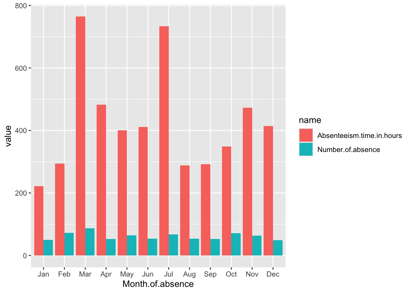
What changed and why:
facet_wrap(~ metric, ncol = 1, scales = "free_y")splits the chart into two stacked panels, one per metric, each with its own y-axis.ncol = 1keeps the months aligned horizontally so the eye can scan across panels.labeller = as_labeller(...)turns the column names (n_absences,total_hours) into human-readable strip titles. Letting raw variable names appear in a finished chart is a small piece of chart junk — it forces the reader to translate.theme(legend.position = "none")removes the legend. Once each metric has its own panel, the legend is redundant — the panel title tells you what you are looking at.theme_minimal()strips out the heavy grey backgroundggplot2uses by default. Less ink, more data, per Chapter 7’s design principles.
Advanced option: standardizing the metrics
Faceting solves the scale problem by giving each metric its own panel. A different solution is to standardize both metrics — convert each value to a z-score, the number of standard deviations it sits from the mean. After standardization, both series live on the same scale (centered at zero, with most values between roughly -2 and +2), so they can share a single axis.
In R, the scale() function does this:
absences_by_month |>
  mutate(
    n_absences = as.numeric(scale(n_absences)),
    total_hours = as.numeric(scale(total_hours))
  ) |>
  pivot_longer(cols = c(n_absences, total_hours),
               names_to = "metric", values_to = "value") |>
  ggplot(aes(x = Month, y = value, fill = metric)) +
  geom_col(position = "dodge") +
  labs(x = NULL, y = "Standard deviations from mean") +
  theme_minimal()
The trade-off: standardization makes the two series comparable, but it also strips the original units. A reader who sees “March is +2.1” cannot tell whether that means 90 absences or 900 hours — they have to consult a separate table. Faceting keeps the original units visible, which is usually the better default for a business audience. Standardization is most useful when you have many metrics on wildly different scales and the pattern of variation matters more than the levels.
8.2.3 What the chart tells us
Three patterns stand out:
- March is the highest month on both metrics. It has the most absence events and the most total hours absent.
- July is the second-highest month for total hours, but not for counts. That gap is informative: July’s hours come from a smaller number of longer absences, not from many people each missing a little time. A staffing manager would respond to those two situations differently — long July absences might be planned vacation or a few serious illnesses, while many short March absences look more like a contagious illness sweeping the office.
- January is the lowest month on both metrics. This is the kind of pattern that should prompt a follow-up question rather than a conclusion: is January genuinely a low-absence month, or are January records under-reported because the year is just starting?
We will see in later chapters that turning observations like these into testable claims is the bridge from visualization to modeling.