8.3 How Do Absences Spread Across the Week?
The next obvious slice is by day of the week. Are Mondays really the worst day for absences, or is that just a stereotype? The dataset codes the weekday as a number (Day of the week is 2 for Monday through 6 for Friday — no weekend rows because the workplace is closed), which we can recode the same way we did for months.
weekday_labels <- c("Mon", "Tue", "Wed", "Thu", "Fri")

absences_by_weekday <- work |>
  filter(`Month of absence` > 0) |>
  group_by(`Day of the week`) |>
  summarise(
    n_absences = n(),
    total_hours = sum(`Absenteeism time in hours`)
  ) |>
  mutate(
    Weekday = factor(weekday_labels[`Day of the week` - 1],
                     levels = weekday_labels)
  ) |>
  select(Weekday, n_absences, total_hours)
A small mechanical detail: because the day codes start at 2, we subtract 1 before indexing into weekday_labels. Setting levels = weekday_labels again forces calendar order rather than alphabetical order on the chart.
| Weekday | Number of absences | Total hours absent |
|---|---|---|
| Mon | 161 | 1489 |
| Tue | 153 | 1229 |
| Wed | 155 | 1115 |
| Thu | 125 | 553 |
| Fri | 143 | 738 |
We can use exactly the same plotting recipe as before — pivot_longer(), then a faceted bar chart with free y-scales:
absences_by_weekday |>
  pivot_longer(
    cols = c(n_absences, total_hours),
    names_to = "metric",
    values_to = "value"
  ) |>
  ggplot(aes(x = Weekday, y = value, fill = metric)) +
  geom_col() +
  facet_wrap(~ metric, ncol = 1, scales = "free_y",
             labeller = as_labeller(c(
               n_absences = "Number of absences",
               total_hours = "Total hours absent"
             ))) +
  labs(x = NULL, y = NULL) +
  theme_minimal() +
  theme(legend.position = "none")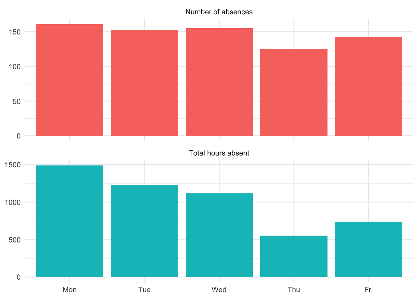
8.3.1 What the chart tells us
The “Monday is worst” stereotype gets partial support — Monday does have the highest count of absence events. But the total hours picture is different: Wednesday loses the most hours, despite having fewer events than Monday or Tuesday. That contrast — many short Monday absences, fewer-but-longer Wednesday absences — is the same story we saw at the monthly level (March vs. July) showing up at a different time scale.
Two things to notice about the method, not just the data:
- The plotting recipe didn’t change. The same
group_by → summarise → pivot_longer → facet_wrappattern handles “by month” and “by day of week” with only the grouping variable swapped. This is a hallmark of well-designed data tools: once you have a recipe that works, applying it to a new question is mostly mechanical. - The chart shape changed in a useful way. Five weekday bars are easier to read at a glance than twelve monthly bars. When you have a categorical variable with only a handful of levels, a faceted bar chart is hard to beat.