12.2 Identifying Anomalies Using Linear Regression
In a previous case study, we used linear regression to examine the variables driving absenteeism. Building on this foundation, we now shift our focus to the application of linear regression for anomaly detection. Unlike the previous scenarios where data might have been aggregated by specific categories such as employee groups, this section examines each individual absence.
The process begins by fitting a linear regression model to the dataset without aggregating by employee. After fitting the model, we proceed to identifying anomalies. This step involves pinpointing observations that significantly deviate from the model’s predictions, particularly those that surpass a predefined threshold of expected values.
Once these outliers are identified, the next phase involves a detailed examination of their characteristics. By scrutinizing these anomalies, we can gain insights into how occurrences differ from the norm, potentially uncovering underlying issues or exceptional cases within the dataset. This analysis not only deepens our understanding but also aids in refining our approach to managing absenteeism effectively.
12.2.1 Fitting a linear model
To analyze absenteeism, we begin by fitting a linear regression model. The response variable, the logarithm of absenteeism hours, is modeled as a function of all other variables in the dataset. Using a logarithmic transformation helps normalize the response variable’s distribution, a typical prerequisite for effective linear regression.
Next, we examine the model’s summary, which provides essential details such as coefficients, residuals, and other diagnostic metrics to evaluate the fit and effectiveness of the model. Understanding the influence of each predictor and the overall model quality is crucial.
| Observations | 696 |
| Dependent variable | log(Absenteeism.time.in.hours) |
| Type | OLS linear regression |
| F(11,684) | 4.44 |
| R² | 0.07 |
| Adj. R² | 0.05 |
| Est. | S.E. | t val. | p | |
|---|---|---|---|---|
| (Intercept) | 1.44 | 0.28 | 5.20 | 0.00 |
| Day.of.the.weekSat | 0.01 | 0.12 | 0.09 | 0.93 |
| Day.of.the.weekThu | 0.26 | 0.12 | 2.26 | 0.02 |
| Day.of.the.weekTue | 0.42 | 0.12 | 3.62 | 0.00 |
| Day.of.the.weekWed | 0.23 | 0.12 | 1.97 | 0.05 |
| Body.mass.index | -0.02 | 0.01 | -1.49 | 0.14 |
| Age | -0.00 | 0.01 | -0.16 | 0.88 |
| Social.smokerSmoker | 0.09 | 0.16 | 0.57 | 0.57 |
| Social.drinkerSocial drinker | 0.30 | 0.09 | 3.36 | 0.00 |
| PetPet(s) | -0.09 | 0.11 | -0.86 | 0.39 |
| ChildrenParent | 0.30 | 0.10 | 2.90 | 0.00 |
| CollegeHigh School | -0.09 | 0.11 | -0.76 | 0.45 |
| Standard errors: OLS |
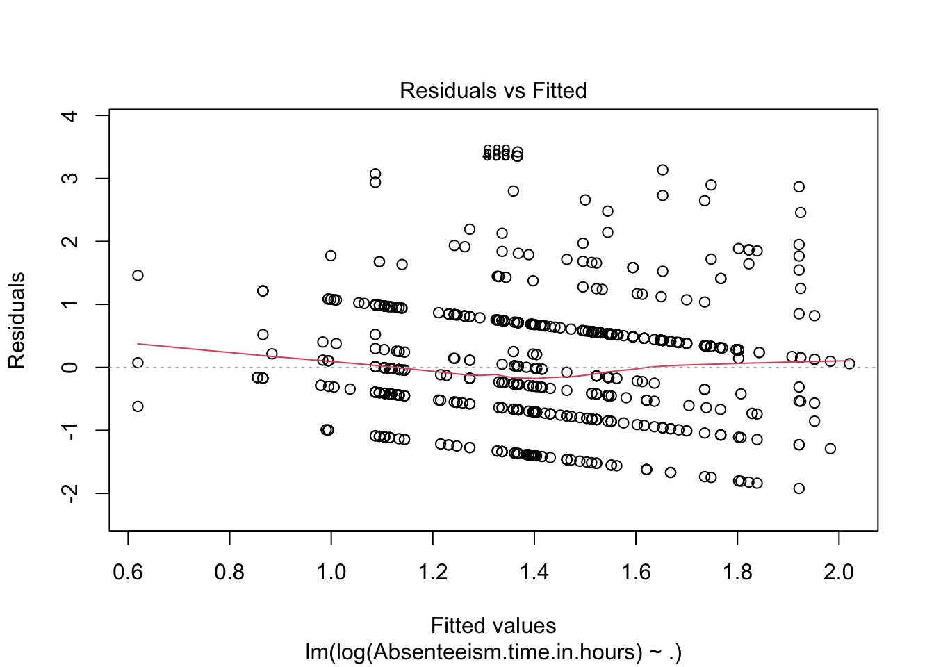
We also generate diagnostic plots for the regression model. Specifically, plotting residuals against fitted values (specified by which = 1) is critical for assessing model assumptions such as non-linearity, identifying outliers, and checking for constant variance of residuals (homoscedasticity).
To optimize the model, a stepwise regression process is employed to either reduce or adjust the explanatory variables based on the Akaike Information Criterion (AIC). This stepwise adjustment helps in achieving a more parsimonious model that balances complexity with fit.
Following the model refinement through stepwise regression, the updated summary of the model is reviewed to note any changes and assess the overall fit with the adjusted set of variables.
| Observations | 696 |
| Dependent variable | log(Absenteeism.time.in.hours) |
| Type | OLS linear regression |
| F(7,688) | 6.68 |
| R² | 0.06 |
| Adj. R² | 0.05 |
| Est. | S.E. | t val. | p | |
|---|---|---|---|---|
| (Intercept) | 1.48 | 0.25 | 5.89 | 0.00 |
| Day.of.the.weekSat | 0.02 | 0.12 | 0.17 | 0.87 |
| Day.of.the.weekThu | 0.26 | 0.12 | 2.25 | 0.03 |
| Day.of.the.weekTue | 0.43 | 0.11 | 3.71 | 0.00 |
| Day.of.the.weekWed | 0.23 | 0.12 | 1.96 | 0.05 |
| Body.mass.index | -0.02 | 0.01 | -2.39 | 0.02 |
| Social.drinkerSocial drinker | 0.30 | 0.08 | 3.93 | 0.00 |
| ChildrenParent | 0.23 | 0.07 | 3.23 | 0.00 |
| Standard errors: OLS |
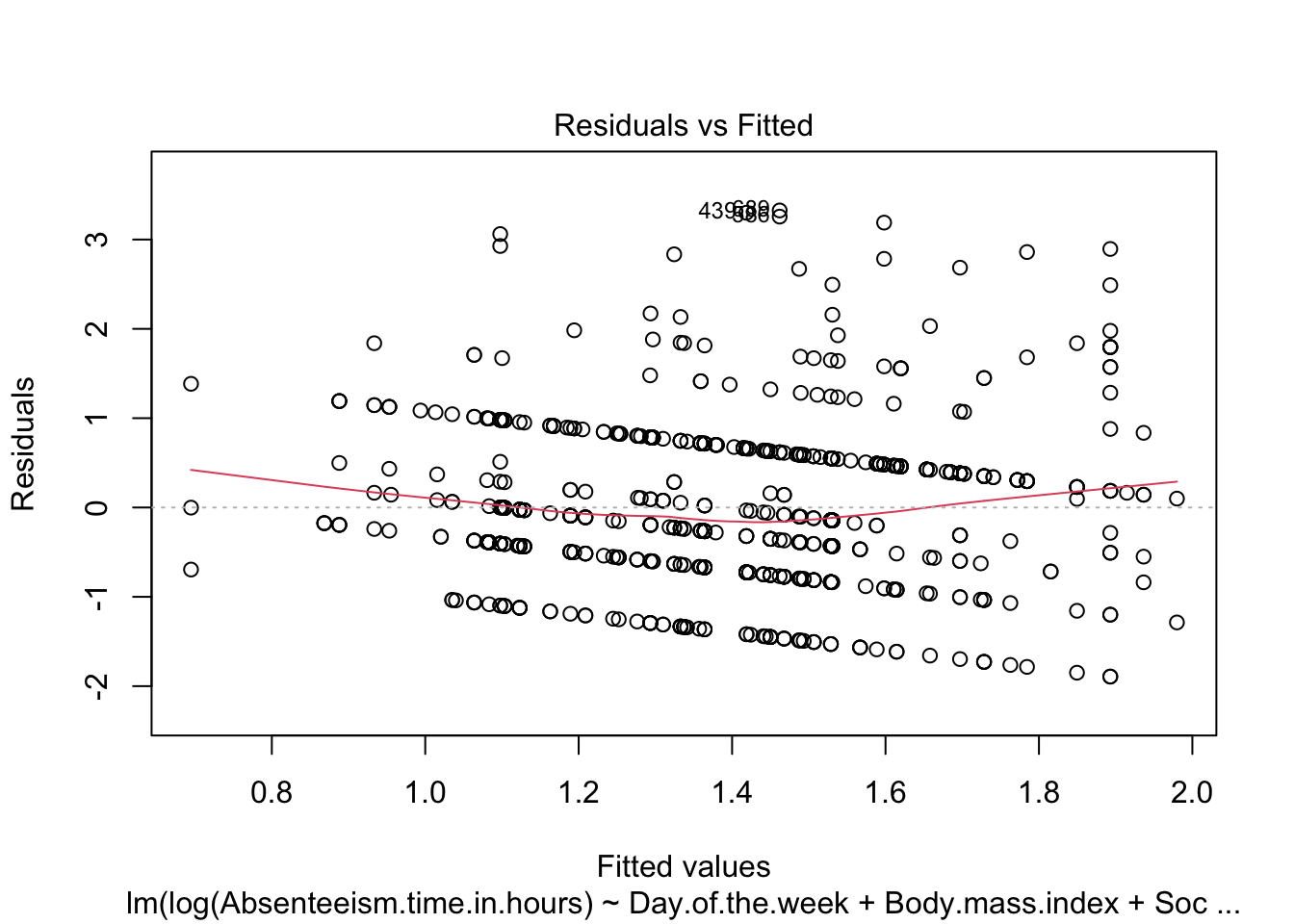
To confirm improvements in model assumptions, such as reduced patterns in residuals and enhanced homogeneity of variance, the diagnostic plot is revisited for the refined model.
The steps described complete a detailed examination and adjustment of the regression model, ensuring its suitability for detecting anomalies in absenteeism data.
12.2.2 Identify Anomalous Residuals
To detect anomalies in the absenteeism data, we first establish a threshold for the residuals from our linear regression model. Anomalies are identified based on the magnitude of the residuals, with larger residuals indicating greater deviations from the predicted model. We set the threshold at twice the standard deviation of the residuals, a common choice for outlier detection which typically captures the most extreme variations.
# Calculate the threshold for defining significant residuals
threshold <- summary(anomaly.lm)$sigma * 2
Next, we visualize these anomalous observations by plotting the residuals against the fitted values. This plot helps in visually identifying data points where the residuals exceed the established threshold. Points with residuals above this threshold are highlighted in red, distinguishing them from typical data points (shown in black).
To identify and visualize anomalous observations effectively, we use the following R code:
# Create a dataframe for plotting the residuals and their corresponding fitted values
plot_data <- data.frame(
  Fitted = anomaly.lm$fitted.values,
  Residuals = anomaly.lm$residuals
)

# Generate the plot of residuals versus fitted values
ggplot(plot_data, aes(x = Fitted, y = Residuals)) +
  geom_hline(yintercept = 0, linetype = "dashed", color = "grey") +
  geom_point(aes(color = Residuals > threshold)) +
  scale_color_manual(values = c("black", "red")) +
  labs(title = "Residual vs. Fitted Plot",
       x = "Fitted Values",
       y = "Residuals",
       color = "Threshold Exceeded") +
  theme_minimal()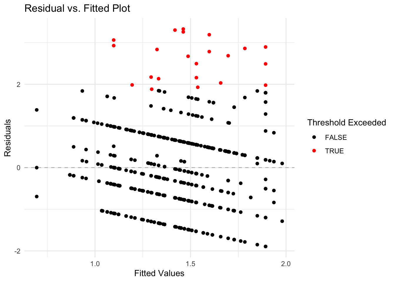
Breaking Down the Code
- Data Frame Creation: A data frame
plot_datais created containing two columns:Fitted(model’s predicted values) andResiduals(differences between observed and predicted values). - Residual Plot: Using
ggplot, the data frame is plotted withFittedvalues on the x-axis andResidualson the y-axis.- Horizontal Line: A horizontal dashed line at zero is added to visually separate positive and negative residuals, aiding in identifying patterns or bias in the residuals.
- Color Coding: Points are colored to distinguish normal residuals (black) from anomalies (red), based on whether residuals exceed the predefined threshold.
- Plot Aesthetics: Titles and labels are added to improve readability and understanding of the plot, and a minimalistic theme is applied for visual clarity.
This visualization is helpful for pinpointing unusual data points that may indicate anomalies, facilitating further investigation into specific cases of absenteeism.
12.2.3 Analysis of Anomalies Identifyed in a Dataset
Once anomalies are identified in a dataset, the next step is to conduct both descriptive and graphical analyses to compare anomalous and non-anomalous observations. This section covers how to perform these analyses using R, a statistical programming language, providing insights into the differences and implications of these observations in your dataset.
Helper Functions for Anomaly Detection
In the context of anomaly detection, two specific R functions, anomaly.boxplot and anomaly.barplot, have been designed to aid in the exploration and analysis of data by visualizing the distribution of numeric and categorical variables respectively against an anomaly indicator. These functions are essential for identifying and understanding patterns or outliers in different data types.
The anomaly.boxplot Function
The anomaly.boxplot function is crucial for analyzing numeric data. It begins by confirming the presence of an anomaly indicator within the dataset. Once validated, it identifies all numeric columns which are then subjected to further visual analysis. For each numeric column, the function generates a box plot, which segments the numeric values according to the categories of the anomaly indicator. This visualization allows for an easy comparison across categories, highlighting potential outliers or anomalies. Each box plot details the median, quartiles, and outliers, providing a clear statistical summary of the data. The plots are arranged in a grid with two columns, simplifying the comparison process and helping quickly spot any irregular patterns that may need deeper investigation.
The anomaly.barplot Function
Conversely, the anomaly.barplot function is tailored for examining categorical data. It also starts by ensuring the anomaly indicator column is present in the dataset. It then identifies all categorical columns, filtering out the anomaly indicator if it is mistakenly categorized as such. For each identified categorical variable, the function computes the proportion of data falling into each category of the anomaly indicator and visualizes this information using bar plots. This setup provides a transparent visualization of how categorical data is distributed across different anomaly classifications, facilitating an easy assessment of how these variables interact with potential anomalies. The individual plots are organized into a two-column grid, enhancing the visual comparison across variables.
These functions represent critical tools in the anomaly detection toolkit, each addressing different aspects of the data and providing comprehensive insights that are pivotal for effective anomaly detection.
Visualize analysis anomalies
To further analyze anomalies in the absenteeism data, we first create a modified version of the original dataset and store it in a new data frame named absenteeism.lm. In this data frame, we add a new column called IsAnomalous. This column categorizes each entry as TRUE if the corresponding residual from the linear regression model (stored in anomaly.lm$residuals) exceeds a predefined threshold, thereby labeling it as an anomaly. Here’s the R code for creating this enhanced data frame:
# Create a new column in the absenteeism data frame to flag anomalies
absenteeism.lm <- absenteeism |>
  mutate(IsAnomalous = anomaly.lm$residuals > threshold)
Next, we visualize the anomalies using box plots and bar plots to compare the distributions of numeric and categorical data, respectively, between anomalous and non-anomalous observations.
# Generate box plots for numeric data categorized by anomaly status
anomaly.boxplot(data = absenteeism.lm, anomaly_indicator = "IsAnomalous")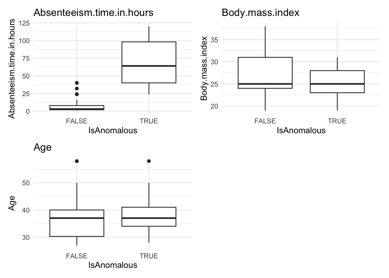
# Generate bar plots for categorical data categorized by anomaly status
anomaly.barplot(data = absenteeism.lm, anomaly_indicator = "IsAnomalous")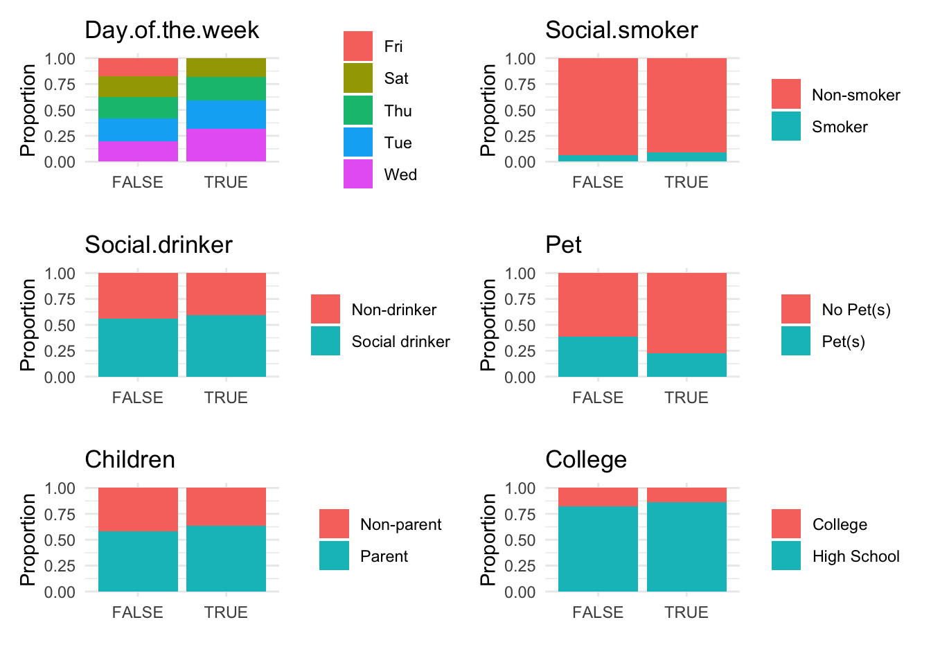
However, upon reviewing these visualizations, we observe that neither the box plots of numeric data nor the bar plots of categorical data show a strong difference between anomalous and non-anomalous observations. This finding suggests that while anomalies are detected, their characteristics might not significantly diverge from the norm based on the analyzed variables.