8.5 Does Absence Length Depend on the Reason?
The histogram in the previous section showed that absence durations are right-skewed — short absences are common, long ones are rare but exist. A natural follow-up: why? Are long absences driven by particular kinds of medical reasons, or are they spread across all reason categories?
The dataset records the reason for each absence as a numeric code from 1 to 28, plus 0 for “no reason given.” Chapter 2 introduced these codes: 1 through 21 are International Classification of Diseases (ICD) chapters covering specific medical categories (infectious diseases, injuries, mental disorders, and so on); 22 through 28 are administrative reasons like medical consultations, dental appointments, and physiotherapy. Plotting all 28 categories side-by-side would be unreadable, so we will collapse them into a smaller number of meaningful groups.
absence_with_reason <- work |>
  filter(`Absenteeism time in hours` > 0,
         `Reason for absence` > 0) |>
  mutate(
    reason_group = case_when(
      `Reason for absence` %in% 1:6   ~ "Serious illness",
      `Reason for absence` %in% 7:14  ~ "Other illness",
      `Reason for absence` %in% 15:17 ~ "Pregnancy / perinatal",
      `Reason for absence` %in% 18:21 ~ "Injury / external",
      `Reason for absence` %in% 22:28 ~ "Routine / administrative",
      TRUE                            ~ "Other"
    ),
    reason_group = factor(reason_group, levels = c(
      "Routine / administrative",
      "Other illness",
      "Serious illness",
      "Injury / external",
      "Pregnancy / perinatal"
    ))
  )
A note on the grouping itself: the buckets above are a judgment call, not a fixed rule. We chose them to capture distinctions a manager would care about (a routine dental appointment is operationally very different from a serious illness or a maternity-related absence) while keeping the number of groups small enough to plot. A different analyst might draw the lines differently — and the chart would change accordingly. That is one of the honest realities of analysis: the way you bucket your data is part of the analysis, not a neutral preprocessing step.
Now the chart. A box plot is the natural choice for “compare the distribution of a continuous variable across categories”: each box shows the median, the interquartile range, and the outliers for one category, side by side.
absence_with_reason |>
  ggplot(aes(x = reason_group, y = `Absenteeism time in hours`)) +
  geom_boxplot(fill = "steelblue", alpha = 0.6, outlier.color = "grey40") +
  scale_y_continuous(trans = "log10") +
  labs(
    title = "Absence duration by reason group",
    x = NULL,
    y = "Hours absent (log scale)"
  ) +
  theme_minimal()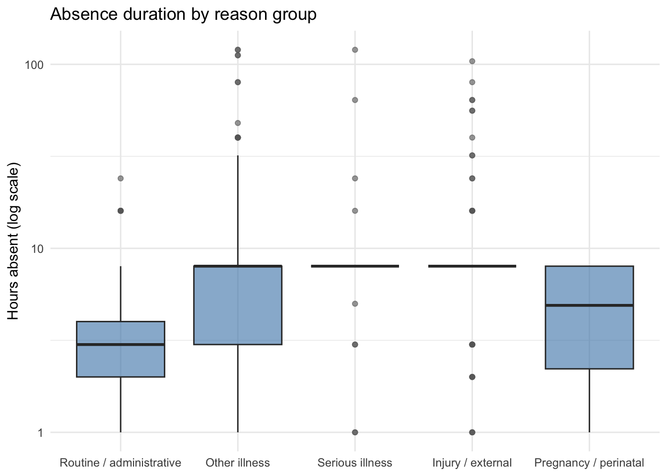
Two design decisions here are worth flagging:
scale_y_continuous(trans = "log10")puts the y-axis on a log scale. Without it, the long tail of multi-hundred-hour absences would compress everything else down to a thin band at the bottom of the chart. A log scale spaces values by order of magnitude instead of by absolute distance, which lets you see the shape of both ends of the distribution at once. The trade-off: log scales need explanation. A general-business audience may not read them correctly, and the y-axis label has to make the scaling explicit.- Order of categories on the x-axis. We set the factor levels deliberately, putting Routine / administrative first and Pregnancy / perinatal last. Box plots are easiest to compare when the categories are arranged in some meaningful order — here, roughly increasing typical duration. Letting
ggplot2use the default alphabetical order would scramble that.
8.5.1 What the chart tells us
The box plot makes the shape of the differences immediately visible:
- Routine and administrative absences are tightly clustered at the low end — exactly what we would expect from dental appointments and physiotherapy sessions.
- Other illness has a much wider spread, with a thick band of outliers above the box. These are the short, common absences from the histogram, plus a fair number of longer ones.
- Serious illness, injury, and pregnancy/perinatal absences each have higher medians and noticeably longer upper tails. Pregnancy/perinatal in particular has a high typical duration — consistent with maternity leave being measured in weeks, not hours.
This is the answer to the question we started with: the long tail in the histogram is not a single phenomenon. Different reason categories produce systematically different durations. A staffing model that treats all absences the same will be wrong on average and very wrong in the tails. We will pick this thread back up when we model absenteeism in Chapter 10.