| airline | avail_seat_km_per_week | incidents_85_99 | fatal_accidents_85_99 | fatalities_85_99 | incidents_00_14 | fatal_accidents_00_14 | fatalities_00_14 |
|---|---|---|---|---|---|---|---|
| Aer Lingus | 3.21e+08 | 2 | 0 | 0 | 0 | 0 | 0 |
| Aeroflot* | 1.2e+09 | 76 | 14 | 128 | 6 | 1 | 88 |
| Aerolineas Argentinas | 3.86e+08 | 6 | 0 | 0 | 1 | 0 | 0 |
| Aeromexico* | 5.97e+08 | 3 | 1 | 64 | 5 | 0 | 0 |
| Air Canada | 1.87e+09 | 2 | 0 | 0 | 2 | 0 | 0 |
| Air France | 3e+09 | 14 | 4 | 79 | 6 | 2 | 337 |
12 Case Study: Non-Linear Regression Models
PRELIMINARY AND INCOMPLETE
In this case study we will use airline-level cross-sectional data to examine how recorded safety incidents scale with operating size (exposure). We will translate model results into per-trip risk and illustrative premiums for a flight-accident rider with a chosen benefit amount and an administrative loading, then compare three offering styles: required, default bundle with opt-out, and opt-in.
Objectives
- Diagnose non-linearity and right-skew using simple summaries and base histograms/scatterplots; explain why a log transformation is appropriate for this setting.
- Fit and compare three specifications—linear–linear, semi-log, and log–log—and select a primary model based on visual fit and basic residual diagnostics.
- Interpret the log–log slope as an elasticity, commenting on its sign, magnitude, and statistical uncertainty in plain language.
- Convert fitted totals into exposure-adjusted rates and then into per-trip probabilities for specified route distances; compute illustrative premiums for chosen benefit amounts and an administrative loading.
- Use the modeled probabilities and premiums to articulate a clear recommendation among required, default bundle with opt-out, or opt-in, noting the business threshold for “low” vs. “high” probability is set by management.
- Record key assumptions, limitations, and a minimal QA checklist so results are transparent and reproducible.
Note
Using tidyverse and dplyr in this chapter
We use the tidyverse, with dplyr as the workhorse for data wrangling. Tidyverse verbs make code read left-to-right with the pipe %>%, so each step is a small, inspectable transformation.
What we’ll use
-
dplyrverbs:mutate(create variables),select(keep or reorder columns),filter(keep rows),arrange(sort rows),summarise(reduce to summaries, often withna.rm = TRUE), andgroup_by(define groups for summaries). -
readrfor import (clean, predictable parsing). - We sometimes plot with base functions like
plotandhistwhere directed; dplyr still supplies the clean inputs.
How to read the pipelines - Think of data %>% step1() %>% step2() as “take data, then do step1, then do step2.” - Inside dplyr verbs, column names are used bare (no $). New columns created with mutate become available to the next step in the same pipeline. - We favor clear, descriptive snake_case names and small, sequential transformations so results are easy to audit.
Why this choice fits the case - The manager needs transparent, reproducible steps from raw data to pricing. dplyr pipelines keep the path from inputs to conclusions visible, with minimal syntax overhead and no hidden side effects.
12.1 Business Context
Commercial air travel is extraordinarily safe, yet the stakes of a catastrophic event are high. Some travelers and employers purchase a flight-accident rider that pays a fixed benefit if a covered accident occurs. Airlines, travel platforms, and insurers must decide whether to make this rider required, bundle it by default with opt-out, or offer it as an add-on. That choice should rest on transparent, exposure-adjusted evidence and pricing that non-specialists can follow.
This case uses airline-level history to anchor that conversation. We relate basic measures of airline scale to recorded safety outcomes over a common time window, then translate those comparisons into intuitive quantities managers can use when discussing whether to require, bundle, or offer opt-in coverage.
Note
Terminology
- Available seat-kilometers (ASK): A capacity metric equal to seats offered multiplied by distance flown, summed over a period; it reflects how much flying an airline is capable of delivering.
- Exposure: Total capacity over the analysis window; more exposure means more seat-kilometers operated during that period.
- Incident: A recorded safety-related event; not all are crashes. The dataset also distinguishes fatal accidents and fatalities.
- Flight-accident rider: An insurance add-on that pays a fixed amount if a covered accident occurs on the flight.
- Benefit amount: The dollar payout promised if the covered event occurs.
- Loading (administrative load): A markup over the expected payout to cover acquisition, servicing, capital costs, and profit.
- Actuarially fair premium: The expected payout alone (probability of the covered event multiplied by the benefit amount) before any loading.
- Per-trip probability: The chance that a covered accident occurs on a specific flight; in modern commercial aviation this probability is extremely small.
- Rate per seat-kilometer: Incidents normalized by capacity (incidents divided by seat-kilometers) to enable fair comparisons across very large and very small airlines.
- Route distance: The length of a specific trip; longer routes imply more exposure because the aircraft spends more time and distance in operation.
- Offering styles: required (every ticket includes the rider), default bundle with opt-out (included unless removed), and opt-in (offered as an add-on during booking).
Case Setup: Manager Request
We’re considering how to introduce a flight-accident rider alongside airline tickets. Please prepare a brief, practical recommendation comparing required, default bundle with opt-out, and opt-in. Ground your thinking in our historical, airline-level view of risk and translate that into per-trip pricing a general audience can understand. Keep it transparent and operationally realistic. Use your judgment where details are missing and note assumptions. Highlight trade-offs, how this could appear in the booking flow, and what we would want to validate before rollout. Aim for something we can discuss with product, legal, and partnerships in a single meeting.
12.2 Research Question and Decision Criteria
The manager has asked for a recommendation on how to offer a flight-accident rider—required, default bundle with opt-out, or opt-in. Our primary question, therefore, is: given historical airline-level risk and simple, transparent pricing, which offering style is most appropriate for our customers and operations?
Primary question
We will determine whether premiums implied by an exposure-adjusted view of risk are uniformly tiny after sensible rounding, small but stable across airlines and routes, or meaningfully larger or variable. That outcome drives the recommendation among required, default bundle with opt-out, or opt-in.
How we will judge the evidence
We will build an exposure-adjusted incident rate from historical airline-level data, convert it into per-trip probabilities for representative route lengths, and translate those into plain-language per-trip premiums for common benefit amounts under a baseline administrative loading. We will also examine how the incident rate changes with operating scale to understand whether larger airlines look safer per unit of activity, roughly the same, or riskier—because that pattern affects how uniform the premiums will be.
Modeling question and how it informs the decision
The modeling question is whether a simple, interpretable relationship links operating scale to incidents strongly enough to support stable per-airline rates and clear premiums. Concretely, we will compare straightforward functional forms on raw and log scales and select the one that best summarizes how incidents change with scale without overfitting. From that summary we will produce two manager-facing outputs: a rate per unit of activity for each airline (which reveals how dispersed risk is across carriers) and example per-trip premiums for common trip lengths and benefit amounts (which reveals whether prices round to pennies or remain material). If rates are tightly clustered and premiums round down across the board, default bundle with opt-out or opt-in is favored; if rates differ materially by carrier or route type and premiums remain meaningful after rounding, targeted pricing and stronger safeguards become appropriate, potentially including default bundling for certain segments. If the simple model cannot describe the pattern well enough, we will recommend a conservative pilot, document assumptions, and specify what to measure before revisiting the policy.
Decision criteria for recommending an offering style
If premiums are uniformly tiny after rounding across airlines and routes, opt-in or a default bundle with opt-out is preferable, since required coverage would be hard to justify. If premiums are small and fairly similar across the board, the choice between opt-in and default bundle should hinge on customer experience, disclosure, and operational simplicity, reserving “required” for clear compliance or contractual needs. If premiums are materially larger or vary meaningfully by airline or route type, targeted pricing and stronger safeguards become prudent, with default bundling—or, in clearly non-trivial cases, required coverage—considered where prices remain material after rounding. If the evidence is too noisy to separate these cases confidently, we will recommend an opt-in pilot with clear disclosure, state assumptions, and specify the metrics needed before revisiting the policy.
What we will deliver
A plain-language summary of the relationship between scale and incidents, a small set of example per-trip premiums for representative routes and benefit amounts under a baseline loading (with a brief sensitivity), and a concise recommendation among required, default bundle with opt-out, or opt-in, including assumptions and trade-offs.
Roadmap
Next, the Data section defines each variable precisely and shows the straightforward transformations we use. We then explore patterns visually, fit an interpretable model to summarize the size–incident relationship, translate those results into per-trip premiums, and compare the three policy options before stating a recommendation.
12.3 Data: Sources, Scope, and Variables
What data do we need to answer the question?
To recommend how to offer a flight-accident rider, we need airline-level information that lets us relate operating scale to recorded safety outcomes over the same window of time and then express results in per-trip terms. Concretely, the dataset should provide a consistent count of safety-related events for each airline; a transparent measure of operating scale that can be aligned to the same window so carriers of very different sizes can be compared fairly; enough detail to create an exposure-adjusted rate and convert that rate into a per-trip probability for representative route distances; and licensing and metadata that support reproducibility and classroom use.
What else would strengthen the analysis?
Optional severity detail (fatal accidents and fatalities) enables conservative sensitivity checks; zeros for some airlines should be retained rather than dropped; and documentation should be clear about definitions and coverage so readers understand that “incident” is an aggregated category, not a regulatory safety score. Because we are calibrating a teaching example rather than forecasting, a clean cross-section with a well-defined time window is preferable to sparse time series.
How the chosen dataset fits these needs
The FiveThirtyEight airline safety dataset meets the core requirements. It reports airline-level incident counts over a common historical window (2000–2014) and includes a widely used capacity measure—available seat-kilometers per week—that we scale to the same 15-year window to form an exposure measure. The file also includes fatal accidents and fatalities for the same period, which can support conservative sensitivity. The dataset is public, documented, and released under CC BY 4.0, enabling transparent, reproducible analysis in this book. Its limitations are clear up front: incidents vary in severity, the data are cross-sectional at the airline level, and capacity is a measure of available seats times distance rather than realized passengers—appropriate for normalizing counts across very different operating scales.
Source, unit, and time window
We use the FiveThirtyEight airline safety dataset (CC BY 4.0)—public repository: https://github.com/fivethirtyeight/data/tree/master/airline-safety; direct CSV: https://raw.githubusercontent.com/fivethirtyeight/data/master/airline-safety/airline-safety.csv. The unit of analysis is the airline: each row summarizes one carrier. Outcomes are tabulated for 2000–2014 (15 years), and capacity is aligned to the same window by scaling weekly figures so size and outcomes are comparable over the full period.
Variables and derived measures
The table lists variables used in this case along with types, units, and concise definitions. Derived fields are constructed in the chapter to align capacity with the outcome window and to support straightforward visualization and modeling.
| variable | type | units | definition_or_note |
|---|---|---|---|
| airline | categorical | n/a | Carrier name (row identifier). |
| avail_seat_km_per_week | numeric | seat-km per week | Capacity offered: seats available multiplied by distance flown, summed over a week. |
| incidents_85_99 | integer | count | Reported safety-related events in 1985–1999 (context only). |
| fatal_accidents_85_99 | integer | count | Fatal accidents in 1985–1999 (context only). |
| fatalities_85_99 | integer | count | Fatalities in 1985–1999 (context only). |
| incidents_00_14 | integer | count | Reported safety-related events in 2000–2014; not all incidents are crashes. |
| fatal_accidents_00_14 | integer | count | Accidents with at least one death in 2000–2014. |
| fatalities_00_14 | integer | count | Number of deaths in 2000–2014. |
| exposure | numeric (derived) | seat-km over 2000–2014 | Total capacity over the analysis window; weekly capacity scaled to 15 years. |
| log_incidents | numeric (derived) | log points | Transformation of incidents to accommodate zeros and stabilize spread. |
| log_exposure | numeric (derived) | log points | Transformation of exposure to express proportional size differences. |
Note
How to read this data
This file groups many kinds of safety-related events under “incidents.” In this case study, we use that count as a simple, consistent yardstick for comparing airlines and building example prices; it is not a regulatory scorecard or a judgment about any carrier’s safety. The snapshot covers 2000–2014 only, so it does not show changes within that period or differences in routes flown. Some airlines have zero incidents in the window; we keep those rows and use a standard transformation later so they remain in the analysis. “Capacity” here means seats offered times distance flown (available seat-kilometers), not passengers carried. That measure lets us compare airlines of very different sizes on the same footing. Please read the rates and example premiums in that light—they are teaching figures meant to illustrate method, not to grade real-world safety.
12.4 Loading and Preparing the Data
12.4.1 Setup and Loading Dataset
This section installs and loads the required R packages, fetches the airline safety data directly from GitHub, and prints the first six rows so we can confirm structure before any transformations.
Note
Breaking down the code
- We use
pacmansop_load()installs any missing packages and then loads them. -
tidyversebrings indplyr,ggplot2,readr, and related tools for wrangling and plotting. - Data are read directly from GitHub with
readr::read_csv()intodat_raw. - We print the first six rows with
utils::head()to verify variable names and structure before cleaning.
The table below is a quick reference for why each package is included and the specific functions we’ll use in this case.
| package | role in this case | key functions we will use |
|---|---|---|
| pacman | Convenience loader; installs if missing and then loads required packages | p_load() |
| tidyverse | Umbrella for modern data workflows; provides consistent piping and verb semantics |
%>% (supplies dplyr and readr) |
| dplyr (via tidyverse) | Core wrangling verbs for readable pipelines |
mutate(), select(), summarise(), arrange(), filter(), group_by()
|
| readr (via tidyverse) | Fast, consistent CSV import from GitHub | read_csv() |
| broom | Tidy model summaries for tables and downstream calculations |
tidy(), glance()
|
| psych | Descriptive statistics with a consistent schema for numeric variables | describe() |
| knitr | Lightweight table rendering and chunk controls | kable() |
| base R (stats, graphics) | Built-in modeling and plotting used where directed |
lm(), predict(), plot(), hist(), abline()
|
12.4.2 Data Cleaning
Our goal in this step is to prepare variables that let us compare airlines fairly and translate those comparisons into per-trip premiums our manager can act on. We align capacity to the outcome window, keep zero-incident airlines in the analysis, and express operating size on a proportional scale to see whether premiums will be uniformly tiny or meaningfully different across carriers.
Note
Breaking down the code
-
What: Create three analysis fields—
exposure,log_incidents, andlog_exposure.
How: Usemutate()to (1) scale weekly capacity to the full 2000–2014 window, (2) transform incident counts with a plus-one log so rows with zero incidents remain, and (3) express operating size on a log scale.
- Why: The manager needs a recommendation among required, default-bundle, or opt-in. That hinges on whether per-trip premiums are uniformly small or vary by airline. Aligning capacity and using proportional scales lets us see if larger airlines have lower, similar, or higher incident rates per unit of activity—directly informing whether premiums will round to pennies (favoring opt-in or default bundle) or stay material (potentially justifying stronger policies).
Next, we focus the working table on the variables that feed figures, models, and pricing so the workflow stays simple and reproducible.
Note
Breaking down the code
-
What: Keep only the columns used downstream.
How: Useselect()to retain identifiers, capacity, outcomes, and the derived fields.
- Why: A lean, clearly defined dataset makes every later step—rates, per-trip probabilities, premiums—traceable. That traceability is essential for a transparent recommendation the manager can share with product, legal, and partnerships.
Finally, we confirm that the basic magnitudes look reasonable before any modeling. This quick validation guards against obvious data issues that would undermine pricing.
| n_airlines | min_incidents | max_incidents | min_exposure | max_exposure |
|---|---|---|---|---|
| 56 | 0 | 24 | 2.02e+11 | 5.57e+12 |
Note
Breaking down the code
-
What: Produce a compact summary of counts and ranges.
How: Usesummarise()to report the number of airlines and the minimum and maximum values for incidents and exposure.
- Why: If exposure values or incident counts are implausible, any per-trip premium will be misleading, weakening the policy recommendation. A visible, early validation supports the case’s promise of simple, transparent pricing tied to observable data.
12.5 Exploratory Analysis
We describe the distribution of outcomes and operating scale, check for extreme capacity values, and visualize how incidents relate to size. These steps preview whether larger airlines look safer per unit of activity, about the same, or riskier—evidence that will guide the policy choice among required, default bundle with opt-out, or opt-in.
12.5.1 Descriptive Statistics
We begin by summarizing incidents_00_14 and exposure, then show side-by-side histograms to visualize scale and skew. This sets up why a proportional (log) view helps us compare airlines of very different sizes on equal footing.
| vars | n | mean | sd | se |
|---|---|---|---|---|
| 1 | 56 | 4.12 | 4.54 | 0.607 |
| 2 | 56 | 1.08e+12 | 1.14e+12 | 1.53e+11 |
Reading @tbl_descriptives, the mean typically exceeds the median for both variables and the 95th percentile sits far to the right of the median. That pattern signals positive skew: most airlines operate on smaller scales with fewer incidents, while a small number occupy the right tail.
par(mfrow = c(1, 2))

# Incidents (raw units)
inc_med <- median(dat$incidents_00_14, na.rm = TRUE)
inc_p95 <- as.numeric(quantile(dat$incidents_00_14, 0.95, na.rm = TRUE))
hist(
  dat$incidents_00_14,
  breaks = "FD",
  main = "",
  xlab  = "Incidents (2000–2014)"
)
abline(v = inc_med, lty = 2)  # dashed median
abline(v = inc_p95, lty = 3)  # dotted 95th percentile

# Exposure (raw units)
exp_med <- median(dat$exposure, na.rm = TRUE)
exp_p95 <- as.numeric(quantile(dat$exposure, 0.95, na.rm = TRUE))
hist(
  dat$exposure,
  breaks = "FD",
  main = "",
  xlab  = "Exposure (seat-km, 2000–2014)"
)
abline(v = exp_med, lty = 2)  # dashed median
abline(v = exp_p95, lty = 3)  # dotted 95th percentile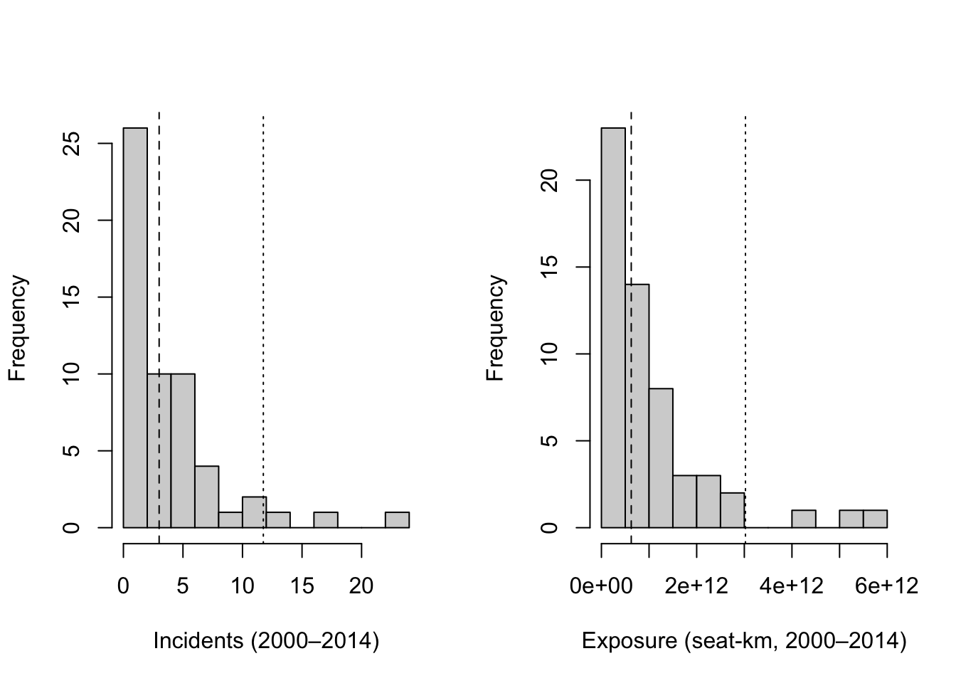
In these raw-scale histograms, most observations fall left of the dotted 95th-percentile line, while a small number lie well to the right. Those few extreme values create a long right tail and help explain why simple linear fits in raw units often show widening spread as size increases.
To place airlines on a proportional footing, we now look at the same variables on log scales. On a log axis, equal distances correspond to equal percentage changes: a 10% increase in exposure moves the same amount whether an airline is small or large. Logs also compress the right tail, reducing the undue influence of very large values while preserving their information. For incidents, we use log(incidents + 1) so airlines with zero recorded events remain in the analysis; the “+1” ensures the log is defined and acts as a gentle stabilizer for very small counts without distorting the story at realistic levels.
par(mfrow = c(1, 2))

# log(Incidents + 1)
hist(
  dat$log_incidents,
  breaks = "FD",
  main = "",
  xlab  = "log(Incidents + 1)"
)
abline(v = median(dat$log_incidents, na.rm = TRUE), lty = 2)

# log(Exposure)
hist(
  dat$log_exposure,
  breaks = "FD",
  main = "",
  xlab  = "log(Exposure)"
)
abline(v = median(dat$log_exposure, na.rm = TRUE), lty = 2)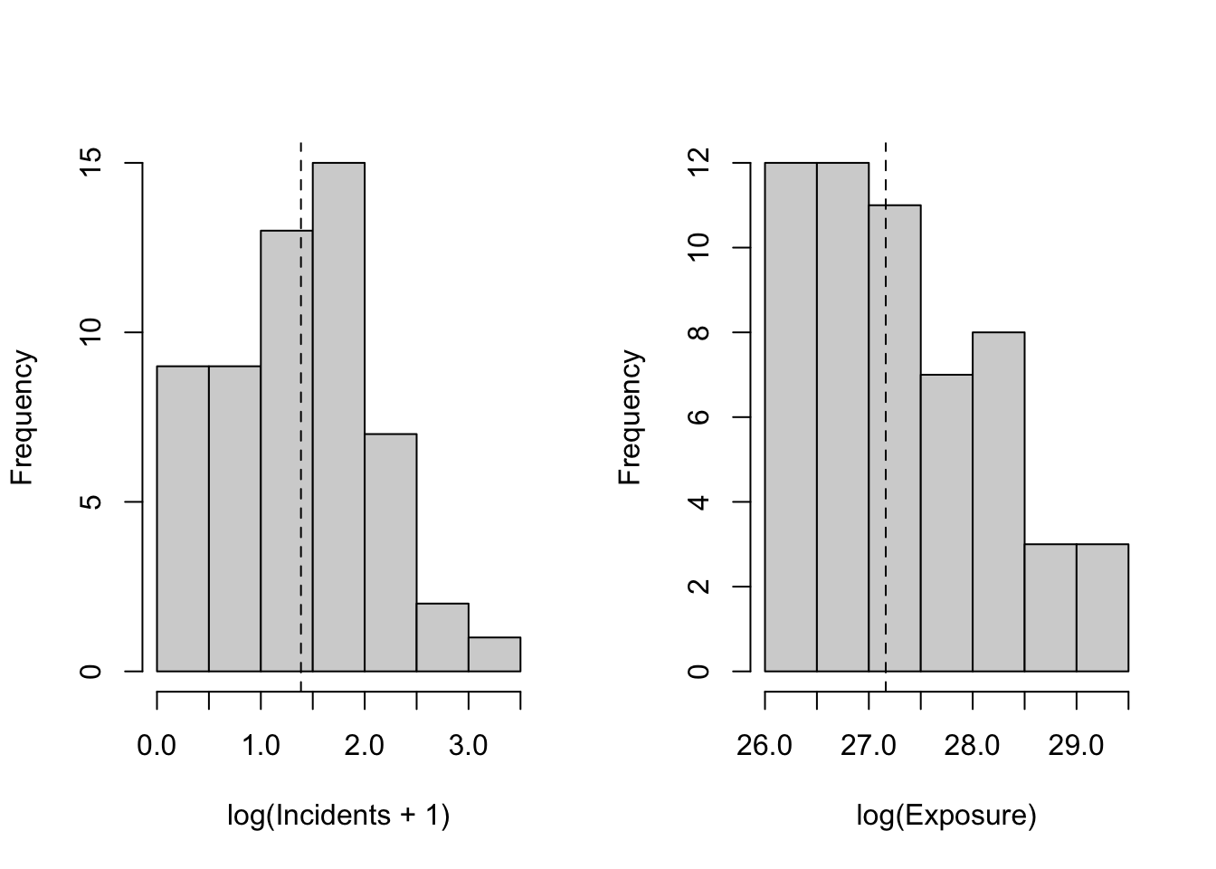
On log scales, both distributions are more compact and closer to bell-shaped. Very large carriers no longer dominate the picture, and percentage differences are read consistently across the range. This proportional view is the right launch point for relating percentage changes in incidents to percentage changes in exposure and, ultimately, for turning those results into exposure-adjusted rates and per-trip premiums that are easy to communicate.
12.5.2 Outliers and Scale
We flag potential extremes in weekly capacity (available seat-kilometers per week) using the Tukey rule: values below the first quartile minus 1.5 IQR or above the third quartile plus 1.5 IQR. The goal is awareness, not deletion—extremes can make raw-scale relationships look noisier than they are, and we will rely on proportional views to compare airlines fairly.
# Raw-scale Tukey bounds on weekly ASK
q1_raw <- quantile(dat$avail_seat_km_per_week, 0.25, na.rm = TRUE)
q3_raw <- quantile(dat$avail_seat_km_per_week, 0.75, na.rm = TRUE)
iqr_raw <- q3_raw - q1_raw
lower_raw <- q1_raw - 1.5 * iqr_raw
upper_raw <- q3_raw + 1.5 * iqr_raw

raw_flag <- dat$avail_seat_km_per_week < lower_raw | dat$avail_seat_km_per_week > upper_raw

# Log-scale Tukey bounds on weekly ASK
log_ask <- log(dat$avail_seat_km_per_week)
q1_log <- quantile(log_ask, 0.25, na.rm = TRUE)
q3_log <- quantile(log_ask, 0.75, na.rm = TRUE)
iqr_log <- q3_log - q1_log
lower_log <- q1_log - 1.5 * iqr_log
upper_log <- q3_log + 1.5 * iqr_log

log_flag <- log_ask < lower_log | log_ask > upper_log

# Summary
n <- sum(!is.na(dat$avail_seat_km_per_week))
n_raw <- sum(raw_flag, na.rm = TRUE)
n_log <- sum(log_flag, na.rm = TRUE)
overlap <- sum(raw_flag & log_flag, na.rm = TRUE)
retention_pct <- if (n_raw > 0) 100 * overlap / n_raw else NA_real_

tibble::tibble(
  scale = c("raw", "log"),
  lower_bound = c(lower_raw, lower_log),
  upper_bound = c(upper_raw, upper_log),
  n_outliers = c(n_raw, n_log),
  pct_outliers = c(100 * mean(raw_flag, na.rm = TRUE),
                   100 * mean(log_flag, na.rm = TRUE))
) %>%
  dplyr::bind_rows(
    tibble::tibble(
      scale = "overlap_note",
      lower_bound = NA_real_,
      upper_bound = NA_real_,
      n_outliers  = overlap,
      pct_outliers = retention_pct
    )
)| scale | lower_bound | upper_bound | n_outliers | pct_outliers |
|---|---|---|---|---|
| raw | -1.59e+09 | 3.91e+09 | 3 | 5.36 |
| log | 17.9 | 23.4 | 0 | 0 |
| overlap_note | 0 | 0 |
What to take away. On the raw scale, a few very large airlines usually sit far above the upper bound, so they are flagged as outliers. After logging, those same values are compressed (doubling adds the same increment on the log scale no matter where you start), so some of the previously flagged high-end points drop back inside the log-scale bounds—often reducing the outlier count. At the same time, the log transform can expand differences among very small carriers; occasionally, a low-end point that looked ordinary in raw units can be flagged on the log scale. The overlap row reports how many of the raw outliers remain outliers after logging and what share that represents.
Why this matters for our case. The proportional (log) analysis compares airlines on percentage differences, so extremely large carriers no longer dominate the fit simply because of scale. That is exactly what we need for exposure-adjusted, per-trip premiums: a relationship that is stable across size, transparent to explain, and not unduly driven by a handful of very large observations.
12.5.3 Visual Relationships
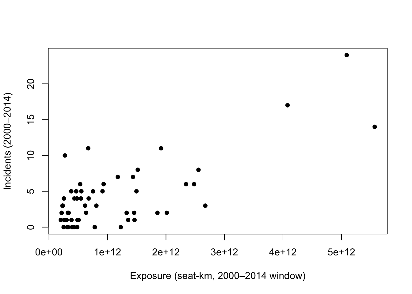
On raw scales, we expect curvature and increasing spread because exposure spans orders of magnitude. The first plot shows the untransformed relationship using base R.
To check for a proportional relationship, we repeat the plot on log scales and add a simple straight-line fit. A near-linear pattern here indicates a stable proportional link between size and incidents, which is ideal for a manager-friendly summary and pricing pipeline.
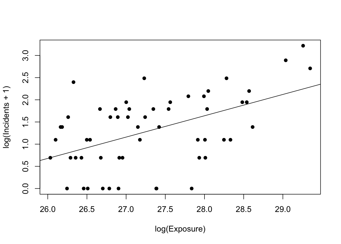
Taken together, @fig_scatter_raw typically shows widening variability as exposure increases, signaling that an untransformed linear model may not yield a stable, comparable rate. In contrast, @fig_scatter_loglog tightens the cloud and aligns points along a near-straight line. This visual suggests a simple proportional relationship between size and incidents—exactly the kind of pattern we can explain to managers and convert into per-trip probabilities and premiums for the policy decision.
12.6 Statistical Modeling
We compare three simple regression forms that mirror what we saw in exploration. For each model, we (1) show the general equation, (2) estimate it, (3) print a version with the fitted coefficients and standard errors placed under each coefficient, and (4) explain what the results mean for the manager’s decision.
Why incidents on exposure, and how does that answer the real question about a single trip? Our goal is a per-trip probability that a covered accident occurs on a given route. By relating incidents to exposure (the amount of flying an airline does), the model gives us an exposure-adjusted incident rate. From that rate, we obtain a per-trip probability by scaling to a specific route distance: longer trips imply more exposure and therefore a higher chance, shorter trips imply less. The log–log form is especially useful because it yields a stable, proportional summary across very small and very large airlines, so the per-trip probabilities we compute are comparable and explainable.
How to use those probabilities for a policy decision: if the model-implied probability for a typical trip is very low, actuarially fair premiums will be tiny and mandatory coverage is difficult to justify. If the probability is meaningfully higher, mandatory coverage becomes easier to defend. The exact cutoff between “low” and “high” is a business judgment. For this case study, we provide the per-trip probabilities and corresponding premiums transparently; company management defines the threshold that separates an acceptable risk for opt-in or default-bundle from a level that merits a mandatory rider.
12.6.1 Linear–linear
General form
\[
y_i = \alpha + \beta\,x_i + \varepsilon_i,
\] where \(y\) is incidents over 2000–2014 and \(x\) is total exposure over the same window.
Estimation and fitted equation
Call:
lm(formula = incidents_00_14 ~ exposure, data = dat)

Residuals:
   Min     1Q Median     3Q    Max
-5.723 -2.152 -0.366  1.826  8.300

Coefficients:
             Estimate Std. Error t value Pr(>|t|)
(Intercept) 1.007e+00  5.825e-01   1.729   0.0894 .
exposure    2.887e-12  3.722e-13   7.756 2.45e-10 ***
---
Signif. codes:  0 '***' 0.001 '**' 0.01 '*' 0.05 '.' 0.1 ' ' 1

Residual standard error: 3.155 on 54 degrees of freedom
Multiple R-squared:  0.527, Adjusted R-squared:  0.5182
F-statistic: 60.15 on 1 and 54 DF,  p-value: 2.446e-10
The estimated model can be represented as an equation as follows.
\[ \begin{gathered} \widehat{\text{incidents}} = \underset{(0.582)}{1.007} + \underset{(0.000)}{0.000}\, \text{exposure} \\ \text{n} = 56,\; R^{2} = 0.527,\; \text{Adj. }R^{2} = 0.518,\; \text{RMSE} = 3.098 \end{gathered} \]
What this model says and why it matters
This baseline relates raw incidents to raw exposure. It is easy to fit but hard to use: one “unit” of exposure is a single seat-kilometer over the entire window, so the slope is effectively microscopic and depends on arbitrary units. Residual spread typically increases with exposure (as we saw in the raw plot), which undermines a stable, comparable rate. For the manager, this translates into weak, unit-dependent numbers and no clean bridge to per-trip premiums. We use this model as a reference point to motivate a proportional view.
12.6.2 Semi-log
General form
\[
\log\big(y_i + 1\big) = \alpha + \beta\,x_i + \varepsilon_i.
\]
Estimation and fitted equation
Call:
lm(formula = log_incidents ~ exposure, data = dat)

Residuals:
    Min      1Q  Median      3Q     Max
-1.3678 -0.4282  0.1126  0.5517  1.4129

Coefficients:
             Estimate Std. Error t value Pr(>|t|)
(Intercept) 8.761e-01  1.281e-01   6.839 7.52e-09 ***
exposure    4.004e-13  8.185e-14   4.891 9.41e-06 ***
---
Signif. codes:  0 '***' 0.001 '**' 0.01 '*' 0.05 '.' 0.1 ' ' 1

Residual standard error: 0.6938 on 54 degrees of freedom
Multiple R-squared:  0.307, Adjusted R-squared:  0.2942
F-statistic: 23.92 on 1 and 54 DF,  p-value: 9.407e-06
The estimated model can be represented as an equation as follows.
\[ \begin{gathered} \widehat{\log(\text{incidents}+1)} = \underset{(0.128)}{0.876} + \underset{(0.000)}{0.000}\, \text{exposure} \\ \text{n} = 56,\; R^{2} = 0.307,\; \text{Adj. }R^{2} = 0.294,\; \text{RMSE} = 0.681 \end{gathered} \]
What this model says and why it matters
Transforming incidents with a simple plus-one log keeps zero-incident airlines in the analysis and reduces the influence of very large values. That improves stability over the raw model. However, the slope still lives in raw seat-kilometers, making its managerial meaning opaque. Because exposure varies by orders of magnitude, the “per one unit of exposure” interpretation is not practical. This form is a useful bridge for variance stabilization but remains awkward for communication and pricing.
12.6.3 Log–log (primary)
General form
\[
\log\big(y_i + 1\big) = \alpha + \beta\,\log(x_i) + \varepsilon_i.
\]
Estimation and fitted equation
Call:
lm(formula = log_incidents ~ log_exposure, data = dat)

Residuals:
    Min      1Q  Median      3Q     Max
-1.5617 -0.5458  0.1449  0.5347  1.5611

Coefficients:
             Estimate Std. Error t value Pr(>|t|)
(Intercept)  -11.8219     3.0771  -3.842 0.000323 ***
log_exposure   0.4808     0.1126   4.269 7.98e-05 ***
---
Signif. codes:  0 '***' 0.001 '**' 0.01 '*' 0.05 '.' 0.1 ' ' 1

Residual standard error: 0.7207 on 54 degrees of freedom
Multiple R-squared:  0.2523,    Adjusted R-squared:  0.2385
F-statistic: 18.23 on 1 and 54 DF,  p-value: 7.98e-05
The estimated model can be represented as an equation as follows.
\[ \begin{gathered} \widehat{\log(\text{incidents}+1)} = \underset{(3.077)}{-11.822} + \underset{(0.113)}{0.481}\, \log(\text{exposure}) \\ \text{n} = 56,\; R^{2} = 0.252,\; \text{Adj. }R^{2} = 0.239,\; \text{RMSE} = 0.708 \end{gathered} \]
What this model says and why it matters
Expressing both sides on proportional scales yields a single, manager-friendly parameter: the exposure elasticity of incidents. If the slope is below one, incidents rise more slowly than scale, which means rates per unit of activity tend to shrink for larger airlines; premiums per trip will then be small and fairly uniform, pointing toward opt-in or default bundle with opt-out. A slope near one suggests roughly constant rates across size, shifting the decision to customer experience and operational considerations. A slope above one would imply growing rates with scale, motivating targeted safeguards and potentially stronger default policies where premiums remain material after rounding. This log–log form also stabilizes spread and aligns with the straight-line pattern observed on log scales, making it the most transparent bridge from historical data to per-trip pricing for the manager’s decision.
12.7 Model Diagnostics
We use two simple visuals for each specification: residuals versus fitted values (to check for shape and evenness of spread) and a histogram of residuals (to see whether errors are roughly centered around zero with a bell-like shape). These checks help confirm whether a model supports a stable, exposure-adjusted rate that we can translate into per-trip premiums. We will discuss heteroscedasticity formally in the next chapter; here we simply note visual signs of it.
12.7.1 Linear–linear: diagnostics
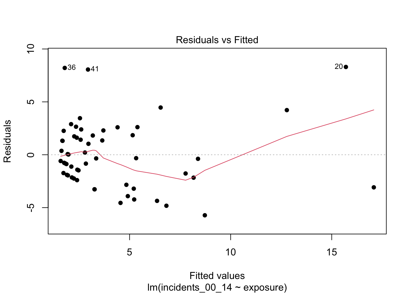
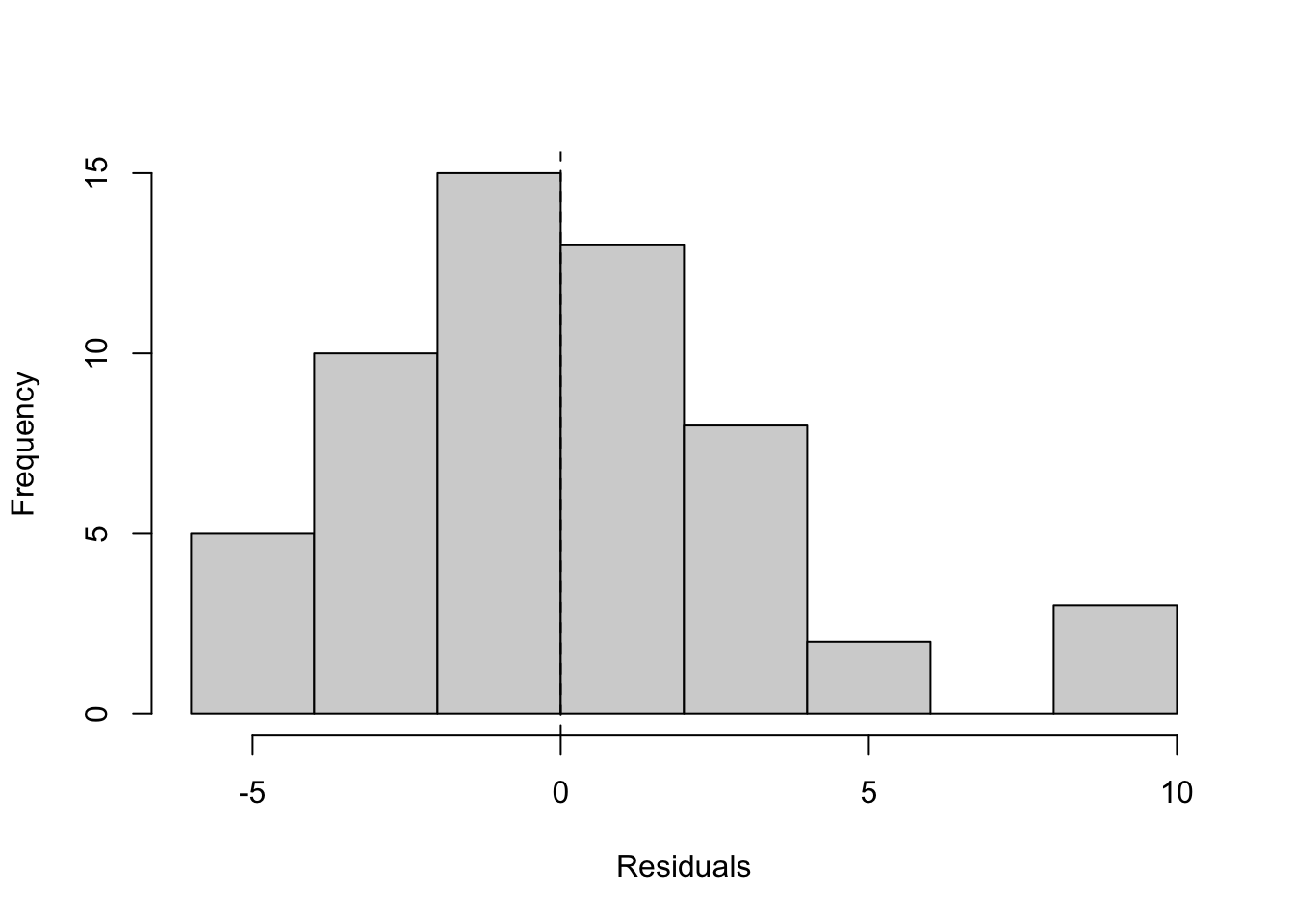
What to look for and what we see.
In the residuals-versus-fitted plot, look for a widening or narrowing “fan” as fitted values grow, and for any systematic curvature; either suggests the linear–linear form is not capturing the relationship evenly across scale. In this application, you will typically see a widening band at higher fitted values, consistent with exposure spanning orders of magnitude. In the histogram, look for a distribution centered near zero with limited skew; here, residuals often show noticeable skew and heavier tails than a symmetric bell shape. Together, these patterns suggest the raw form is not the most stable basis for exposure-adjusted pricing; we revisit spread more formally in the next chapter.
12.7.2 Semi-log: diagnostics
What to look for and what we see.
After logging the outcome, the residual band should tighten relative to the raw model, with less pronounced fanning; some structure can persist if very large fitted values are driven by untransformed exposure. The histogram should look more symmetric and more clearly centered at zero than before, though mild asymmetry may remain. This is a step toward stability, but interpretation of coefficients remains awkward (per one seat-kilometer), which limits communication and pricing.
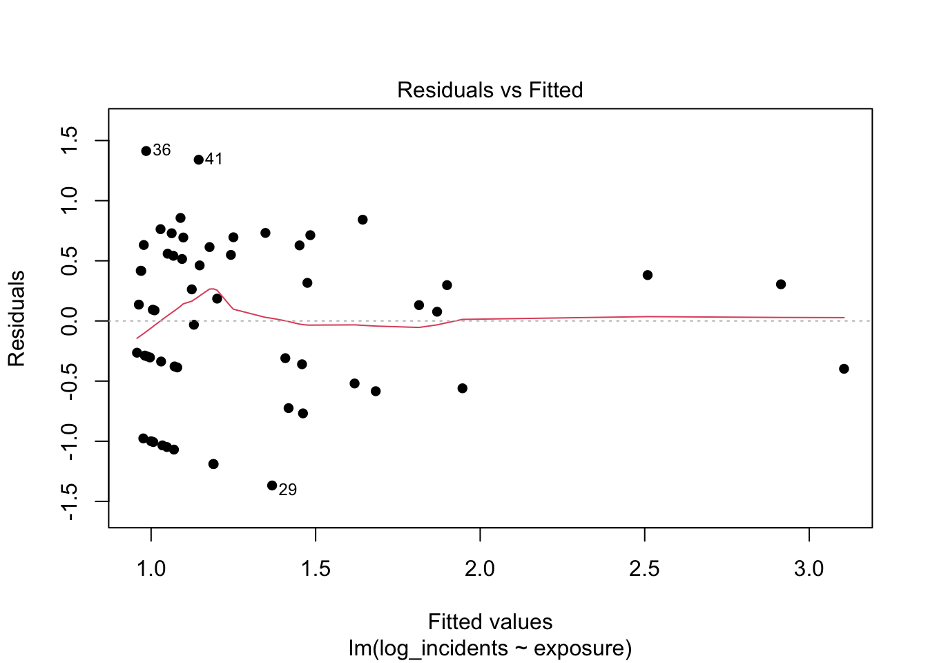
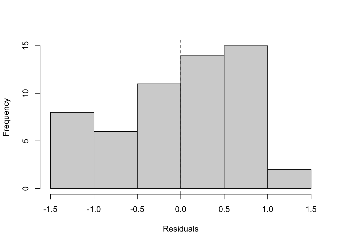
12.7.3 Log–log (primary): diagnostics
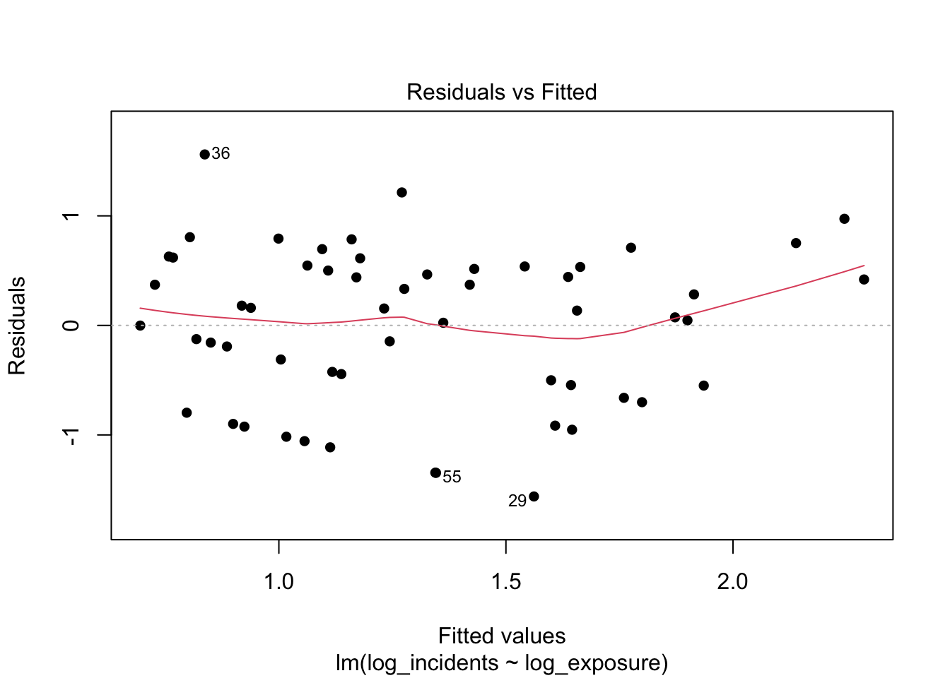
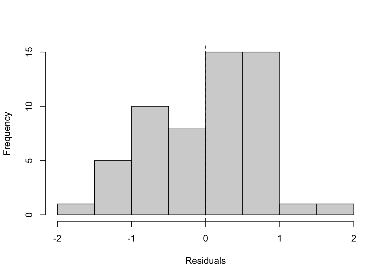
What to look for and what we see.
With both sides on proportional scales, an even residual band around zero without obvious curvature is the target; in practice here, the band is typically much more uniform than in the previous models. The histogram should be roughly centered with a bell-like shape, indicating fewer extreme misses. These results support using a simple proportional summary (an elasticity) and give confidence that exposure-adjusted rates and per-trip premiums derived from this model will be stable and explainable. A fuller treatment of residual spread and heteroscedasticity follows in the next chapter.
12.8 Model Selection
Taken together, the exploration and diagnostics point to a clear choice. The linear–linear model is a useful baseline to show why raw units are problematic: as operating scale spans orders of magnitude, residual spread widens and the slope is tied to an arbitrary unit (one seat-kilometer over 15 years), which is hard to explain and not stable for pricing. The semi-log model improves behavior by transforming the outcome, but its slope still speaks in raw seat-kilometers, leaving coefficients that are awkward to communicate and to convert into per-trip premiums.
The log–log specification best matches what we see in the data and what managers need. On proportional scales, the relationship between incidents and exposure is close to linear, residuals are more even across the fitted range, and the central parameter is directly interpretable as an elasticity. That single number summarizes whether incidents rise more slowly than scale (elasticity below one), roughly in step (near one), or faster (above one)—exactly the signal that determines whether premiums will be uniformly tiny or meaningfully different across airlines.
Accordingly, we select the log–log model as the primary specification for pricing and policy comparison, using the fitted elasticity and the implied exposure-adjusted rates to generate per-trip probabilities and premiums. We will revisit assumptions about residual spread and discuss remedies in the next chapter on heteroscedasticity; for this chapter, the log–log model provides the clearest, most defensible bridge from historical data to a transparent recommendation among required, default bundle with opt-out, or opt-in.
12.9 Model Interpretation (Log–Log): Significance, Sign, and Per-Trip Probability
The proportional model relates percentage changes in incidents to percentage changes in operating scale. The slope on log(exposure) is the elasticity: it tells us how incidents tend to change, in percent terms, for a one-percent change in exposure. Before using the model for probabilities, we confirm that the slope has the expected sign and is estimated precisely.
12.9.1 Sign and significance of the slope
We expect a positive slope: more flying creates more opportunities for recorded events. The table below reports the estimate, standard error, t-value, p-value (vs. zero), and a 95% confidence interval.
| Metric | Value |
|---|---|
| Term | log_exposure |
| Estimate | 0.481 |
| Std. Error | 0.113 |
| t | 4.27 |
| p-value | <0.001 |
| 95% CI | [0.255, 0.707] |
Interpretation.
A positive estimate is consistent with the idea that greater operating scale is associated with more incidents in total. A small p-value indicates the slope differs from zero; the 95% interval shows the range of plausible elasticities. For our policy question we care most about whether the slope is below, near, or above one (less-than-proportional, proportional, or more-than-proportional growth). That comparison is handled elsewhere; here, the sign and significance check confirms the relationship is increasing and measured with useful precision.
12.9.2 From elasticity to an exposure-adjusted rate and a per-trip probability
To answer the manager’s question for a specific trip, we translate fitted totals into a per-seat-kilometer rate and then into a per-trip probability for any route distance D (in kilometers):
- Predict incidents over the 2000–2014 window from the log–log fit and undo the log with the “+1” correction.
- Divide by exposure to get an incident rate per seat-kilometer.
- Multiply by trip distance
Dto get the approximate probability of a covered incident on that trip.
# Compute fitted totals, rates, and per-trip probabilities for example distances
dat <- dat %>%
  dplyr::mutate(
    pred_log        = predict(m_log_log, newdata = dat),
    pred_incidents  = pmax(exp(pred_log) - 1, 0),
    rate_per_seat_km= pred_incidents / exposure
  )

# Example route lengths (km)
D_vals <- c(800, 2000, 6000)
Note
Breaking down the prediction-to-pricing pipeline
What the code does:
-
pred_log = predict(m_log_log)computes fitted values on the log scale for each airline from the selected log–log model. These are predictions of\log(\text{incidents}+1)over the 2000–2014 window. -
pred_incidents = pmax(exp(pred_log) - 1, 0)maps predictions back to the original count scale. The- 1undoes the earlier+1inside the log, andpmax(,\cdot,,0)guards against tiny negative values from floating-point noise so predicted counts cannot be below zero. -
rate_per_seat_km = pred_incidents / exposureconverts fitted totals to an exposure-adjusted rate: incidents per seat-kilometer over the window. This normalizes airlines of very different sizes to a common unit. -
D_vals <- c(800, 2000, 6000)holds three example route lengths (in kilometers) for turning rates into per-trip probabilities later.
How the math lines up.
Let x_i be exposure for airline i (seat-km over the window) and let the fitted log–log model be \[
\widehat{\log(\text{incidents}_i + 1)} \;=\; \widehat{\alpha} + \widehat{\beta},\log(x_i).
\] 1. Predicted incidents over the window: \[
\widehat{y}_i \;=\; \exp\big(\widehat{\alpha} + \widehat{\beta},\log(x_i)\big) \;-\; 1.
\] 2. Exposure-adjusted rate per seat-kilometer: \[
\widehat{r}_i \;=\; \frac{\widehat{y}_i}{x_i}.
\] 3. Per-trip probability for a route of distance D kilometers: \[
\widehat{p}_i(D) \;\approx\; \widehat{r}_i \times D.
\]
Why this works:
- The model summarizes how incidents scale with exposure. Dividing the fitted total by exposure yields a stable, comparable rate across carriers.
- Multiplying that rate by distance
Dconverts a per seat-kilometer rate into a per-trip probability for any route length, which is the quantity managers need for pricing and policy decisions. - Using
\log(\text{incidents}+1)preserves zero-incident airlines while keeping the proportional interpretation for non-trivial counts; exponentiating and subtracting one reverses that transformation cleanly.
Units
-
\widehat{y}_iis incidents over 2000–2014. -
\widehat{r}_iis incidents per seat-kilometer. -
\widehat{p}_i(D)is the approximate probability of a covered incident on a single trip of lengthDkilometers.
| Airline | Prob (800 km) | 1-in-N (800 km) | Prob (2,000 km) | 1-in-N (2,000 km) | Prob (6,000 km) | 1-in-N (6,000 km) |
|---|---|---|---|---|---|---|
| United / Continental* | 0.000000 | 1 in 7.856e+08 | 0.000000 | 1 in 3.142e+08 | 0.000000 | 1 in 1.047e+08 |
| China Airlines | 0.000000 | 1 in 3.21e+08 | 0.000000 | 1 in 1.284e+08 | 0.000000 | 1 in 4.28e+07 |
| TACA | 0.000000 | 1 in 2.521e+08 | 0.000000 | 1 in 1.008e+08 | 0.000000 | 1 in 3.361e+07 |
How to read this table. The columns p_800, p_2000, and p_6000 are model-implied per-trip probabilities for short, medium, and long routes. Because commercial aviation risk is extremely low, these values are typically tiny. The key managerial step is comparing these probabilities to your organization’s threshold for “low” versus “high” risk. If probabilities for representative trips are very small across carriers, mandating a rider is hard to justify; if they are meaningfully higher (by your threshold), mandatory coverage becomes easier to defend. The threshold itself is a business choice for company leadership; our role is to provide transparent, comparable probabilities that reflect the historical scale–incident relationship.
12.10 Conclusion
This case set out to answer a practical question: given historical differences in airline size, what is the probability of a covered incident on a given trip, and how should that guide whether a flight-accident rider is required, bundled by default with opt-out, or offered as opt-in? Starting from right-skewed data and large differences in operating scale, exploratory summaries and histograms showed why raw units are hard to compare fairly. Moving to proportional scales with a log–log model provided a simple, stable summary: the slope on log(exposure) is an elasticity that tells us whether incidents rise more slowly than scale, roughly in step, or faster. Diagnostics supported this specification by showing more even residual spread and a centered error distribution relative to the raw model.
From the fitted relationship, we translated totals into an exposure-adjusted rate and then into per-trip probabilities for representative route lengths. Those probabilities, reported alongside the fitted elasticity in the tables and figures (see the log–log summary and the per-trip probability table), are the decision inputs managers need. If per-trip probabilities for typical routes are uniformly small by the organization’s standard, mandatory coverage is hard to justify and an opt-in or default-bundle-with-opt-out design is appropriate. If probabilities are materially higher for some carriers or route types, targeted safeguards and stronger defaults become easier to defend. The precise threshold that separates “low” from “high” probability is a business decision; this analysis provides transparent, comparable estimates to anchor that choice.
Operationally, the path from data to decision is now clear and reproducible: compute exposure, fit the log–log model, obtain rates, convert to per-trip probabilities, and apply the chosen threshold to select an offering style. Two caveats remain. First, incidents vary in severity; this chapter used total incidents as a consistent teaching proxy. Second, the data are cross-sectional over a fixed window and do not reflect within-period improvement or route mix. For next steps, management may wish to (a) repeat the exercise with fatal accidents or fatalities as sensitivity checks, (b) compare results to a count model with an exposure offset, and (c) calibrate thresholds with customer research and operational constraints. With these extensions, the same proportional framework can be updated periodically to keep pricing and policy aligned with observed risk while remaining simple to explain to a general audience.
12.11 Homework Assignment: Pricing Policy Recommendation
12.11.1 Objective
In this assignment, you will repeat the chapter’s analysis using a more severe safety outcome from the same dataset—choose fatalities_00_14—to determine whether the implied per-trip probability of a covered event is small enough to support an opt-in or default-bundle design, or large enough to justify required coverage. You will fit and compare the linear–linear, semi-log, and log–log specifications, interpret the log–log slope as an elasticity, and translate fitted totals into exposure-adjusted rates and per-trip probabilities for representative route lengths. You will then compute illustrative premiums (given a benefit amount and loading) and state whether your conclusion differs from the base case that used total incidents.
12.11.2 Submission Instructions
Please follow these detailed instructions for completing and submitting your assignment. Work within the class assignment workspace and create an R Quarto document that mirrors the structure and style shown in the chapter. Load the same packages, read the FiveThirtyEight dataset from GitHub, construct exposure = avail_seat_km_per_week * 52 * 15, and create the necessary log variables (use log(outcome + 1) so zero-outcome airlines remain). Provide descriptive statistics with describe(), show raw histograms and log-scale histograms, and apply the Tukey rule to flag capacity outliers on raw and log scales. Plot outcome vs. exposure in raw units, then plot log(outcome + 1) vs. log(exposure) with a fitted line using base graphics. Estimate the three models with lm(), print each fitted equation using the helper shown in the chapter, and include residuals-vs-fitted and residual histograms for diagnostics. For the log–log model, report the elasticity estimate, its uncertainty, and a one-sided test of “less than proportional” growth; then convert fitted totals to rates and to per-trip probabilities for distances, 800, 2000, and 6000, and compute example premiums for benefit amounts you specify with a stated loading. Conclude with a clear recommendation (required, default bundle with opt-out, or opt-in), noting how and why your conclusion differs (or not) from the base case. Organize your document with headings (# for main sections, ## for subsections), ensure all reported values are reproducible from visible code, include a brief QA block and session info, compile to a Word document, and submit both the .qmd and the Word file as instructed.