2 Case Study: First Look at Data Analysis
PRELIMINARY AND INCOMPLETE
In this chapter, we will walk through the fundamental steps of setting up and performing a data analysis using R within Posit.Cloud, a powerful browser-based platform that emulates RStudio. This case study aims to provide a comprehensive introduction to the tools and techniques necessary for conducting a simple data analysis, including setting up your workspace, creating a Quarto document, loading and exploring a dataset, and performing a simple linear regression. By the end of this chapter, you will have a solid foundation in the basic operations that will be essential as you progress in your studies in business analytics.
2.1 Setting Up Your Environment
To begin your journey into data analysis with R, the first step is to set up your working environment. Posit.Cloud offers an ideal platform for this, providing a fully functional RStudio environment that you can access directly through your web browser.
2.1.1 Setting Up a Posit.Cloud Account
Posit.Cloud is a web service designed to replicate the RStudio integrated development environment (IDE) in a browser-based setting. This platform is particularly well-suited for educational purposes, allowing students to engage with R in a consistent and accessible environment without needing to install any software on their local machines. To get started, you need to create a Posit.Cloud account.
The process of creating an account is straightforward. First, navigate to the Posit.Cloud Free plan sign-up page. Here, you’ll find a simple registration form that requires basic information such as your email address and password. It’s recommended to use your school email for registration, as this will make it easier to access educational resources and join class workspaces. Once you’ve filled out the form and submitted it, you will receive a verification email. By clicking the verification link in this email, you will complete the registration process and gain access to Posit.Cloud.
After creating your account, you may be invited to join a class workspace, particularly if your instructor has set one up. Workspaces in Posit.Cloud are shareable environments that facilitate collaboration. If your instructor uses the Cloud Instructor plan, they can invite you to a shared workspace where all course materials and assignments will be accessible. Accepting this invitation will automatically add you to the workspace, where you can collaborate with classmates and follow along with the course content.
2.1.2 Setting Up a New RStudio Project
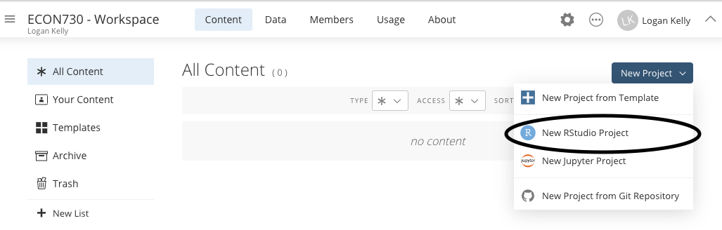
Once your Posit.Cloud account is set up and you’ve joined the appropriate workspace, the next step is to create a new RStudio project. In RStudio, projects help organize your work, keeping all related files, scripts, and data together in one place.
To create a new project, log into your Posit.Cloud account, and click on the “New Project” button. This action will open a dialog box where you can specify the details of your project. It’s important to choose a meaningful name for your project, as this will help you identify it later, especially if you work on multiple projects over time. You should also select the appropriate directory where your project will be saved. Once you’ve entered these details, click “Create,” and RStudio will open with your new project ready to go.
2.2 Setting Up a Quarto Document
With your RStudio project in place, it’s time to create a Quarto document. Quarto is a versatile tool that allows you to create dynamic documents that integrate text, code, and outputs such as tables and plots, all in one place. This makes it an excellent tool for documenting your data analysis process and sharing your results in a clear and reproducible format.
2.2.1 Creating a New Quarto Document
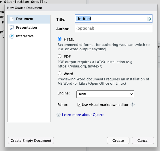
To create a Quarto document within your project, go to the File menu in RStudio, select New File, and then choose Quarto Document. This will open a dialog box where you can specify the format of the document (e.g., HTML, PDF, or Word), as well as enter the title and author information. For this case study, choose “Document” as the format, and provide a title and your name as the author. Once you’ve filled in these details, click “Create” to generate your Quarto document.
2.2.2 Understanding the Quarto Layout
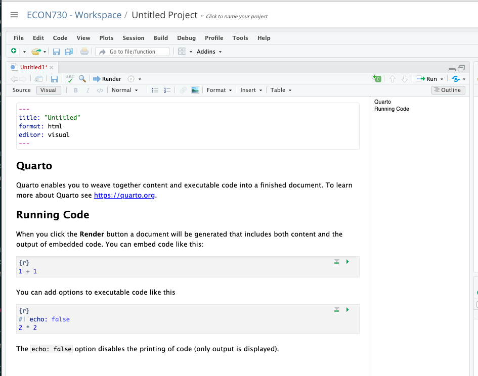
When your Quarto document is created, you will notice that it contains three key sections. At the top is the YAML header, which is delimited by three dashes (---) and contains metadata about the document such as the title, author, and output format. This section is important as it defines how your document will be processed and rendered.
Below the YAML header, you will find code chunks, which are sections of the document where you can write and execute R code. Code chunks are enclosed within triple backticks followed by {r}, and each chunk can be customized with various options, such as controlling whether the code or just the output is displayed.
The main content area of your Quarto document is where you will write the narrative of your analysis, interspersed with code chunks. This area supports markdown syntax, allowing you to easily format text, create lists, insert links, and more. Understanding this layout will help you effectively organize your analysis and ensure that your document is both informative and easy to follow.
2.3 Loading the Data
With your Quarto document ready, the next step is to load the dataset you will be working with. For this case study, we will use the mtcars dataset, which is a built-in dataset in R. The mtcars dataset contains information on various attributes of car models, including miles per gallon (mpg), horsepower (hp), weight, and more. This dataset is particularly useful for demonstrating basic data analysis techniques.
To load the mtcars dataset into your R environment, you simply use the following command:
This command loads the dataset so that you can start working with it. Once loaded, you can inspect the dataset by typing mtcars into the console, which will display the entire data frame, or by using functions like head(mtcars) to view just the first few rows.
Loading the data is a crucial step in any data analysis, as it brings the dataset into your working environment, making it available for inspection, manipulation, and modeling.
2.4 Conducting a Simple Linear Regression
In this section, we will explore how to conduct a simple linear regression analysis using the mtcars dataset in R. This will involve understanding the structure of data frames, using R’s powerful tools to access and summarize data, visualizing relationships between variables, and ultimately fitting a linear model to predict one variable based on another.
2.4.1 Understanding Data Frames
A data frame in R is one of the most essential data structures you’ll work with. It is a two-dimensional data structure, much like a table in a spreadsheet or a SQL database. Each data frame is composed of rows and columns. Each row in a data frame represents a single observation or entity, while each column represents a variable or attribute associated with those observations.
For example, in a data frame that contains car data, each row might represent a different car model, and the columns might represent various attributes of those cars, such as their horsepower, miles per gallon (mpg), weight, and so on.
One of the powerful aspects of data frames is their ability to store different types of data within the same structure. A single column in a data frame must contain data of the same type (e.g., all numeric, all character, etc.), but different columns can contain different types of data. This makes data frames flexible and suitable for a wide range of data analysis tasks.
The mtcars dataset is a built-in data frame in R that provides a rich set of variables about car models from a 1974 Motor Trend magazine. This dataset contains 32 rows and 11 columns. Each row corresponds to a different car model, and the columns represent various attributes of these cars, such as miles per gallon (mpg), cylinders (cyl), horsepower (hp), weight (wt), and more.
To load the mtcars dataset into your R environment, you simply use the following command:
This command loads the dataset so that you can start working with it. Once loaded, you can inspect the dataset by typing mtcars into the console, which will display the entire data frame, or by using functions like head(mtcars) to view just the first few rows.
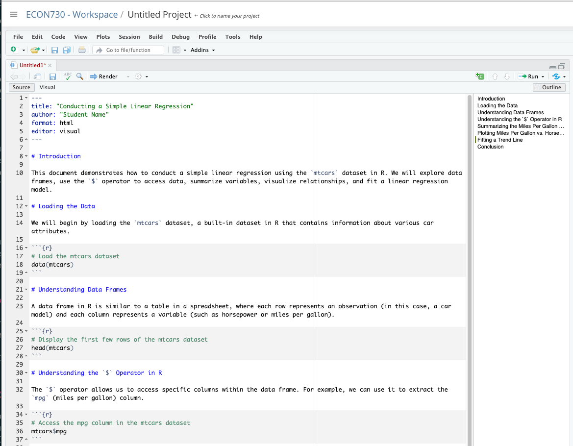
2.4.2 Understanding the $ Operator in R
In R, the $ operator is a convenient way to access specific columns within a data frame. This operator allows you to extract a single column from a data frame by name, making it easy to work with individual variables.
For instance, if
you wanted to access the mpg (miles per gallon) column in the mtcars dataset, you would use the following command:
 [1] 21.0 21.0 22.8 21.4 18.7 18.1 14.3 24.4 22.8 19.2 17.8 16.4 17.3 15.2 10.4
[16] 10.4 14.7 32.4 30.4 33.9 21.5 15.5 15.2 13.3 19.2 27.3 26.0 30.4 15.8 19.7
[31] 15.0 21.4
This command retrieves the entire mpg column from the mtcars data frame, which you can then use in further analysis or visualization. The $ operator is particularly useful when you need to perform operations on specific columns without modifying the entire data frame.
2.4.3 Summarizing the Miles Per Gallon Variable
Before diving into more complex analyses, it’s often useful to start with some basic descriptive statistics. The summary() function in R is a quick way to generate a statistical summary of a dataset or a specific variable. This function provides key metrics such as the minimum, maximum, mean, median, and quartiles.
To summarize the mpg variable in the mtcars dataset, you would use the following command:
   Min. 1st Qu.  Median    Mean 3rd Qu.    Max.
  10.40   15.43   19.20   20.09   22.80   33.90
This command first computes the summary statistics for the mpg variable and then stores the results in an object called mpg_summary. When you print mpg_summary, you’ll see a range of descriptive statistics that give you a good sense of the distribution of miles per gallon among the cars in the dataset. For example, you might observe that the mean miles per gallon is around 20, with a median value slightly lower or higher, indicating the central tendency of the data.
2.4.4 Plotting Miles Per Gallon vs. Horsepower
Visualizing data is a critical step in any analysis, as it allows you to explore relationships between variables and identify patterns or anomalies that might not be immediately apparent from the raw numbers. In this case, we want to explore the relationship between miles per gallon (mpg) and horsepower (hp).
The plot() function in R is a versatile tool for creating a wide range of plots and charts. To create a scatter plot that shows the relationship between mpg and hp, you would use the following code:
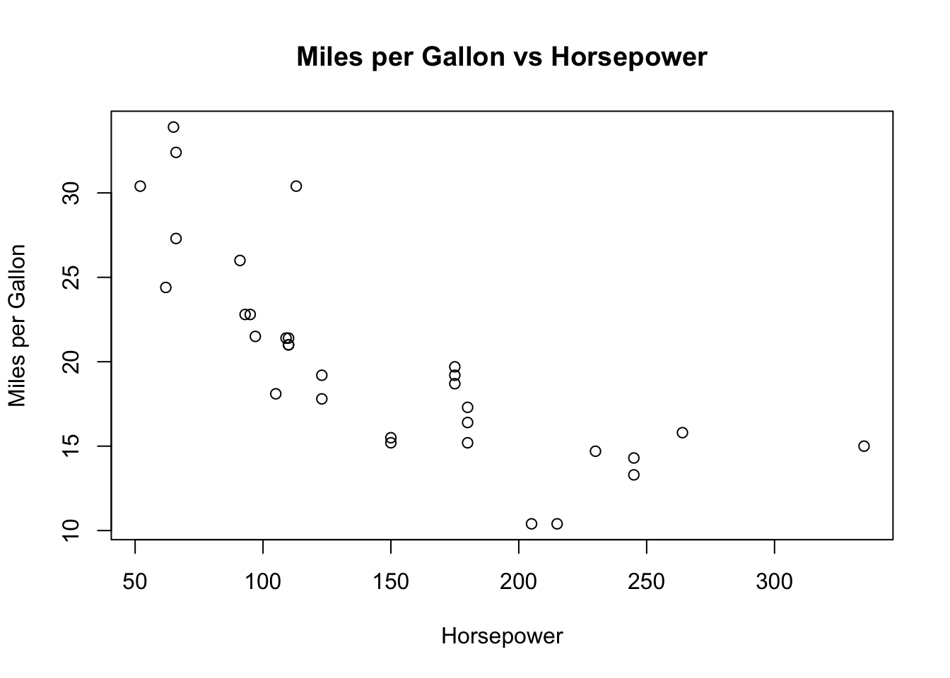
In this code, x = mtcars$hp specifies that horsepower should be plotted on the x-axis, while y = mtcars$mpg specifies that miles per gallon should be plotted on the y-axis. The xlab and ylab arguments label the axes, helping to clarify what each axis represents. Finally, the main argument adds a title to the plot, making it clear what the plot is showing.
The resulting scatter plot allows you to visually assess the relationship between these two variables. You might observe, for example, that as horsepower increases, miles per gallon tends to decrease, suggesting a negative correlation between these two variables.
2.4.5 Fitting a Trend Line
While a scatter plot provides a visual indication of the relationship between two variables, fitting a trend line allows you to quantify that relationship. In R, the lm() function is used to fit linear models, including simple linear regression.
A simple linear regression model examines the relationship between a dependent variable (in this case, mpg) and an independent variable (in this case, hp). The basic idea is to fit a straight line that best represents the data, minimizing the sum of the squared residuals (the differences between the observed values and the values predicted by the model).
To fit a linear regression model that predicts mpg based on hp, you would use the following code:
This command creates a linear model object called fit that encapsulates the results of the regression analysis. The formula mpg ~ hp specifies that we want to model mpg as a function of hp. The data = mtcars argument tells R to use the mtcars dataset for this analysis.
Once the model is fitted, you can visualize the fitted line on the scatter plot by using the abline() function:

In this code, abline(fit, col="red") adds the regression line to the existing plot in red, making it easy to see how well the line fits the data. The line represents the predicted values of mpg based on the model, allowing you to assess the relationship between horsepower and fuel efficiency quantitatively.
2.4.6 Complete Chapter Example
To summarize the steps we’ve covered in this chapter, here’s a complete example that walks through the process of loading the data, summarizing a variable, plotting a relationship, and fitting a linear model:
   Min. 1st Qu.  Median    Mean 3rd Qu.    Max.
10.40 15.43 19.20 20.09 22.80 33.90 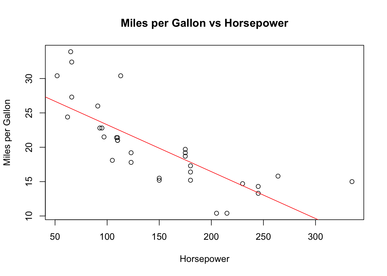
This script encapsulates the key steps involved in conducting a simple linear regression analysis in R, providing a concise yet comprehensive example of how to work with data frames, summarize data, visualize relationships, and model those relationships using linear regression. Through this process, you’ve gained hands-on experience with essential R functions and concepts that are foundational to data analysis in business analytics.
2.5 Drawing a Conclusion
Based on the analysis and visualization, we observe a clear negative relationship between horsepower and miles per gallon. The results of the regression analysis indicate that as horsepower increases, the miles per gallon decrease, suggesting that cars with higher horsepower tend to be less fuel-efficient. This finding aligns with common expectations in automotive performance: more powerful engines typically consume more fuel.
The linear regression model’s summary also provides insights into the strength and significance of this relationship. For example, the R-squared value gives us an idea of how much of the variation in mpg is explained by hp, while the p-value associated with the slope coefficient tells us whether this relationship is statistically significant.
This case study has demonstrated the foundational steps in setting up a data analysis project in R using Posit.Cloud, creating a Quarto document, loading data, performing a simple linear regression, and drawing conclusions based on the results. These skills form the basis for more advanced analyses you’ll encounter as you progress in your studies.
You can download this Quarto file here.
I understand now. Below is the section of the original chapter, adjusted to fit within the context of your chapter and focusing on the state.x77 dataset. This section guides students through converting the dataset into a data frame, calculating summary statistics, and performing a linear regression analysis of Life Exp (Life Expectancy) on Income.
2.6 Homework Assignment: Exploring life expectancy
2.6.1 Objective
The objective of this assignment is to predict the life expectancy (Life Exp) of U.S. states based on income (Income) using the state.x77 dataset.
For this initial assignment, I’ve provided example code to guide you through the process. This code contains everything you need to successfully complete the assignment. As the text progresses, the examples will gradually become more general, giving you more room to apply what you’ve learned independently. However, for the time being, simply replicating the provided example will suffice.
2.6.2 The Data
The state.x77 dataset is a dataset in the R package datasets, containing various statistics about the 50 U.S. states in the 1970s. This dataset includes information such as population, income, illiteracy rate, life expectancy, murder rate, high school graduation rate, frost (mean number of days below freezing), and area.
Here’s a brief overview of the key variables we will use in this assignment:
- Population: Population in 1975.
- Income: Per capita income in 1974.
- Illiteracy: Percentage of illiterate individuals in 1970.
- Life Exp: Life expectancy in years in 1969–1971.
- Murder: Murder and non-negligent manslaughter rate per 100,000 people in 1976.
- HS Grad: Percentage of high-school graduates in 1970.
- Frost: Mean number of days with minimum temperature below freezing in 1931–1960 in capital or large city.
- Area: Land area (in square miles).
2.6.2.1 Step 1: Load Data and Convert to a Data Frame
Begin by loading the state.x77 dataset and converting it into a data frame using the as.data.frame() function. This conversion is necessary because state.x77 is initially a matrix, and converting it to a data frame allows us to use the full range of data manipulation functions available for data frames in R.
2.6.2.2 Step 2: Summary Statistics
Calculate key summary statistics for the Life Exp and Income variables to understand their distributions and central tendencies. You can use the summary() function to quickly obtain this information.
2.6.2.3 Step 3: Data Visualization
Visualize the relationship between Life Exp (Life Expectancy) and Income by creating a scatter plot. This will help you understand how income levels might relate to life expectancy across the U.S. states.
2.6.2.4 Step 4: Simple Linear Regression Analysis
Perform a linear regression analysis to model Life Exp as a function of Income. This analysis will allow you to quantify the relationship between these two variables and make predictions about life expectancy based on income levels.
2.6.2.5 Step 5: Interpretation of Results
Interpret the output of the linear regression model, focusing on the coefficient for Income. Discuss how changes in income might affect life expectancy based on your model. Reflect on what this means for policy or public health initiatives aimed at improving life expectancy.
2.6.3 Submission Instructions
Please follow these detailed instructions for completing and submitting your assignment. This assignment is to be conducted within the class assignment workspace provided to you. You will create an R Quarto document, incorporating code and analysis as demonstrated in the provided examples. Follow the structure provided in the example code and explanations to guide your analysis. Each required step should correspond to a separate section within your R Quarto document. Utilize the headings feature in Quarto to organize your document (# for main sections, ## for subsections). Once you have completed the analysis and are satisfied with your document, compile it into MS Word document and submit it as instructed.