Chapter 8 Linear Regression: Model Evaluation
PRELIMINARY AND INCOMPLETE
8.1 Case Study: Wine Quality
This case study applies the linear regression to data from Portuguese wine producers. The dataset is available here, Cortez, Paulo, Cerdeira, A., Almeida, F., Matos, T., and Reis, J.. (2009).6
Case Background
As a vineyard owner, the essence of the wine business revolves around the production of high-quality wines that can stand out in a competitive market. To understand what factors contribute most significantly to wine quality, we will use a dataset that contains physicochemical attributes of wines and their corresponding quality ratings. Leveraging this dataset, our aim is to determine which characteristics of a wine lead to high-quality ratings.
Description of the Data
The dataset contains red wine samples. The data has been sourced from the north of Portugal. There are several variables in the dataset, including fixed acidity, volatile acidity, citric acid, residual sugar, chlorides, free sulfur dioxide, total sulfur dioxide, density, pH, sulphates, alcohol, and quality (score between 0 and 10).
| Variable | Description |
|---|---|
| fixed acidity | Most acids involved with wine or fixed or nonvolatile (do not evaporate readily) |
| volatile acidity | Amount of acetic acid in wine, high levels can lead to an unpleasant, vinegar taste |
| citric acid | Found in small quantities, adds freshness and flavor to wines |
| residual sugar | Amount of sugar remaining after fermentation stops, rare to find wines with less than 1 gram/liter |
| chlorides | Amount of salt in the wine |
| free sulfur dioxide | Free form of SO2 present in wine, prevents microbial growth and oxidation of wine |
| total sulfur dioxide | Amount of free and bound forms of S02, in low concentrations, undetectable in wine but its presence can be felt in the nose and taste |
| density | Density of wine, correlates with alcohol percentage and sugar content |
| pH | Describes how acidic or basic a wine is on a scale from 0 (very acidic) to 14 (very basic); most wines are between 3-4 |
| sulphates | Wine additive that can contribute to sulfur dioxide gas (S02) levels, acts as an antimicrobial and antioxidant |
| alcohol | Alcohol content of the wine |
| quality | Wine quality as assessed by experts, score between 0 and 10 |
These descriptions are based on the initial attributes provided in the dataset.
Step 1: Load and exploration the data
Loading Libraries
This line uses the p_load function from the pacman package to load multiple R packages. Specifically, it loads:
psych: This package contains tools for psychometric theory and data analysis.jtools: Provides functions for data analysis, particularly those related to regression and plotting.tidyverse: A collection of R packages that share a common design philosophy and are designed to work seamlessly together. It includes packages for data manipulation (dplyr), data visualization (ggplot2), and more.
Loading the Dataset
wine_data <- read.csv("https://ljkelly3141.github.io/ABE-Book/data/winequality-red.csv",
                      header=TRUE, sep=";")
This line reads a CSV file from a URL and stores the dataset in the wine_data dataframe. The arguments header=TRUE and sep=";" specify that the CSV file has column names in the first row and that the values in the CSV are separated by semicolons.
Standardizing the Dataset
This line standardizes all columns in wine_data except for the “quality” column. The standardize function, likely sourced from the jtools or psych package, typically z-score standardizes data. This means for every variable, it subtracts the mean and divides by the standard deviation, resulting in variables with mean 0 and standard deviation 1.
Visualizing Data
This chunk creates scatter plots to examine the relationships between the wine quality rating and the physicochemical attributes of wines. Here’s a breakdown:
pivot_longer: Reshapes the data from a wide format to a long format, where each row represents an observation for a particular wine attribute and its quality score.ggplot(aes(y=quality,x=Attributes)): Initiates a ggplot graph, plotting “quality” on the y-axis and the standardized attribute values on the x-axis.geom_point(): Adds scatter plot points to the graph.geom_smooth(se=FALSE): Adds a smoothed conditional mean line (typically using a method like LOESS) to the graph, with the standard error shading turned off.facet_wrap(~Variable,ncol = 2): Divides the graph into multiple panels based on the variable/attribute being considered, arranging them in a format with 2 columns.
In essence, the code provides a visual representation for each physicochemical attribute of wine against its quality, helping to discern patterns or trends between each attribute and wine quality.
wine_data %>%
  pivot_longer(cols = -quality,
               names_to = "Variable",
               values_to = "Attributes") %>%
  ggplot(aes(y=quality,x=Attributes)) +
  geom_point() +
  geom_smooth(se=FALSE) +
  facet_wrap(~Variable,ncol = 3)
## `geom_smooth()` using method = 'gam' and
## formula = 'y ~ s(x, bs = "cs")'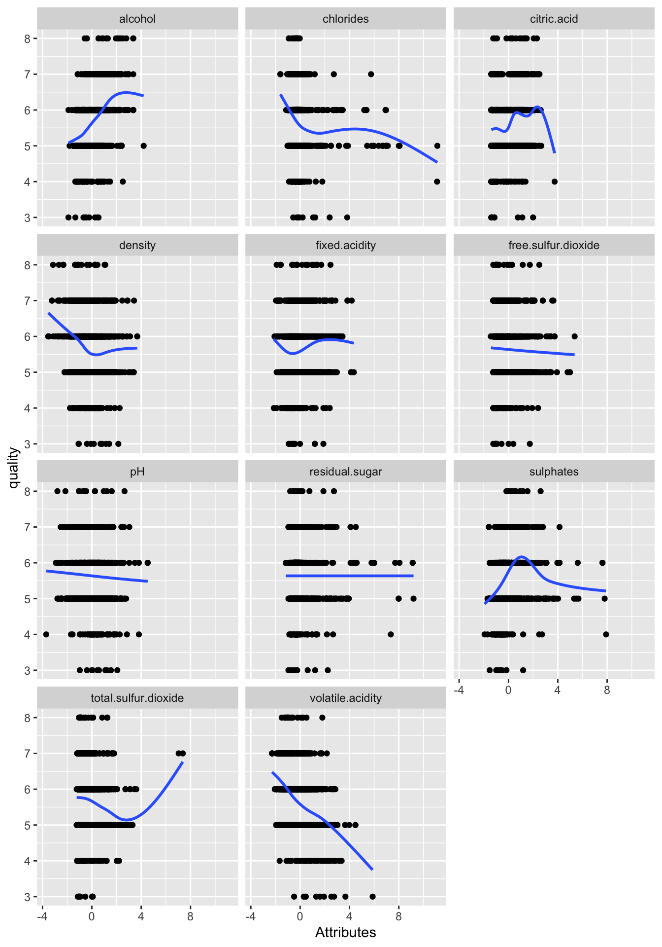
The scatter plots depict the intricate relationships between the quality of wines and their physicochemical attributes. At first glance, the relationships are multifaceted. Some attributes seem to have minimal correlation with quality, whereas others suggest a pronounced relationship, although the strength and direction of these correlations are diverse across attributes. Notably, a few of these relationships hint at non-linearity, with the distribution of points not always following a direct linear path. However, it’s essential to approach these findings with caution. Each plot showcases the relationship between quality and just one attribute, overlooking the potential interplay of multiple attributes influencing wine quality. Therefore, while the plots provide a preliminary understanding, more in-depth analyses considering multiple attributes in tandem are vital to gaining comprehensive insights into the determinants of wine quality.
Step 2: Estimate a Linear Regression Model
# Use lm function to estimate a model using all variables in the dataset to predict wine quality
wine.quality_all <- lm(quality ~ ., data = wine_data)
summ(wine.quality_all)| Observations | 1599 |
| Dependent variable | quality |
| Type | OLS linear regression |
| F(11,1587) | 81.35 |
| R² | 0.36 |
| Adj. R² | 0.36 |
| Est. | S.E. | t val. | p | |
|---|---|---|---|---|
| (Intercept) | 5.64 | 0.02 | 347.79 | 0.00 |
| fixed.acidity | 0.04 | 0.05 | 0.96 | 0.34 |
| volatile.acidity | -0.19 | 0.02 | -8.95 | 0.00 |
| citric.acid | -0.04 | 0.03 | -1.24 | 0.21 |
| residual.sugar | 0.02 | 0.02 | 1.09 | 0.28 |
| chlorides | -0.09 | 0.02 | -4.47 | 0.00 |
| free.sulfur.dioxide | 0.05 | 0.02 | 2.01 | 0.04 |
| total.sulfur.dioxide | -0.11 | 0.02 | -4.48 | 0.00 |
| density | -0.03 | 0.04 | -0.83 | 0.41 |
| pH | -0.06 | 0.03 | -2.16 | 0.03 |
| sulphates | 0.16 | 0.02 | 8.01 | 0.00 |
| alcohol | 0.29 | 0.03 | 10.43 | 0.00 |
| Standard errors: OLS |
Step 3: Model Refinement
Using the step function, we will iteratively remove irrelevant variables.
The step() function function performs a stepwise model selection based on the AIC (Akaike Information Criterion) value. The goal is to identify the best subset of predictors for the regression model.
wine.quality_all: This is the full model that was initially built using all available predictors. The
stepfunction will try to refine this model by either adding or removing predictors based on the AIC.trace=0: This argument tells R not to print the stepwise selection process as it’s being carried out. If
trace=1(default), the function would print details of the stepwise selection at each step.
The result of this stepwise process is then assigned to wine.quality_final, which is the final, refined regression model.
| Observations | 1599 |
| Dependent variable | quality |
| Type | OLS linear regression |
| F(7,1591) | 127.55 |
| R² | 0.36 |
| Adj. R² | 0.36 |
| Est. | S.E. | t val. | p | |
|---|---|---|---|---|
| (Intercept) | 5.64 | 0.02 | 347.93 | 0.00 |
| volatile.acidity | -0.18 | 0.02 | -10.04 | 0.00 |
| chlorides | -0.09 | 0.02 | -5.08 | 0.00 |
| free.sulfur.dioxide | 0.05 | 0.02 | 2.39 | 0.02 |
| total.sulfur.dioxide | -0.11 | 0.02 | -5.07 | 0.00 |
| pH | -0.07 | 0.02 | -4.11 | 0.00 |
| sulphates | 0.15 | 0.02 | 8.03 | 0.00 |
| alcohol | 0.31 | 0.02 | 17.22 | 0.00 |
| Standard errors: OLS |
The summ() function function is from the jtools package and is an alternative to the base R summary() function. It provides a summary of the regression model, displaying coefficients, t-values, p-values, confidence intervals, and other relevant statistics, often in a more user-friendly or visually appealing format compared to summary(). Here, it is used to get the summary of the wine.quality_final model, which is the refined model after stepwise selection.
Step 4: Assessing Model for Nonlinearity
We will plot the residuals vs fitted values and actual vs fitted plots to check for nonlinearity in our model.
Loading Packages:
The line pacman::p_load(tidyverse) utilizes the p_load function from the pacman package to load the tidyverse package. tidyverse is a collection of R packages primarily for data manipulation (through dplyr) and visualization (via ggplot2).
Creating a Data Frame for Plotting:
The segment res.fit_data <- data.frame(...) constructs a new data frame named res.fit_data. This data frame comprises two columns: Residuals, which contains the residuals of the wine.quality_final regression model, and Fitted Values, which holds the model’s fitted values. The check.names = FALSE argument ensures that the provided column names retain any special characters.
# Make a data frame with the necessary data for the plot
res.fit_data <- data.frame(check.names = FALSE,
  'Residuals' = wine.quality_final$residuals,
  'Fitted Values' = wine.quality_final$fitted.values
)
Creating the Scatter Plot:
Using ggplot2, a scatter plot is generated from the data in res.fit_data. The Residuals are plotted on the y-axis, and the Fitted Values on the x-axis. The geom_point() function adds scatter plot points, geom_smooth(se=FALSE) introduces a smoothed conditional mean line without a shaded standard error, and geom_abline(intercept = 0,slope = 0) places a straight line at y = 0. This resulting visualization serves as a diagnostic tool for linear regression. Residuals should ideally be randomly dispersed around this horizontal line, with patterns suggesting potential issues such as non-linearity or heteroscedasticity.
res.fit_data %>% ggplot(aes(y=`Residuals`,x=`Fitted Values`)) +
  geom_point() +
  geom_smooth(se=FALSE) +
  geom_abline(intercept = 0,slope = 0)
## `geom_smooth()` using method = 'gam' and
## formula = 'y ~ s(x, bs = "cs")'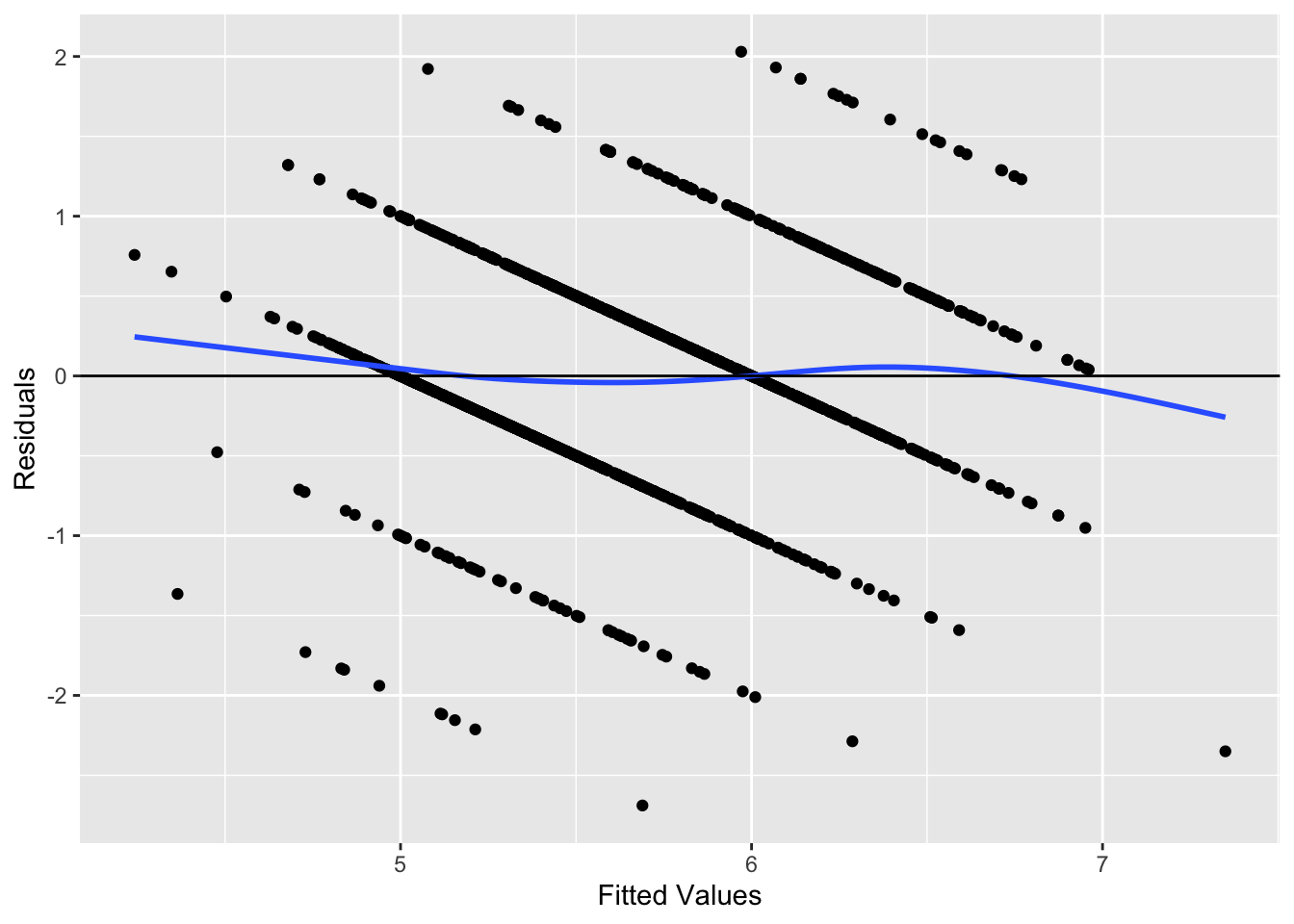
The plot below shows no indications of either nonlinearity or heteroscedasticity.
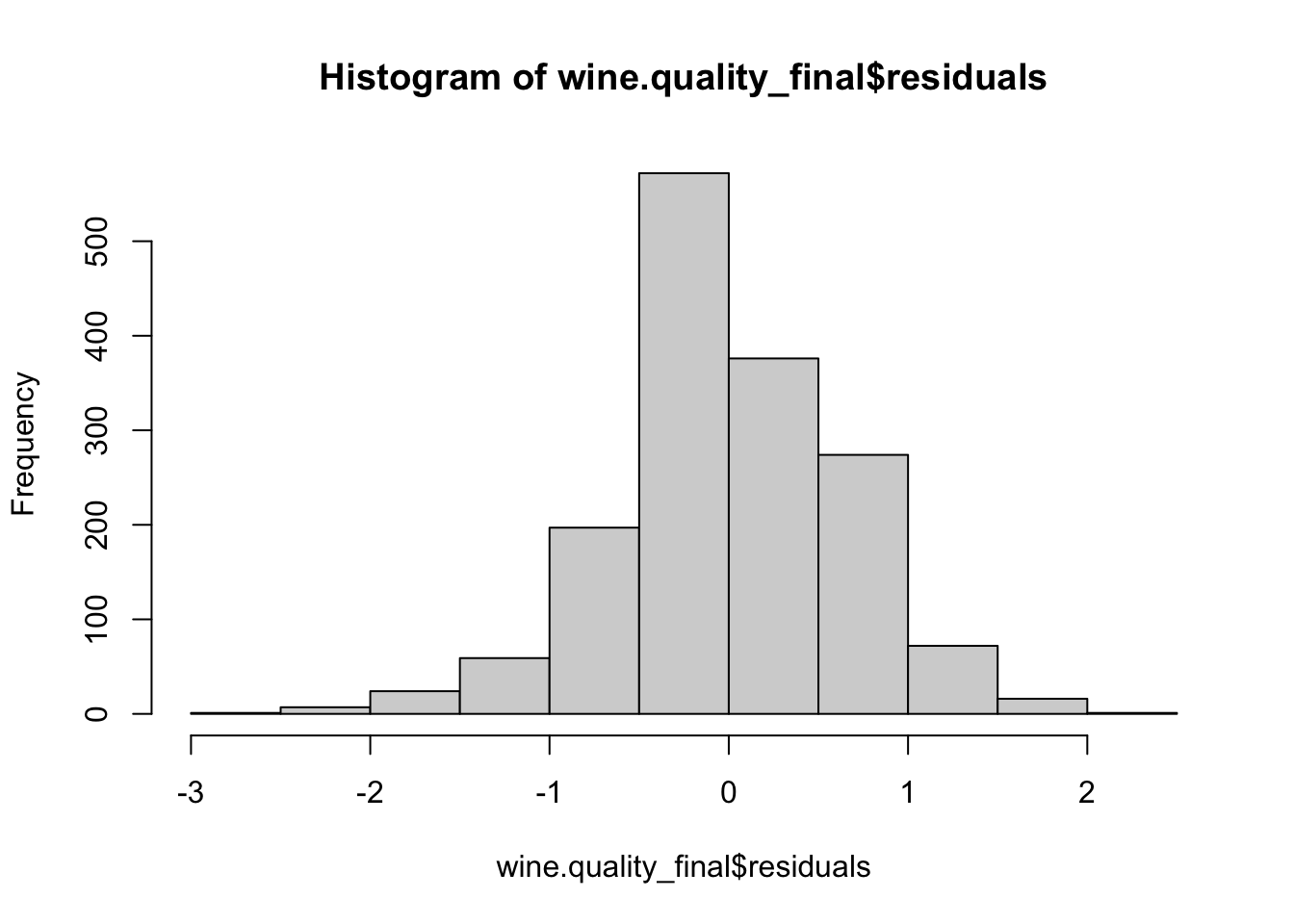
Step 5: Test Normality of Residuals
Step 6: Test for Heteroscedasticity
We will use the bptest function from the lmtest package to check for heteroscedasticity.
##
##  studentized Breusch-Pagan test
##
## data:  wine.quality_final
## BP = 54.816, df = 7, p-value = 1.622e-09
The studentized Breusch-Pagan test is a diagnostic tool used to check for heteroscedasticity — a situation where the variance of the residuals from a regression model is not constant across all levels of the independent variables. This can be problematic as heteroscedasticity can undermine the reliability of the regression coefficients and standard errors.
For the wine.quality_final regression model, the test returned a BP statistic of 54.816 with 7 degrees of freedom. The associated p-value is extremely low, recorded at \(1.622 \times 10^{-9}\). Such a minuscule p-value provides compelling evidence against the null hypothesis, which posits that the residuals have constant variance (homoscedasticity).
In essence, based on the Breusch-Pagan test results, we have significant evidence to believe that our regression model’s residuals exhibit heteroscedasticity. This underscores the need for further examination and potentially considering methods to address this issue to ensure the robustness and reliability of our model’s findings. In the following table we display the model with robust standard errors.
| Observations | 1599 |
| Dependent variable | quality |
| Type | OLS linear regression |
| F(7,1591) | 127.5549 |
| R² | 0.3595 |
| Adj. R² | 0.3567 |
| Est. | S.E. | t val. | p | |
|---|---|---|---|---|
| (Intercept) | 5.6360 | 0.0163 | 346.6625 | 0.0000 |
| volatile.acidity | -0.1813 | 0.0206 | -8.8007 | 0.0000 |
| chlorides | -0.0950 | 0.0220 | -4.3127 | 0.0000 |
| free.sulfur.dioxide | 0.0531 | 0.0222 | 2.3961 | 0.0167 |
| total.sulfur.dioxide | -0.1145 | 0.0244 | -4.7033 | 0.0000 |
| pH | -0.0745 | 0.0201 | -3.6992 | 0.0002 |
| sulphates | 0.1496 | 0.0224 | 6.6664 | 0.0000 |
| alcohol | 0.3083 | 0.0212 | 14.5090 | 0.0000 |
| Standard errors: Robust, type = HC3 |
Step 7: Interpretation of the Model
The linear regression model, derived from a dataset with 1,599 observations, was constructed to predict wine quality based on various physicochemical properties. The model utilized the Ordinary Least Squares (OLS) method, and its overall significance was affirmed by an F-statistic value of \(F(7,1591) = 127.5549\) with a p-value of 0.0000. This implies that our model notably fits the data better than a model devoid of predictors.
Delving into the coefficients, the intercept’s estimate stands at 5.6360, suggesting that when all other predictors are held constant, the anticipated quality rating of a wine is approximately 5.636. The variable volatile.acidity shows a coefficient of -0.1813, indicating that a one-unit surge in volatile acidity would, on average, result in a decrease of 0.1813 in the wine quality rating, keeping all else constant. Similarly, the chlorides predictor exhibits a coefficient of -0.0950, denoting that a unit increment in chlorides corresponds to a decrease of 0.0950 in wine quality. On the more positive side, the alcohol coefficient is 0.3083, suggesting that wines with a unit increase in alcohol content can expect an elevation of 0.3083 in their quality rating.
Moreover, all the predictors displayed p-values below 0.05, emphasizing their statistical significance in predicting wine quality. However, the model’s residuals were subjected to the studentized Breusch-Pagan test, which yielded a BP statistic of 54.816 with a p-value of 1.622e-09. This result underscores potential heteroscedasticity concerns, suggesting that the variance of the residuals may not be consistent across all levels of the independent variables.
8.2 Case Study Assignments
8.2.1 City of Windsor Housing Prices
In this case study, we will utilize the Housing dataset from the Ecdat package to model house prices in the City of Windsor using linear regression. The objective of this study is to develop a model to determine which variables most significantly impact house prices and evaluate that model.
Case Background
As a vineyard owner, you want to develop an objective methode of evaluating your wines. To understand what factors contribute most significantly to wine quality, we will use a dataset that contains physicochemical attributes of wines and their corresponding quality ratings. Leveraging this dataset, our aim is to determine which characteristics of a wine lead to high-quality ratings.
Description of the Data
The Housing dataset contains data about various properties in the City of Windsor, Canada. Each row corresponds to a house and the dataset includes variables such as lot size, the number of bedrooms, and the price of the house.
| vars | n | mean | sd | se | |
|---|---|---|---|---|---|
| price | 1 | 546 | 68121.5971 | 26702.6709 | 1142.7688 |
| lotsize | 2 | 546 | 5150.2656 | 2168.1587 | 92.7886 |
| bedrooms | 3 | 546 | 2.9652 | 0.7374 | 0.0316 |
| bathrms | 4 | 546 | 1.2857 | 0.5022 | 0.0215 |
| stories | 5 | 546 | 1.8077 | 0.8682 | 0.0372 |
| driveway* | 6 | 546 | 1.8590 | 0.3484 | 0.0149 |
| recroom* | 7 | 546 | 1.1777 | 0.3826 | 0.0164 |
| fullbase* | 8 | 546 | 1.3498 | 0.4773 | 0.0204 |
| gashw* | 9 | 546 | 1.0458 | 0.2092 | 0.0090 |
| airco* | 10 | 546 | 1.3168 | 0.4657 | 0.0199 |
| garagepl | 11 | 546 | 0.6923 | 0.8613 | 0.0369 |
| prefarea* | 12 | 546 | 1.2344 | 0.4240 | 0.0181 |
Note that variables with asterisks are categorical.
Instructions
Set Up
Before beginning the analysis, it’s essential to have all the necessary packages installed and loaded. If you haven’t already, make sure to install and load the pacman package using if(!require(pacman)) install.packages("pacman"). Once you’ve confirmed that pacman is available, load the required packages with pacman::p_load(tidyverse, jtools, psych, lmtest).
Loading the Data
To kick off the actual analysis, you’ll be working with the Housing dataset from the Ecdat package as we did in the previous chapter.
Data Visualization
First, create scatter plots of the numeric data in the dataset vs. house price:
- Prepare Your Dataset:
- Begin by reshaping your dataset into a longer format. This helps in analyzing and plotting multiple variables against a single reference variable.
- From the
Housingdataset, select only the numeric columns while excluding the ‘price’ column. You can achieve this using theselectfunction combined withwhere(is.numeric). - Then, utilize the
pivot_longerfunction to pivot the selected data. Set the columns parameter to exclude ‘price’. Rename the resulting column names to “variable” and the values to “value”. Store the reshaped data in a new variable namedlong_data.
- Visualize the Data with ggplot:
- Start with the
ggplotfunction by setting your data source aslong_dataand defining the aesthetic mappings, with ‘value’ on the x-axis and ‘price’ on the y-axis. - Add a layer of points to the plot using the
geom_point()function. - To segregate the scatter plots of different numeric variables, apply the
facet_wrapfunction. Set the faceting variable as ‘variable’. Adjust the visual display by enabling free scales and arranging the plots in two columns. - Enhance the visualization with a minimal theme using the
theme_minimal()function. - Finally, label your axes and give the plot a title to make it more descriptive. Set the y-axis label to “Price”, the x-axis label to “Value of Variable”, and the overall title to “Scatter Plots of Numeric Variables vs. Price”.
- Start with the
Here is example code:
# Pivot dataset to a longer format
long_data <- Housing %>%
  select(where(is.numeric)) %>% # Select only numeric columns excluding price
  pivot_longer(cols = -price, names_to = "variable", values_to = "value")

# Scatter plot using ggplot and facet_wrap
ggplot(long_data, aes(x = value, y = price)) +
  geom_point() +
  facet_wrap(~ variable, scales = "free", ncol = 2) +
  theme_minimal() +
  labs(y = "Price", x = "Value of Variable", title = "Scatter Plots of Numeric Variables vs. Price")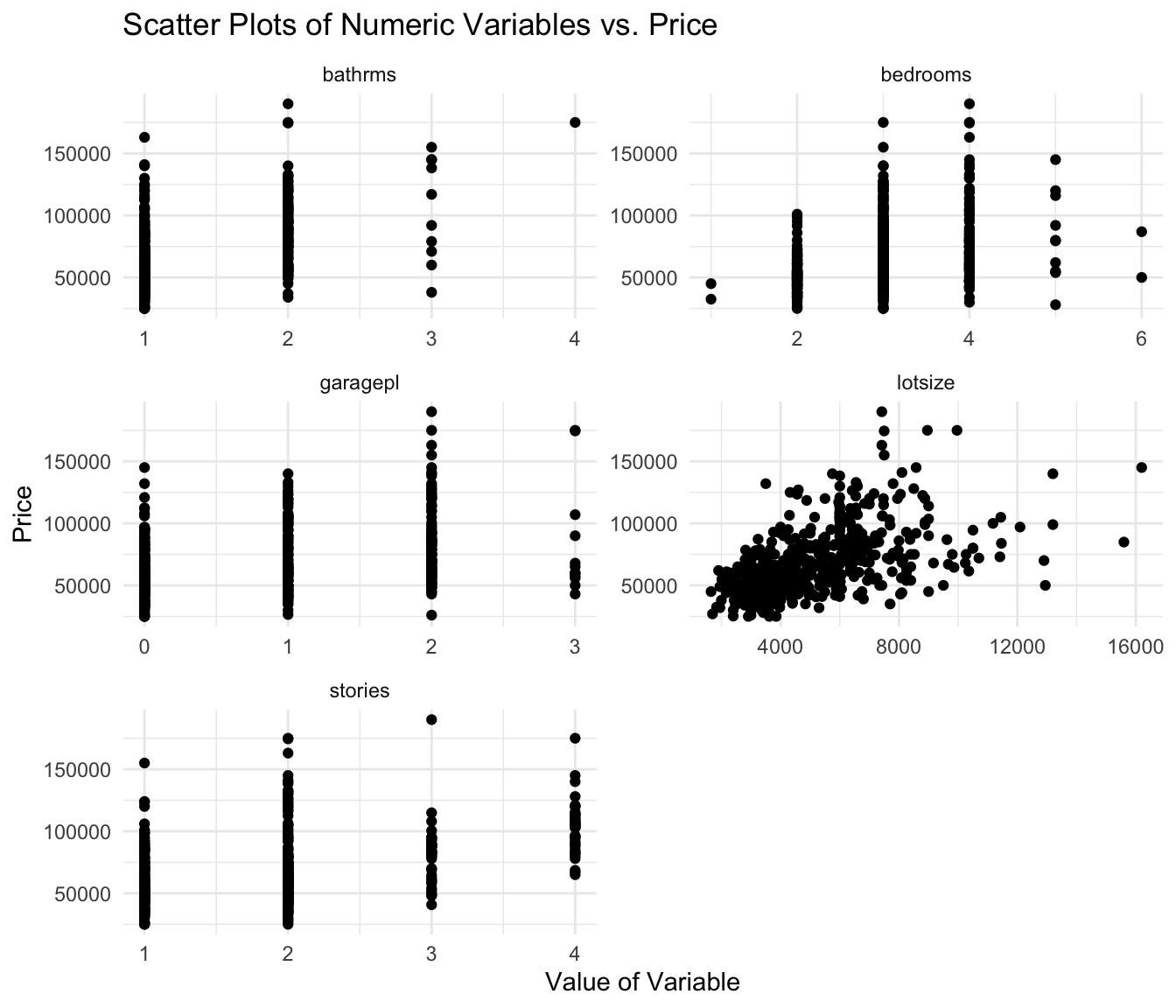
Next, create boxplots of the categorical data in the dataset vs. house price:
- Prepare the Data for Visualization:
- Start by filtering the
Housingdataset to only include the categorical variables and theprice. - To make the data suitable for visualization, reshape the dataset from a wide format to a longer one using the
pivot_longerfunction. This allows each categorical variable and its associated price to be represented in separate rows.
- Start by filtering the
- Construct the Boxplot:
- With the reshaped data (
long_data), use theggplot2package to create a boxplot. - Set the categorical values on the x-axis and the price on the y-axis.
- Apply color to the boxes based on the categorical value.
- To ensure clarity when plotting multiple categorical variables, use the
facet_wrapfunction to create separate plots for each category. Adjust the scales to be free so that each facet can have its own axis scales, and set the layout to have two columns. - Lastly, style the plot using
theme_minimaland label the axes and title appropriately.
- With the reshaped data (
Here is example code:
# Pivot dataset to a longer format focusing on categorical variables
long_data <- Housing %>%
  select(where(is.factor), price) %>%  # Select only character (categorical) columns
  pivot_longer(cols = -price, names_to = "variable", values_to = "value")

# Boxplot using ggplot and facet_wrap
ggplot(long_data, aes(x = value, y = price)) +
  geom_boxplot(aes(fill = value)) +
  facet_wrap(~ variable, scales = "free", ncol = 2) +
  theme_minimal() +
  labs(y = "Price", x = "Category", title = "Boxplots of Categorical Variables vs. Price")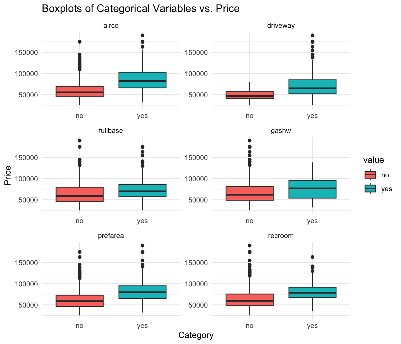
Regression Analysis
Develop the Initial Model: Using the
lm()function, create a linear regression model withpriceas the dependent variable and all other variables as independent predictors. Save this model for further evaluation.Check for Linearity: Evaluate if the assumptions of linearity are met:
- Residual vs. Fitted Plot: This will help you visualize if residuals have non-linear patterns.
- Actual vs. Fitted Values Plot: Check how well your model’s predictions match the actual data.
Check for Multicollinearity: To do this, calculate the Variance Inflation Factors (VIFs) for your predictors. Additionally, generate a correlation matrix to gain insights into the relationships between predictors. Both these steps will help ensure that the predictors in your model aren’t unduly influencing each other.
Assess Residual Normality: Create a histogram to visually inspect the distribution of the residuals. This will help in understanding if they approximately follow a normal distribution.
Evaluate Heteroscedasticity: Begin by examining the Residual vs. Fitted Plot, which provides a visual representation of variance consistency. To further confirm your observations, apply the Breusch-Pagan test using the
lmtest::bptest()function.
Refinement and Final Model
Based on the results from the linearity and multicollinearity checks:
Refine the Model: If certain predictors are found to be problematic (e.g., non-linear relationship, high VIF), consider excluding them or transforming them. For non-linear relationships, polynomial or interaction terms might be helpful.
Develop an Improved Model: After refining your predictors, recreate your regression model.
Conclusion
- Interpret the Results: Highlight the significant predictors and interpret their coefficients. Discuss the R-squared value to explain the model’s overall fit.
- Assumptions Check: Recap your findings on the regression assumptions and how well they are met.
- Recommendations: Based on the model’s results, provide recommendations for potential buyers or sellers in the City of Windsor’s housing market.
Finally, always remember that while the statistical tools and methods are essential, critical thinking and domain knowledge should also be applied when interpreting results and making recommendations.
Cortez, Paulo, Cerdeira, A., Almeida, F., Matos, T., and Reis, J.. (2009). Wine Quality. UCI Machine Learning Repository. https://doi.org/10.24432/C56S3T.↩︎