In this case study, we delve into a practical application of data analysis to unravel the complexities behind workplace absenteeism. Utilizing a refined version of the “Absenteeism at Work Data Set,” which has been meticulously aggregated by employee and re-coded for enhanced clarity, we aim to dissect the various factors that may contribute to elevated absenteeism rates, defined as absences exceeding 5.5 hours per month. Through the lens of logistic regression, we seek to illuminate the intricate interplay between these factors and high absenteeism, acknowledging the potential for certain limitations within our analysis that may necessitate further exploration.
As we navigate through this investigation, it is paramount to approach this chapter with an open mind, recognizing it as an introductory glimpse into the broader realm of data analysis. The intricate details and statistical nuances presented may not be immediately comprehensible to all readers; however, the primary objective is to foster an understanding of the fundamental workflow involved in addressing questions with data. This case study is designed not only to provide insights into absenteeism but also to serve as a foundational stepping stone, preparing you for the more advanced analytical techniques and concepts that lie ahead.
4.1 Load data and clean data
In this section, we will load the dataset and provide explanations for each variable it contains, setting the stage for our analysis.
This line of code reads a CSV file named Absenteeism_by_employee.csv from a directory named data. The CSV file format is a popular choice for storing tabular data due to its simplicity and wide support across various software.
The read.csv function in R is utilized to load this data, resulting in the creation of a data frame named Absenteeism.by.employee. Data frames in R are akin to tables in a database or Excel sheets, making them a fundamental structure for data manipulation in R.
Here, the column Most.common.reason.for.absence within the data frame is converted into a factor, a data structure in R used for categorical variables. This is a critical step for ensuring that subsequent analysis recognizes this variable’s categorical nature, allowing for appropriate statistical techniques to be applied.
Inspecting the Data:
head(Absenteeism.by.employee):
This command provides a quick snapshot of the data frame, displaying the first six rows by default. This is an essential step for verifying data integrity and understanding the dataset’s structure and content at a glance.
4.1.2 Insights into the Data Structure
Expanding on the structure of our data, the Absenteeism.by.employee data frame encompasses 33 observations, each corresponding to an aggregated record of an employee’s absenteeism pattern, across 10 distinct variables:
Number.of.absence: This numeric variable represents the average number of times an employee has been absent per month, providing a quantifiable measure of absenteeism frequency.
Absenteeism.time.in.hours: Another numeric variable, it quantifies the total hours of absence per month for each employee, offering insight into the extent of absenteeism in terms of time.
Body.mass.index (BMI): BMI is a numeric variable that gives an assessment of an individual’s body fat based on their weight and height. It serves as a proxy for evaluating the overall health status and potential health risks of the employees.
Age: This numeric variable records the age of each employee, allowing for the exploration of age-related patterns in absenteeism.
Most.common.reason.for.absence: Initially an integer, this variable is converted into a factor to represent the most frequent reasons for absenteeism categorically, facilitating the analysis of common triggers or causes for absenteeism within the workforce.
Social.smoker: A character variable indicating whether an employee is a “Non-smoker” or “Smoker”, this categorical variable allows for the investigation of smoking habits’ potential impact on absenteeism.
Social.drinker: Similar to Social.smoker, this character variable categorizes employees as “Non-drinkers” or “Social drinkers”, enabling the study of how alcohol consumption might influence absenteeism patterns.
Pet: This character variable denotes the presence of pets in an employee’s life, distinguishing between “No Pet(s)” and “Pet(s)”. It provides a basis to explore if and how pet ownership might relate to absenteeism.
Children: Indicating parental status, this character variable differentiates between “Non-parent” and “Parent”, offering a perspective on how parental responsibilities might affect absenteeism.
High.absenteeism: A crucial character variable, it classifies absenteeism into “High Absenteeism” or “Low Absenteeism” based on predefined criteria, serving as the dependent variable in analyses aimed at identifying factors influencing high levels of absenteeism.
4.2 Summary Statistics
Exploring descriptive statistics offers us a detailed snapshot of our dataset, laying the groundwork to better understand the key variables associated with absenteeism in the workplace. We begin with the describe() function to summarize the numeric data.
Several arguments are specified to tailor the output to our needs:
skew = FALSE: This argument indicates that the skewness of the distribution for each variable should not be included in the summary output. Skewness is a measure of the asymmetry of the probability distribution of a real-valued random variable about its mean. Excluding skewness can simplify the summary, focusing on more fundamental statistics.
ranges = FALSE: By setting this to false, the function omits the range (the difference between the maximum and minimum values) of each variable from the output. While range can provide insights into the spread of the data, excluding it can help streamline the summary, especially when other measures of dispersion, such as the standard deviation, are included.
omit = TRUE: This argument ensures that any missing values in the dataset are ignored in the calculations of the summary statistics. Handling missing data effectively is crucial for maintaining the integrity of statistical summaries, and omitting missing values can provide a more accurate representation of the available data.
The output from this function encompasses several key statistical measures for each variable under consideration:
n: Represents the count, or the number of observations, for each variable. This gives us an idea of the dataset’s size and can help identify variables with a significant amount of missing data if the counts are unexpectedly low.
mean: The average value of the variable across all observations. The mean is a central measure of location, providing a sense of the ‘center’ of the data distribution.
sd (Standard Deviation): A measure of the amount of variation or dispersion of a set of values. A low standard deviation indicates that the values tend to be close to the mean, while a high standard deviation indicates that the values are spread out over a wider range.
se (Standard Error): The standard error of the mean estimates the variability between sample means that you would obtain if you took multiple samples from the same population. It is derived from the standard deviation and provides insight into the reliability of the mean as an estimate of the population mean.
4.2.1 Cross-Tabulations
Cross-tabulations provide insight into the relationships between categorical variables in our dataset. By analyzing the contingency tables and their corresponding \(\chi^2\) tests, we evaluate the association between high absenteeism and variables like parental status, pet ownership, smoking, and drinking habits.
Parental Status:
The table for parental status reveals counts of 4 non-parents and 13 parents in the high absenteeism group, and 7 non-parents and 9 parents in the low absenteeism group. The count of 4 non-parents in the high absenteeism group, being less than 5, could potentially compromise the validity of the \(\chi^2\) test, warranting careful interpretation of these results. The \(\chi^2\) test provides a \(\chi^2\) value of 0.74311 with a p-value of 0.3887, suggesting no significant link between parental status and high absenteeism.
                   Non-parent Parent
  High Absenteeism          4     13
  Low Absenteeism           7      9
chisq.test(tbl.Children)
    Pearson's Chi-squared test with Yates' continuity correction

data:  tbl.Children
X-squared = 0.74311, df = 1, p-value = 0.3887
Pet Ownership:
The table for pet ownership shows no counts below 5, indicating a balanced distribution between employees with and without pets across absenteeism levels. The \(\chi^2\) test yields a \(\chi^2\) value of 0.025276 and a p-value of 0.8737, indicating no significant association between pet ownership and absenteeism levels.
                   No Pet(s) Pet(s)
  High Absenteeism        10      7
  Low Absenteeism          8      8
chisq.test(tbl.Pet)
    Pearson's Chi-squared test with Yates' continuity correction

data:  tbl.Pet
X-squared = 0.025276, df = 1, p-value = 0.8737
Smoking Habits:
The smoking habits table shows a count of 2 smokers within the high absenteeism group. This count, being under 5, suggests a potential threat to the \(\chi^2\) test’s validity in this context. The test results in a \(\chi^2\) value of 0.88809 and a p-value of 0.346, indicating no significant association, but the low count cautions against firm conclusions.
                   Non-smoker Smoker
  High Absenteeism         15      2
  Low Absenteeism          11      5
chisq.test(tbl.Smoker)
Warning in chisq.test(tbl.Smoker): Chi-squared approximation may be incorrect
    Pearson's Chi-squared test with Yates' continuity correction

data:  tbl.Smoker
X-squared = 0.88809, df = 1, p-value = 0.346
Drinking Habits:
The drinking habits table does not have any counts below 5, allowing for a more robust \(\chi^2\) test, which yields a \(\chi^2\) value of 0.26774 and a p-value of 0.6049. This suggests that there is no significant relationship between social drinking habits and absenteeism levels.
                   Non-drinker Social drinker
  High Absenteeism           7             10
  Low Absenteeism            9              7
chisq.test(tbl.Drinker)
    Pearson's Chi-squared test with Yates' continuity correction

data:  tbl.Drinker
X-squared = 0.26774, df = 1, p-value = 0.6049
When interpreting these cross-tabulations, the presence of small counts in certain categories must be considered, as it can affect the reliability of the \(\chi^2\) test, potentially increasing the Type II error rate. This underscores the importance of additional analysis, possibly with larger datasets or different statistical methods, to validate these observations.
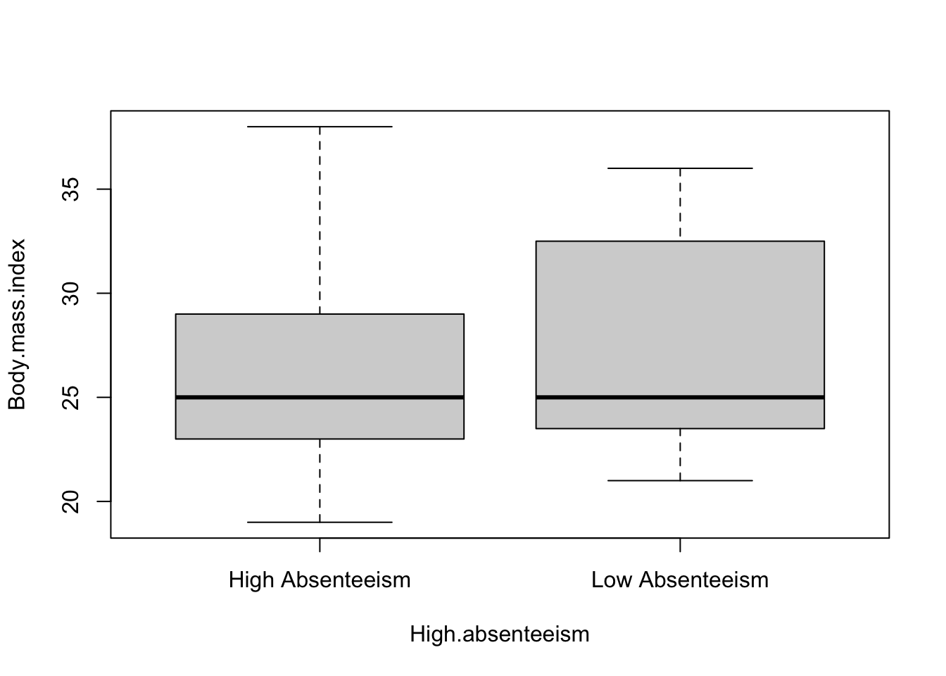
4.3 Visualization
Visualization plays a pivotal role in data analysis, offering an intuitive understanding of data distributions and relationships. In this context, we utilize the boxplot function in R to create boxplots for two numeric variables, Body Mass Index (BMI) and Age, categorizing them by levels of absenteeism (high vs. low).
A boxplot, also known as a box-and-whisker plot, is a standardized way of displaying the distribution of data based on a five-number summary: minimum, first quartile (Q1), median, third quartile (Q3), and maximum. It can also include ‘whiskers’ that extend to show the range of the data and potentially ‘outliers’ that fall far from the bulk of the data.
4.3.1 How to Read a Boxplot:
The Box: The central box of a boxplot represents the interquartile range (IQR), which is the distance between the first and third quartiles. The bottom and top edges of the box indicate the first quartile (25th percentile) and the third quartile (75th percentile), respectively.
The Median: Inside the box, a line (often notched) indicates the median (50th percentile) of the data, providing a measure of the central tendency.
The Whiskers: The lines extending from the top and bottom of the box, known as whiskers, show the range of the data, extending up to 1.5 * IQR from the quartiles. Points beyond this range are often considered outliers and are plotted individually.
Outliers: Points that lie beyond the whiskers are plotted individually and are considered outliers, indicating values that fall far from the central cluster of data.
Using the boxplot function, we create visual representations for BMI and Age against absenteeism categories:
Upon examining these boxplots, we observe little difference in the median values of both BMI and Age between high and low absenteeism groups. The median serves as a robust measure of central tendency, and its consistency across groups suggests that the central tendency of BMI and Age may not differ significantly with absenteeism levels.
However, the variability or spread of the data, as indicated by the length of the boxes and the extent of the whiskers, appears to be greater for employees with low absenteeism. This increased spread implies a wider range of BMI and Age values among employees who exhibit low levels of absenteeism, suggesting more diversity in these characteristics within this group.
In summary, while the central tendencies (medians) of BMI and Age do not show marked differences between high and low absenteeism groups, the variability within these groups, particularly among low absenteeism employees, highlights a broader range of BMI and Age. These insights can inform further analysis, possibly investigating if and how this variability correlates with absenteeism levels.
4.4 Modeling for High Absenteeism
A logistic regression model, or logit model, is a statistical method used to model binary outcome variables. In the context of absenteeism, we’re interested in predicting the likelihood of an employee having high absenteeism based on various predictors such as age, body mass index (BMI), social habits, and family status. The logistic model is particularly suited for this task as it estimates the probability that a given outcome is 1 (high absenteeism) versus 0 (low absenteeism).
The logistic function, central to the model, transforms linear combinations of the predictors into probabilities, ensuring that the output stays within the 0 to 1 range, making it interpretable as a probability. The coefficients in a logistic regression represent the change in the log odds of the outcome for a one-unit change in the predictor variable, holding all other variables constant.
4.4.1 Logistic Regression Model for High Absenteeism
The R code to fit a logistic regression model to our absenteeism data is as follows:
mod1 <-glm(High.absenteeism ~ Age + Body.mass.index + Social.drinker + Social.smoker + Children + Pet, data = Absenteeism.by.employee, family ="binomial")summ(mod1)
MODEL INFO:
Observations: 33
Dependent Variable: High.absenteeism
Type: Generalized linear model
  Family: binomial
  Link function: logit

MODEL FIT:
χ²(6) = 9.79, p = 0.13
Pseudo-R² (Cragg-Uhler) = 0.34
Pseudo-R² (McFadden) = 0.21
AIC = 49.92, BIC = 60.40

Standard errors: MLE
--------------------------------------------------------
                             Est.   S.E.   z val.      p
------------------------- ------- ------ -------- ------
(Intercept)                 -3.79   3.28    -1.15   0.25
Age                          0.03   0.06     0.50   0.61
Body.mass.index              0.13   0.11     1.13   0.26
Social.drinkerSocial        -0.34   0.93    -0.36   0.72
drinker
Social.smokerSmoker          2.77   1.41     1.97   0.05
ChildrenParent              -3.11   1.55    -2.00   0.05
PetPet(s)                    1.80   1.31     1.37   0.17
--------------------------------------------------------
This code snippet specifies a generalized linear model (glm) with the binary outcome High.absenteeism. The predictors include continuous variables like Age and Body.mass.index, as well as categorical variables such as Social.drinker, Social.smoker, Children, and Pet. The family = "binomial" argument indicates that we’re using logistic regression, appropriate for a binary dependent variable.
4.4.2 Interpretation of the Logistic Regression Output
The output from the summ() function provides a detailed summary of the model, including coefficients, standard errors, z-values, and p-values for each predictor. Here’s how to interpret these elements:
Coefficients: These values indicate the direction and strength of the association between each predictor and the log odds of high absenteeism. A positive coefficient suggests an increase in the likelihood of high absenteeism with a one-unit increase in the predictor, while a negative coefficient suggests a decrease.
Standard Errors (S.E.): These measure the variability in the coefficient estimates, indicating the precision with which the coefficients are measured. Smaller standard errors suggest more precise estimates.
Z-values: These are the ratios of the coefficients to their standard errors. They are used in testing the null hypothesis that a coefficient is zero (no effect).
P-values: These values indicate the probability of observing the estimated coefficients (or more extreme) if the null hypothesis were true. A small p-value (typically < 0.05) suggests that the effect of the predictor is statistically significant.
In our model, certain predictors like being a smoker (Social.smokerSmoker) and having children (ChildrenParent) show notable associations with high absenteeism. Specifically, smoking is associated with an increased likelihood, while having children is linked to a decreased likelihood of high absenteeism. However, the significance of these effects, as indicated by p-values, and the model’s overall explanatory power should be carefully considered alongside the context and limitations of the data.
4.5 explain threat to the valitidy of our model
The validity of our logistic regression analysis, which aims to identify factors influencing high absenteeism, could be impacted by several key issues. Two primary concerns that stand out in this context are the small sample size and the limited observations within some cross-tabulation groupings.
4.5.1 Small Sample Size
The small sample size of 33 observations presents a significant challenge. In statistical modeling, particularly in logistic regression, having a larger sample size is crucial for several reasons:
Parameter Estimates: A small sample size can lead to less precise estimates of parameters, making it difficult to detect true effects. The estimates may be biased or vary widely from sample to sample, reducing confidence in the findings.
Statistical Power: The power of a statistical test is its ability to detect an effect if there is one. With a small sample size, the study may lack sufficient power to identify significant relationships between predictors and the outcome variable, potentially leading to Type II errors (failing to reject a false null hypothesis).
Overfitting: In logistic regression, having many predictors relative to the number of observations increases the risk of overfitting, where the model fits the training data well but performs poorly on new data. This is particularly concerning when the sample size is small, as the model may capture noise instead of the underlying data pattern.
4.5.2 Limited Observations in Cross-Tabulation Groupings
The analysis includes cross-tabulations of categorical variables with high absenteeism. Some groupings in these tables have very few observations, with counts less than 5, which poses several issues:
Chi-Squared Test Validity: The validity of the Chi-squared test, used to assess the association between categorical variables, relies on an expected frequency assumption. When cell counts are low, the test’s assumptions may not hold, leading to unreliable p-values and potentially misleading conclusions about associations.
Estimate Stability: Small counts in certain categories can lead to instability in the logistic regression estimates. Categories with very few observations contribute less information to the model, making it difficult to assess the true effect of these predictors on the outcome.
Generalizability: With limited observations in certain categories, it becomes challenging to generalize findings to the broader population. The results may be highly specific to the sample used and may not represent the true relationship in the population of interest.
To mitigate these threats to validity, several strategies could be considered, such as increasing the sample size, using alternative statistical methods that are more robust to small sample sizes, or combining categories in cross-tabulations to ensure a sufficient number of observations per group. Additionally, sensitivity analyses could be conducted to assess the robustness of the findings to different modeling choices and assumptions.
4.6 Conclution
Our investigation into the factors influencing high absenteeism through logistic regression revealed notable insights, particularly regarding lifestyle and personal circumstances such as smoking habits and parental status. The significant association of parental status with lower absenteeism rates stood out, suggesting potential protective dynamics. However, the influences of other variables like age, BMI, and pet ownership remained less conclusive within our model’s framework.
The endeavor was not without its limitations, prominently marked by the small sample size and sparse observations in certain categories of the cross-tabulations. These constraints necessitated a cautious approach to interpreting the results, highlighting potential validity threats such as diminished statistical power, the risk of model overfitting, and challenges in extending our findings to a broader context.
This exploration, while preliminary, underscores the complexity of absenteeism and the necessity for robust, data-driven analyses to unravel its underpinnings. Future research, armed with larger datasets and potentially more sophisticated modeling techniques, will be crucial in building upon these initial findings. Through such endeavors, we can hope to gain a more nuanced understanding of absenteeism, paving the way for more effective interventions and management practices in the workplace.
4.7 Homework Assignment: Exploring the mtcars Dataset
4.7.1 Objective:
The objective of this assignment is to predict the miles per gallon (mpg) of cars based on various attributes found in the mtcars dataset.
Caution
For this initial assignment, I’ve provided example code to guide you through the process. This code contains everything you need to successfully complete the assignment. As the text progresses, the examples will gradually become more general, giving you more room to apply what you’ve learned independently. However, for the time being, simply replicating the provided example will suffice.
4.7.2 The Data
The mtcars dataset is a classic data frame in R, frequently used for illustrating data analysis techniques in statistical modeling and graphics. It originates from the 1974 Motor Trend US magazine and comprises fuel consumption (miles per gallon) and 10 aspects of automobile design and performance for 32 automobiles (1973–74 models).
Here’s a brief overview of each variable within the mtcars dataset:
mpg: Miles per gallon (MPG) - This is a measure of fuel economy, indicating how many miles a car can travel on a gallon of fuel. It serves as a key indicator of vehicle efficiency.
cyl: Number of cylinders - This represents the engine’s cylinder count, which can affect the car’s power and fuel efficiency.
disp: Displacement (in cubic inches) - This refers to the engine’s total volume of all the cylinders. Larger engines typically have more power but may be less fuel-efficient.
hp: Gross horsepower - A measure of engine power output. Higher horsepower means the car can achieve higher speeds and better acceleration but often at the cost of lower MPG.
drat: Rear axle ratio - This ratio affects performance characteristics such as acceleration and top speed. Higher ratios usually offer better acceleration.
wt: Weight (in 1000 lbs) - The total weight of the vehicle. Heavier cars often have lower MPG due to the greater energy required to move them.
qsec: 1/4 mile time (seconds) - A performance measure indicating the time it takes for a car to complete a quarter-mile from a standing start. Shorter times indicate faster acceleration.
vs: Engine (0 = V-shaped, 1 = straight) - This variable denotes the engine configuration, with V-shaped engines typically providing more power and straight engines often being more efficient.
am: Transmission (0 = automatic, 1 = manual) - This indicates the type of transmission. Manual transmissions may offer better control and efficiency in certain conditions.
gear: Number of forward gears - More gears can provide better fuel efficiency and performance.
carb: Number of carburetors - This affects the engine’s air/fuel mixture. More carburetors can increase power but might reduce fuel efficiency.
Step 1. Load Data:
Begin by loading the Tidyverse package and accessing the mtcars dataset.
Begin by transforming the mtcars dataset to a long format using the pivot_longer() function. Exclude mpg from the transformation by specifying cols = -mpg, which retains mpg as a separate column. This step organizes the data so each row represents a single observation for an attribute relative to mpg.
In the transformation, designate names_to = "Attribute" to create a new column titled “Attribute” that will contain the names of the original variables (except for mpg), and values_to = "Value" for a column titled “Value” that stores the corresponding values of these variables.
Following the data restructuring, use ggplot() to initiate the plotting process. Set up your aesthetics (aes) with x = Value and y = mpg, plotting the relationship of miles per gallon with various car attributes captured in the “Value” column.
Add geom_point() to the plot, which generates a scatter plot layer. This visually represents the individual data points, showing how mpg varies with different attribute values.
Implement facet_wrap(~Attribute, scales = "free") to create separate plots for each car attribute within the “Attribute” column. The scales = "free" option allows each subplot to have its own x-axis scale, accommodating the differing ranges and distributions of the attributes.
Example
mtcars |>pivot_longer(cols =-mpg, names_to ="Attribute", values_to ="Value") |>ggplot(aes(x = Value, y = mpg)) +geom_point() +facet_wrap(~Attribute, scales ="free") +labs(x =NULL, y ="Miles Per Gallon", title ="Miles Per Gallon vs. Attributes") +theme_minimal()
Explanation of the Code:
Data Transformation with pivot_longer():
mtcars |> pivot_longer(cols = -mpg, names_to = "Attribute", values_to = "Value"): This command transforms the mtcars dataset from a wide format to a long format, where:
cols = -mpg specifies that all columns except mpg should be pivoted into longer format. The - sign is used to exclude the mpg column.
names_to = "Attribute" designates that the names of the pivoted columns will be stored in a new column named Attribute.
values_to = "Value" indicates that the values from the pivoted columns will be stored in a new column named Value.
This transformation results in a dataframe where each row contains the mpg value for a car and the value of one of the other attributes (with the attribute’s name and its value stored in the Attribute and Value columns, respectively).
Visualization with ggplot2:
ggplot(aes(x = Value, y = mpg)) initializes a ggplot object, specifying the aesthetics (aes) for the scatter plots, with Value on the x-axis and mpg on the y-axis.
geom_point() adds scatter plot points to the plot, representing the relationship between MPG and each of the car attributes.
facet_wrap(~Attribute, scales = "free") creates a separate scatter plot for each car attribute (Attribute) in the transformed dataframe. The scales = "free" argument allows each plot to have its own free x-axis scale, accommodating the different ranges of each attribute.
Customizing the Plot:
labs(x = NULL, y = "Miles Per Gallon", title = "Miles Per Gallon vs. Attributes") customizes the plot labels: it removes the x-axis label (x = NULL), sets the y-axis label to “Miles Per Gallon”, and gives the plot a title.
theme_minimal() applies a minimalistic theme to the plot, reducing visual clutter and focusing attention on the data points.
Step 4. Prepare the data for further analysis.
To prepare the mtcars dataset for a focused analysis, start by selecting only the essential columns: miles per gallon (mpg), horsepower (hp), weight (wt), and transmission type (am). This selection narrows the data to key attributes relevant to our study. Next, for enhanced clarity and ease of interpretation, rename these columns to more descriptive terms: mpg becomes Miles per Gallon, hp transforms into Horsepower, wt is updated to Weight, and am is changed to Transmission Type. These changes make the dataset more accessible, especially to those unfamiliar with the original terminology. Finally, the Transmission Type column is converted from a numeric representation to a categorical factor variable, with 0 recoded to “Automatic” and 1 to “Manual”. This adjustment provides clearer insights into the data by representing transmission types as interpretable categories, facilitating analyses that treat transmission type as a critical factor.
Selecting Variables: select(mpg, hp, wt, am): This line selects four columns from the mtcars dataset: mpg (miles per gallon), hp (horsepower), wt (weight in 1000 lbs), and am (transmission type, where 0 = automatic and 1 = manual). This step narrows down the dataset to the variables of interest for the analysis.
Renaming Variables: dplyr::rename(Miles_Per_Gallon = mpg, Horsepower = hp, Weight = wt): Utilizes the rename function from the dplyr package to change the column names from mpg, hp, and wt to Miles_Per_Gallon, Horsepower, and Weight, respectively. The new names are more descriptive, making the data frame easier to understand for someone unfamiliar with the original dataset.
Recoding the am Variable: mutate(Transmission_Type = factor(am, levels = c(0, 1), labels = c("Automatic", "Manual"))): The mutate function is used to transform and add a new column Transmission_Type to the data frame. This column is a factorized version of the am variable, where numeric values are replaced with the labels “Automatic” and “Manual” to clearly indicate the type of transmission a car has. The factor function specifies that 0 should be labeled as “Automatic” and 1 as “Manual”. This conversion enhances the readability and interpretability of the variable.
Step 5. Visualize the Processed Data
Visualize the mtcars1 dataset, focusing on the relationship between Miles per Gallon and the attributes Horsepower and Weight, alongside Transmission Type’s influence. Use facet_wrap() to put create a side by side view and use the color ascetic to separate transmission type.
Example
mtcars1 |>pivot_longer(cols =c(Horsepower, Weight),names_to ="Attribute",values_to ="Value" ) |>ggplot(aes(x = Value,y =`Miles per Gallon`,color = Transmission_Type)) +geom_point() +facet_wrap( ~ Attribute,scales ="free") +geom_smooth(method ="lm", se =FALSE) +labs(title ="Miles per Gallon vs. Attributes",x =NULL,y ="Miles per Gallon",color =NULL ) +theme_minimal() +theme(legend.position ="bottom")
This function converts the data from wide to long format. Horsepower and Weight columns are combined into two new columns: Attribute and Value.
Attribute contains the names of the original columns (Horsepower and Weight), and Value contains their corresponding values.
This transformation is essential for faceting the data by attribute in the subsequent plot.
ggplot(aes(x = Value, y = \Miles per Gallon`, color = Transmission_Type)) + geom_point()`:
The ggplot() function initializes the plotting object, setting up the aesthetics (aes) to plot Value on the x-axis against Miles per Gallon on the y-axis, colored by Transmission_Type.
geom_point() adds a layer of points to the plot, visualizing the relationship between the attributes and MPG.
facet_wrap() creates separate plots (facets) for each Attribute (i.e., Horsepower and Weight), allowing for a side-by-side comparison.
scales = "free" lets each facet have its own scale for the x-axis, which is useful when the range of values for Horsepower and Weight significantly differ.
geom_smooth(method = "lm", se = FALSE):
Adds a linear regression line to each facet, modeling the relationship between the Value and Miles per Gallon within each attribute category.
method = "lm" specifies that a linear model should be used.
se = FALSE disables the shading around the regression line that represents the standard error, making the plot cleaner.
labs(title = "Miles per Gallon vs. Attributes", x = NULL, y = "Miles per Gallon", color = NULL):
Sets the plot title and y-axis label while removing the x-axis and color legend labels (x = NULL and color = NULL) for clarity and simplicity.
Applies a minimal theme to reduce visual clutter and moves the legend to the bottom of the plot for better legibility.
Step 6. Simple Linear Regression Analysis:
Perform a linear regression analysis to model MPG as a function of weight.
Example
pacman::p_load("jtools")model <-lm(`Miles per Gallon`~ (Horsepower + Weight) * Transmission_Type, data = mtcars1)summ(model)
Explanation of the Code:
lm(Miles per Gallon~ (Horsepower + Weight) * Transmission_Type, data = mtcars1): This line creates a linear model (lm) where Miles per Gallon is modeled as a function of Horsepower, Weight, and Transmission_Type, including both the main effects and the interaction effects between (Horsepower + Weight) and Transmission_Type. The formula within the lm function specifies that:
The main effects of Horsepower and Weight on Miles per Gallon are to be included.
The main effect of Transmission_Type on Miles per Gallon is to be included.
The interaction effects between Horsepower and Transmission_Type, and Weight and Transmission_Type, are to be included. These interactions allow the model to assess whether the impact of Horsepower and Weight on Miles per Gallon differs based on the type of transmission.
data = mtcars1 indicates that the data for this model comes from the mtcars1 dataframe.
summ(model): This line is presumably intended to output a summary of the linear model created in the previous step. However, it’s important to note that summ() is apart of thejtools package.
Step 7. Interpretation of Results:
Interpret the linear regression model’s output, focusing on the coefficient for weight. Discuss how changes in weight might affect MPG based on your model. Reflect on what this means for car design and fuel efficiency.
Example
This regression output details the influence of several variables, including Horsepower, Weight, and Transmission Type, on the dependent variable, Miles per Gallon (MPG). Here’s a detailed interpretation:
Intercept (30.70): The estimated MPG when all other variables are zero is 30.70. This value, while not practically achievable (as it would imply cars with no weight or horsepower), serves as a baseline for the regression model. The high t-value (11.48) and very low p-value (0.00) indicate this intercept is significantly different from zero.
Horsepower (-0.04): Each additional unit of horsepower is associated with a decrease in MPG by 0.04 units, holding all other variables constant. The negative sign indicates an inverse relationship between horsepower and fuel efficiency. This effect is statistically significant at the 0.01 level, suggesting a modest but real impact of horsepower on MPG.
Weight (-1.86): Each additional 1,000 lbs (unit used in the dataset for weight) is associated with a decrease in MPG by 1.86 units, keeping other variables constant. Although the p-value (0.06) is just above the conventional threshold for statistical significance (0.05), it suggests that weight has a notable negative effect on MPG.
Transmission_TypeManual (13.74): Cars with manual transmission are estimated to have 13.74 units higher MPG compared to automatic transmission cars, all else being equal. This substantial increase is statistically significant (p = 0.00), highlighting the positive impact of manual transmissions on fuel efficiency.
Horsepower:Transmission_TypeManual (0.03): This interaction term suggests that the negative impact of horsepower on MPG is slightly lessened in manual transmission cars by 0.03 MPG for each horsepower unit. However, with a p-value of 0.16, this interaction is not statistically significant, indicating that the difference in how horsepower affects MPG between transmission types may not be robust.
Weight:Transmission_TypeManual (-5.77): The interaction between weight and manual transmission indicates that for manual cars, the negative impact of weight on MPG is increased by 5.77 units per 1,000 lbs. This effect is significant (p = 0.01), suggesting that the fuel efficiency penalty of increased weight is more pronounced in manual transmission cars.
In summary, the regression model reveals significant relationships between MPG and the included predictors. While horsepower and weight generally reduce MPG, manual transmission significantly increases it. Interaction terms suggest nuanced dynamics, particularly with weight’s impact being more detrimental in manual cars, though the interaction with horsepower was not statistically significant.
4.7.3 Submission Instructions
Please follow these detailed instructions for completing and submitting your assignment via RStudio in Posit Cloud. This assignment is to be conducted within the class workspace provided to you. You will create an R Markdown document, incorporating code and analysis as demonstrated in the provided examples. Follow the structure provided in the example code and explanations to guide your analysis. Each required step should correspond to a separate section within your R Markdown document. Utilize the headings feature in Markdown to organize your document (# for main sections, ## for subsections). Once you have completed the analysis and are satisfied with your document, you can compile it into an MS Word document. This is done by clicking the “Knit” button at the top of the RStudio script panel and selecting “Knit to Word”. Submit your knitted MS Word document.