8 Chapter: Visualizing Absenteeism
PRELIMINARY AND INCOMPLETE
In this case study, we will analyze the “Absenteeism at Work Data Set” using visualization techniques. The objective is to demonstrate the use of data visualization techniques in uncovering insights from absenteeism records.
8.1 Data Loading and Preparation
The first step in any data analysis process involves loading the dataset into our working environment. For this case study, we utilize the ggplot2 package within the tidyverse due to its powerful visualization capabilities. We begin by loading the absenteeism dataset using the read.csv() function.
8.2 Preparing the Dataset
After loading the dataset, our analysis focuses on identifying seasonal patterns in absenteeism over the year. We aim to determine whether absenteeism fluctuates across different months. To do this, we organize the data by month, which allows us to assess and compare absenteeism for each period.
We calculate two key metrics for each month: the total number of absences and the total absenteeism time in hours. Given that the dataset spans a complete set of months within its recorded timeframe, it’s logical to analyze the aggregate totals. This approach ensures that we are considering a consistent basis for comparison across all months, facilitating a clear understanding of when absenteeism peaks or declines.
The specific data processing steps are outlined in the following R code, which groups the data by month before summarizing the key metrics of interest. This method helps us quantitatively measure and compare absenteeism across different times of the year.
Breaking Down the Code
Start Processing with
absenteeismDataframe: The code uses theabsenteeismdataset and begins data manipulation with the pipe operator (|>).Filter Out Records with No Absences: Applies
filter(Month.of.absence > 0)to exclude rows where theMonth.of.absenceis zero or unspecified, keeping only records with a defined month of absence.Group Data by Month of Absence: Utilizes
group_by(Month.of.absence)to categorize the data into separate groups for each month (e.g., 1 for January, 2 for February, etc.).-
Summarize Data Within Each Group: Implements
summarise(Number.of.absence = n(), Absenteeism.time.in.hours = sum(Absenteeism.time.in.hours))to compute two key statistics for each month:-
Number.of.absence: Counts the total number of absence entries usingn(), which returns the number of rows in each group. -
Absenteeism.time.in.hours: Sums up the total hours of absenteeism.
-
Convert Numeric Month to Abbreviated Month Name and Factorize It: Uses
mutate(Month.of.absence = as.factor(month.abb[Month.of.absence]))to transform theMonth.of.absencefrom numeric values to their corresponding abbreviated names (e.g., “Jan” for January) using themonth.abbarray. It further converts these names into factors.
8.3 Visualizing Absenteeism by Month
To visualize the distribution of absenteeism metrics over the months using a bar chart, it’s necessary to restructure our data into a “long” format. A long data frame, or long format, organizes data such that each row represents a single observation for one variable, and each column represents a different variable. This contrasts with the “wide” format, where multiple observations for various variables are spread across many columns for the same unit, such as a time period or subject.
The long format is needed when using ggplot2, a popular data visualization package in R. This format simplifies the mapping of aesthetics like x, y, color, and fill to variables because each aesthetic can be directly linked to a column in the data frame. It’s especially useful for comparing multiple metrics across a categorical axis, such as months in our case.
For our specific task of plotting the distribution of absenteeism metrics — total number of absences and total hours of absenteeism — over the months, converting our data to long format is crucial. This allows each month’s data to have corresponding entries for both metrics, enabling us to plot them on the same bar chart. We can use the month for the x-axis and the metric values for the y-axis, while differentiating the metrics using color or fill. By pivoting the data frame from wide to long format, we ensure that our visualization is not only more dynamic but also more informative, effectively illustrating and comparing the two different metrics within the same graphical context.
The following code transforms the Absenteeism.Month data into a suitable format for visualization, and creates a bar chart to compare the metrics of absenteeism across different months.
Month.Plot <- Absenteeism.Month |>
  pivot_longer(-Month.of.absence) |>
  ggplot(aes(y = value, x = Month.of.absence, fill = name)) +
  geom_bar(position = "dodge", stat="identity") +
  scale_x_discrete(limits = month.abb)

Month.Plot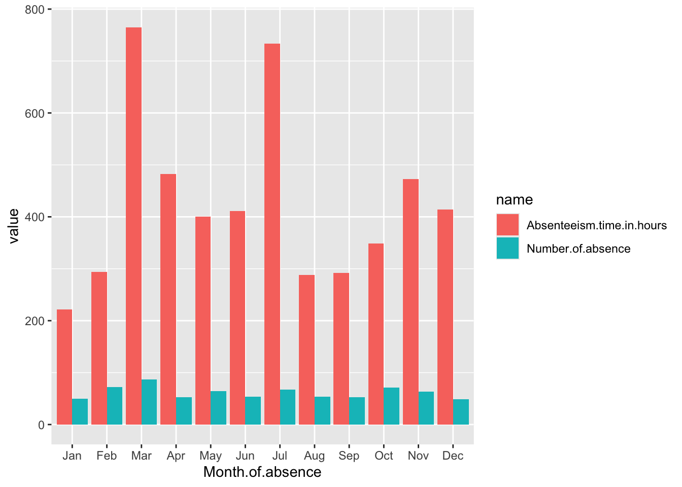
Breaking Down the Code
Data Preparation: A.
Month.Plot <- Absenteeism.Month |>: This line indicates that the plot will be created using theAbsenteeism.Monthdata frame. The assignment toMonth.Plotsuggests that the output of the plotting operations will be stored in this variable. B.pivot_longer(-Month.of.absence) |>: This function is used to transform the data from a wide format to a long format. The-Month.of.absenceargument specifies that all columns exceptMonth.of.absenceshould be pivoted into two new columns: one for the variable names (name) and one for the values (value). Essentially, this step prepares the data for plotting by ensuring that each row contains a month, a metric name, and a metric value.-
Plotting with ggplot2: A.
ggplot(aes(y = value, x = Month.of.absence, fill = name)): This initiates the plot with ggplot2, specifying how aesthetics are mapped:-
y = value: The y-axis will represent the values of the metrics, which could be the number of absences or the total hours of absenteeism, depending on the row. -
x = Month.of.absence: The x-axis will display the months. -
fill = name: Thefillaesthetic determines the color of the bars, which will vary based on the metric name (e.g., total number of absences or total absenteeism hours). This helps differentiate the metrics visually in the chart. B.geom_bar(position = "dodge", stat="identity"): This adds bar geometry to the plot. Theposition = "dodge"argument places bars next to each other rather than stacking them, which is useful for comparing two metrics within the same month. Thestat="identity"argument tells ggplot that the heights of the bars should directly correspond to the data values in thevaluecolumn. B.scale_x_discrete(limits = month.abb): This modifies the x-axis to use discrete limits based onmonth.abb, which are the abbreviated names of the months. This ensures that the months are displayed in a standard abbreviated format and in their natural order.
-
Displaying the Plot:
Month.Plot: This line isn’t part of the code block for creating the plot but is likely used elsewhere to actually display or print the plot stored in theMonth.Plotvariable.
8.4 Improve the Plot
Use a facet to make the plot more readable.
The scales of the two metrics in the plot—number of absences and total hours of absenteeism—are different, which can make it challenging to effectively compare the number of absences directly against the hours due to scale discrepancies. To address this issue and enhance the clarity of the visualization, we can employ the use of facets, or subplots, that separate the two metrics into distinct panels.
In ggplot2, adding facets to an existing plot is straightforward and does not require repeating the entire code used to create the original plot. Instead, facets can be added incrementally to the existing plot object. Here’s how it’s done:
The existing plot stored in Month.Plot can be modified by adding a facet_wrap layer. This function is used to create a separate plot or panel for each metric, allowing each to have its own y-axis scale. The code snippet:
Month.Plot <- Month.Plot +
  facet_wrap(~name, ncol = 1, scales = "free_y") +
  theme(legend.position = "none")
Month.Plot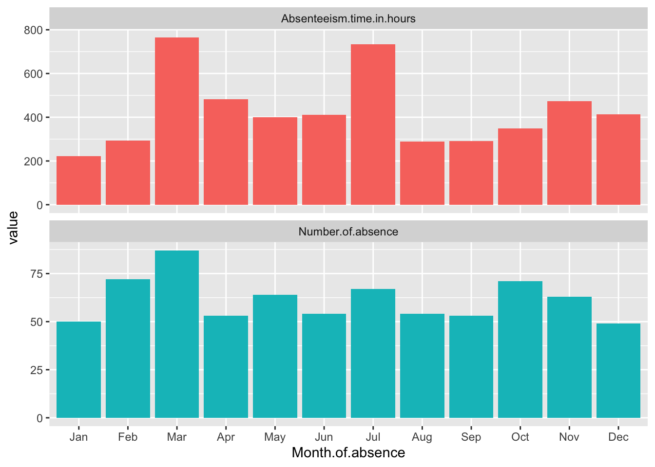
This code adds the facet_wrap function to the existing Month.Plot. The ~name tells ggplot to create a separate panel for each unique value in the name column, which corresponds to the different metrics. Setting ncol = 1 arranges the panels in a single column, and scales = "free_y" allows each panel to have its own y-axis scale, tailored to the range of values for that particular metric. This approach significantly improves the ability to discern patterns in each metric without the distraction of disproportionate scales. theme(legend.position = "none") removes the legend. The final line in the snippet simply displays the updated plot.
Standardize the data
Standardizing data by month is a method used to normalize the values of various metrics within the dataset so that they can be compared on a common scale. This is particularly useful when the original scales of the metrics differ significantly, making it difficult to visually compare them directly. By standardizing, each metric is rescaled so that its distribution has a mean of zero and a standard deviation of one, within each month. This approach reduces the effect of the absolute magnitude of the metrics, focusing instead on their variation and trends over time.
In the context of the Absenteeism.Month dataset, we can standardize the metrics before plotting. This involves adjusting each value of ‘Number of absences’, ‘Absenteeism time in hours’, and ‘Full Day’ so that these values reflect how many standard deviations they are from the mean of that specific metric for each month. This transformation is done using the scale() function in R, which standardizes a vector to have a mean of zero and a standard deviation of one.
Month.Plot <- Absenteeism.Month |>
  mutate(
    Number.of.absence = scale(Number.of.absence),
    Absenteeism.time.in.hours = scale(Absenteeism.time.in.hours)
  ) |>
  pivot_longer(-Month.of.absence) |>
  ggplot(aes(y = value, x = Month.of.absence, fill = name)) +
  geom_bar(position = "dodge", stat="identity") +
  scale_x_discrete(limits = month.abb) +
  facet_wrap(~name,ncol = 1,scales = "free_y") +
  theme(legend.position = "none")

Month.Plot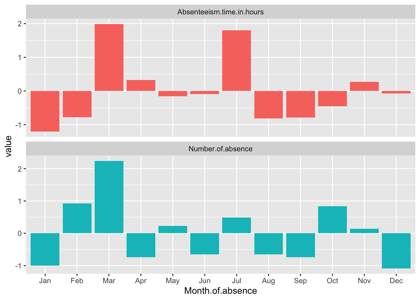
Breaking Down the Code
Mutate with Scale: The code uses the
mutate()function to apply thescale()function to ‘Number of absences’, ‘Absenteeism time in hours’, and ‘Full Day’. This modifies each of these metrics to their standardized values across the months.Pivot Data: After standardizing, the data is pivoted from wide to long format using
pivot_longer(-Month.of.absence). This makes the data suitable for ggplot2 by creating a long format where each row represents a single observation for a specific metric in a specific month, suitable for individual plotting.Plotting: The plotting command starts with
ggplot(), specifyingMonth.of.absenceas the x-axis and the standardized values (value) as the y-axis.geom_bar(position = "dodge", stat="identity")is used to create side-by-side bars for each metric within each month, which makes it easier to compare the metrics directly.Adjust Month Display and Add Facets:
scale_x_discrete(limits = month.abb)ensures that the x-axis labels display month abbreviations in their proper sequence.facet_wrap(~name, ncol = 1, scales = "free_y")adds facets to the plot, creating separate panels for each metric, with each panel having its own y-axis scaled independently. This allows each standardized metric to be displayed in a manner that highlights differences within and across months without the scales interfering with each other.Display the Plot: Finally, the updated
Month.Plotobject, which now contains the ggplot2 plot with standardized data and facets, is displayed.
This method enhances the clarity of the visual representation by allowing us to focus on the relative changes in absenteeism metrics across months, independent of their original measurement scales.
8.5 Conclusion
The data reveals some distinct patterns in absenteeism throughout the year, with significant variations noted in specific months. March and July both exhibit high levels of absenteeism when measured in total hours (Absenteeism.time.in.hours). However, when considering the total number of individual absence occurrences, it is March that stands out with a notably higher count, while July does not show this same increase.
Additionally, January presents a unique case where both metrics—total hours and number of absences—are abnormally low compared to other months. This drop suggests that January might have unique factors or conditions contributing to lower absenteeism rates, making it an outlier in the annual trend. These observations could be essential for understanding the dynamics of workforce management and planning effective strategies to address absenteeism.
8.6 Homework Assignment: Data Visualization of Absenteeism Patterns
8.6.1 Objective:
The purpose of this homework assignment is to develop your skills in data cleaning and visualization by exploring absenteeism patterns based on the day of the week.
8.6.2 Data Source:
For this assignment, you will work with the “Absenteeism at Work Data Set”. The data will be loaded using the following R code:
8.6.3 Instructions:
-
Prepare the Dataset: Start by calculating two key metrics for each day of the week: the total number of absences and the total absenteeism time in hours. Note that in the chapter case we use the built-in constant,
month.abb, but there is no equivalent for days of the week. So we can simply define our ownday.nameconstant, e.g.
Visualizing Absenteeism by Day of the Week: Employ ggplot to create a bar chart that visualizes the distribution of the absenteeism metrics over the days of the week. To do this, you will need to reformat the data into a “long” format to make it compatible with ggplot’s requirements.
Use Facets for Clarity: Due to differences in the scales of the two metrics—number of absences and total hours of absenteeism—it can be challenging to compare them directly. To enhance clarity and readability, utilize facets (or subplots) to separate the two metrics into distinct panels within your plot.
Standardize the Data: Normalize the data by day of the week to ensure that the metrics are on a common scale. This process involves scaling the metrics so that they have a mean of zero and a standard deviation of one, which facilitates more meaningful comparisons across the days.
Plot Standardized Data and Conclude: Plot the standardized data using ggplot. Your final task is to analyze the plots to identify any notable patterns and draft your conclusions based on your observations. Discuss any potential reasons for the patterns you observe and how they might inform workplace policies or practices.
8.6.4 Deliverable:
Produce a Quarto document detailing your analysis process, the visualizations, and your conclusions. Render this document to a DOCX file for submission.
Ensure your report is clear and well-organized, with all code snippets and visualizations properly included. Discuss your findings in a concise and thoughtful manner, providing insights into how these patterns might impact workplace management and strategies for reducing absenteeism.