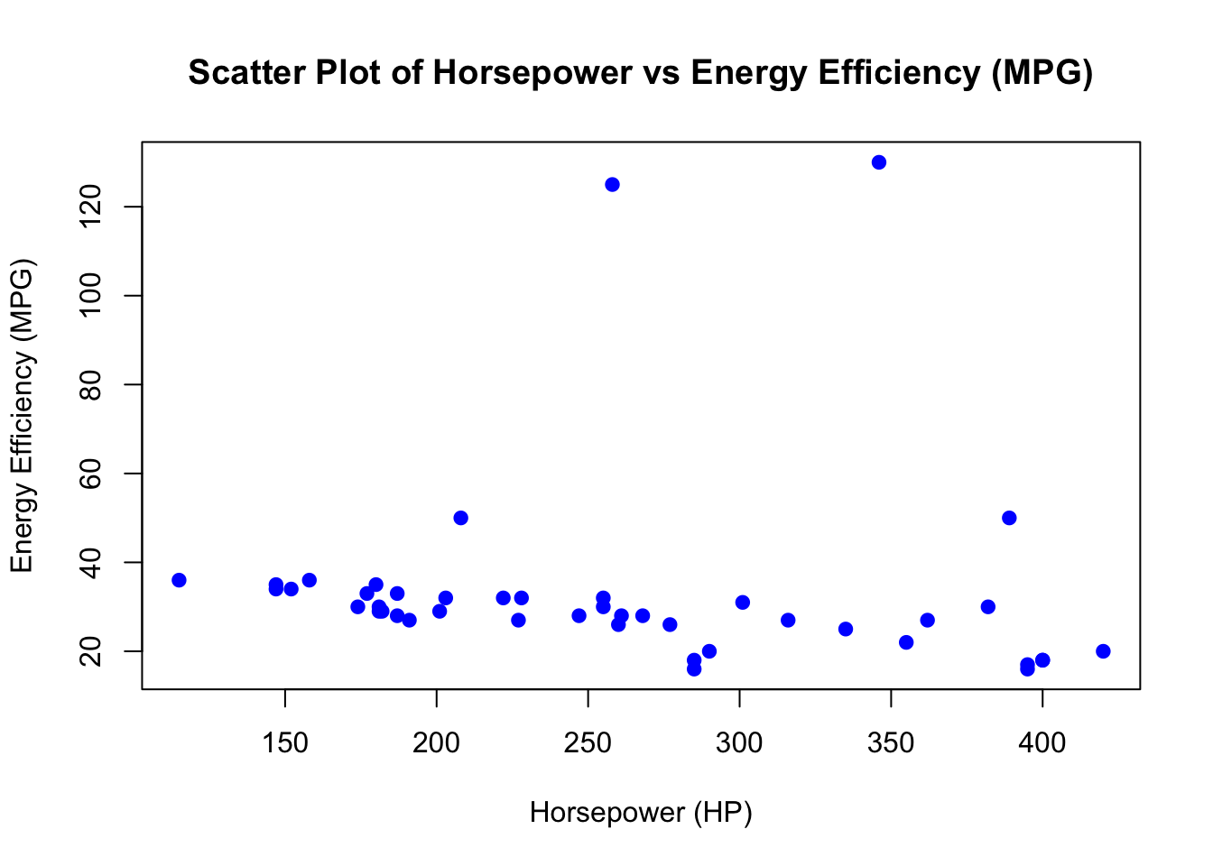
# Scatter plot of Horsepower vs Energy Efficiency (MPG)
plot(car_data$Horsepower, car_data$`Energy Efficiency (MPG)`,
     main = "Scatter Plot of Horsepower vs Energy Efficiency (MPG)",
     xlab = "Horsepower (HP)",
     ylab = "Energy Efficiency (MPG)",
     pch = 19, col = "blue")