An introduction to qualitative data (categorical data).
How to work with nominal and ordinal data in R.
Practical examples of data visualization using bar charts and pie charts for qualitative data.
1. Introduction to Qualitative Data
Qualitative data consists of categories or attributes that describe characteristics rather than numerical values.
The two main subtypes of qualitative data are:
Nominal Data: Categories with no inherent order (e.g., product types, colors).
Ordinal Data: Categories with a meaningful order but undefined intervals (e.g., customer satisfaction ratings, education levels).
Understanding these types of data is crucial for analyzing customer behaviors, preferences, and trends in business analytics.
2. Working with Nominal Data in R
Example: Visualizing Nominal Data (Product Types)
Nominal data includes categories that do not have an intrinsic ranking or order. For instance, product types such as “Electronics”, “Furniture”, and “Clothing” are examples of nominal data.
Visualizing Nominal Data Using Bar Charts
Bar charts are a common tool for visualizing the frequency of categories in nominal data.
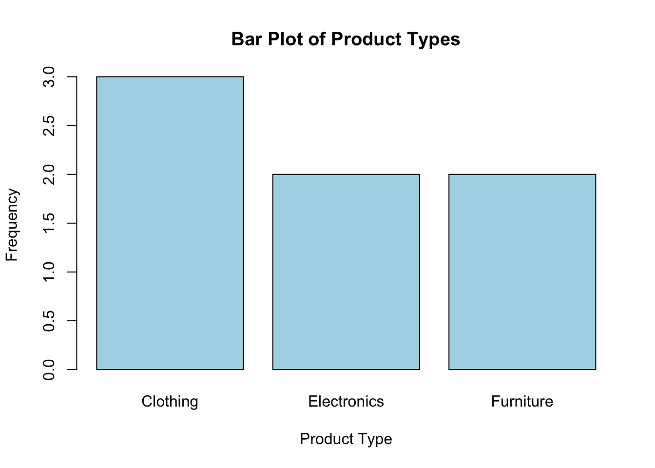
# Generate a bar plot for nominal data (e.g., product types)product_types <-c("Electronics", "Furniture", "Clothing", "Electronics", "Clothing", "Furniture", "Clothing")barplot(table(product_types), main ="Bar Plot of Product Types", xlab ="Product Type", ylab ="Frequency", col ="lightblue")
Explanation: In this example, the bar plot shows the frequency of each product type. Each bar represents how often a product category appears in the dataset.
Example: Visualizing Nominal Data Using Pie Charts
Pie charts can also be used to represent the proportions of different categories in nominal data.
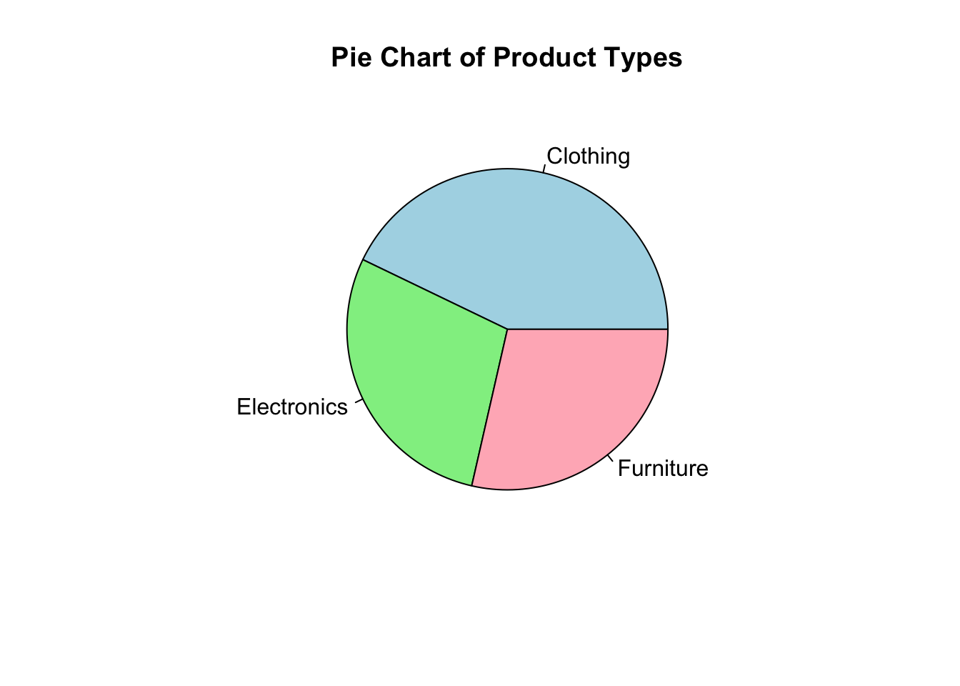
# Generate a pie chart for nominal data (e.g., product types)pie(table(product_types), main ="Pie Chart of Product Types", col =c("lightblue", "lightgreen", "lightpink"))
Explanation: This pie chart visualizes the distribution of product types, with each slice representing the relative proportion of a category in the dataset.
3. Working with Ordinal Data in R
Example: Visualizing Ordinal Data (Customer Satisfaction)
Ordinal data represents categories that have a meaningful order, such as ratings or rankings, though the intervals between the categories are not consistent. For example, customer satisfaction ratings (e.g., “Poor”, “Fair”, “Good”, “Excellent”) are ordinal.
Visualizing Ordinal Data Using Ordered Bar Charts
Ordered bar charts are useful for visualizing ordinal data, as they show categories in the correct sequence.
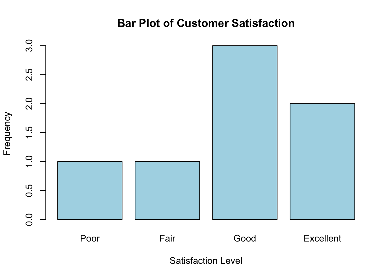
# Generate an ordered bar plot for ordinal data (e.g., customer satisfaction)satisfaction <-factor(c("Good", "Excellent", "Fair", "Good", "Poor", "Good", "Excellent"), levels =c("Poor", "Fair", "Good", "Excellent"), ordered =TRUE)barplot(table(satisfaction), main ="Bar Plot of Customer Satisfaction", xlab ="Satisfaction Level", ylab ="Frequency", col ="lightblue")
Explanation: The bar chart displays the frequency of customer satisfaction levels, with the categories arranged in the correct order (“Poor” to “Excellent”).
Key Concept: Ordinal Data and Ranking
In ordinal data, the order of categories is meaningful (e.g., “Poor” < “Fair” < “Good” < “Excellent”), but the exact differences between the categories are not uniform. This means you can rank the data, but you can’t measure the precise distance between categories.
4. Practical Uses of Qualitative Data in Business Analytics
Nominal data helps in understanding categorical differences, such as product types or customer demographics.
Ordinal data is useful for capturing preferences, satisfaction levels, and rankings, making it crucial for understanding customer feedback and satisfaction.
Qualitative data plays a significant role in marketing, customer satisfaction analysis, and product segmentation, offering insights into customer behavior and preferences.
Key Takeaways
Nominal data consists of categories with no inherent order, and can be visualized using bar charts and pie charts.
Ordinal data has a meaningful order and can be visualized using ordered bar charts.
You now know how to work with and visualize qualitative data using R.
Looking Forward
In the next lecture, we’ll introduce data structures in R, such as vectors, matrices, data frames, and lists, and how to select the appropriate structure for different types of data.