How to work with continuous and discrete data in R.
Practical examples of data visualization using histograms and bar charts for quantitative data.
1. Overview of Quantitative Data
Quantitative data consists of numerical values that can be either:
Continuous Data: Values that can take any real number within a range, such as temperature or revenue.
Discrete Data: Values that are countable and typically integers, such as the number of products sold or customer visits.
Understanding and correctly categorizing quantitative data is critical because each type requires different methods of analysis and visualization.
2. Working with Continuous Data in R
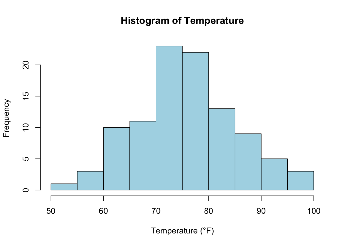
Continuous Data Example: Temperature
Continuous data can take any value within a range and often arise from measurements.
Visualizing Continuous Data Using Histograms
Histograms are an effective way to visualize the distribution of continuous data, showing how data points are spread over a range of values.
# Generate a histogram for continuous data (temperature)set.seed(123) # Ensure reproducibilitytemperature <-rnorm(100, mean =75, sd =10) # Simulate temperature datahist(temperature, main ="Histogram of Temperature", xlab ="Temperature (°F)", col ="lightblue", border ="black")
Explanation: In this example, we generate random temperature data using rnorm() and plot it using a histogram. This helps visualize the distribution of temperature, showing how frequently values fall within specific ranges.
Key Concept: Characteristics of Continuous Data
Range: The spread of values from the minimum to the maximum.
Mean: The average value.
Standard Deviation: How spread out the values are from the mean.
Example: Calculating Summary Statistics for Continuous Data
mean(temperature) # Calculate the average temperature
[1] 75.90406
sd(temperature) # Calculate the standard deviation
[1] 9.128159
range(temperature) # Calculate the range (min and max)
[1] 51.90831 96.87333
3. Working with Discrete Data in R
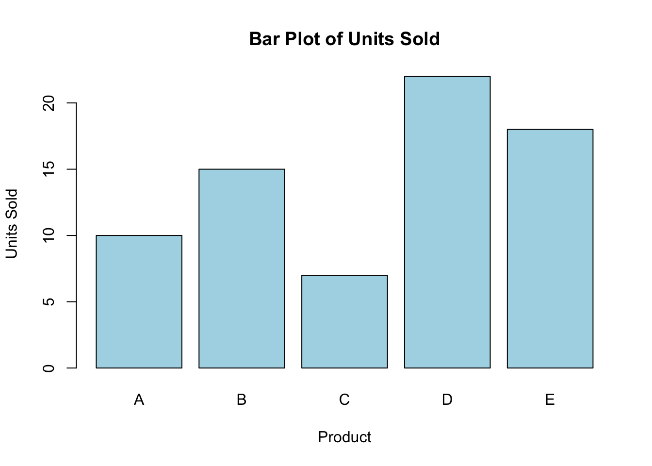
Discrete Data Example: Number of Products Sold
Discrete data consists of countable values that can only take specific, often integer, numbers.
Visualizing Discrete Data Using Bar Charts
Bar charts are useful for visualizing discrete data, where each bar represents a count or frequency of a specific category or value.
# Generate a bar plot for discrete data (number of units sold)units_sold <-c(10, 15, 7, 22, 18)barplot(units_sold, main ="Bar Plot of Units Sold", xlab ="Product", ylab ="Units Sold", col ="lightblue", names.arg =c("A", "B", "C", "D", "E"))
Explanation: This bar chart visualizes the number of units sold for five different products (A, B, C, D, and E). Bar charts are a great way to display discrete data, showing the frequency or count of individual values.
Key Concept: Characteristics of Discrete Data
Countable Values: Discrete data often represents events or occurrences.
Frequency: How often a specific value or event occurs.
Summation: Total counts of the events.
Example: Summing Discrete Data
sum(units_sold) # Calculate the total units sold across all products
[1] 72
4. Practical Uses of Quantitative Data in Business Analytics
Continuous Data: Used to track and analyze measurements over time, such as sales revenue, temperature, or customer satisfaction scores.
Discrete Data: Often used for counts of items like the number of products sold, customer visits, or employee counts.
Quantitative data plays a key role in decision-making processes in business, helping to identify trends, measure performance, and forecast future behavior.
Key Takeaways
Continuous data can take any value and is often visualized using histograms to show the distribution of values.
Discrete data consists of countable values and is best visualized using bar charts to display the frequency of occurrences.
You now know how to generate, visualize, and calculate summary statistics for both continuous and discrete data in R.
Looking Forward
In the next lecture, we’ll explore qualitative data, including how to work with nominal and ordinal data, and how to visualize categorical data using R.