Lecture 1: Introduction to Data, Datasets, and Data Structuresd
Author
Dr. Logan Kelly
Published
September 4, 2024
Overview
In this lecture, we’ll cover:
The importance of understanding different types of data for business analytics.
The chapter goals and what you’ll achieve by the end.
Introduction to the main categories of data: Quantitative and Qualitative.
Practical examples of data visualizations in R using histograms, bar plots, and pie charts.
1. Overview of the Chapter Goals
Upon concluding this chapter, you will be able to: 1. Identify and recall the different types of data and data structures in R. 2. Explain the significance of data types in business analytics. 3. Import, clean, and transform business datasets using R. 4. Distinguish between various data structures and their applications. 5. Assess the quality and suitability of datasets for analysis. 6. Construct and export well-structured datasets for advanced analysis.
2. Why Understanding Data Types Matters in Business Analytics
Data is the foundation of business analytics, and understanding its characteristics helps in selecting the right analytical tools.
Different types of data provide unique insights and require specific statistical methods for proper analysis.
Correctly identifying data types is crucial for accurate interpretation and decision-making in business contexts.
3. Introduction to Types of Data
Quantitative Data
Definition: Quantitative data consists of numerical values that can be measured or counted.
Subtypes:
Continuous Data: Values that can take any number within a range (e.g., temperature, revenue).
Discrete Data: Countable values, often whole numbers (e.g., number of products sold, customer visits).
Qualitative Data
Definition: Qualitative data consists of categories or attributes that describe characteristics, rather than numerical values.
Subtypes:
Nominal Data: Categorical data with no inherent order (e.g., product types, colors).
Ordinal Data: Categorical data with a meaningful order but undefined intervals between categories (e.g., satisfaction ratings, education levels).
4. Visualizing Quantitative and Qualitative Data in R
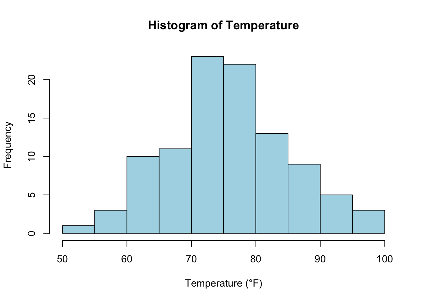
Example: Visualizing Continuous Data (Temperature)
# Generate a histogram for continuous data (e.g., temperature)set.seed(123)temperature <-rnorm(100, mean =75, sd =10)hist(temperature, main ="Histogram of Temperature", xlab ="Temperature (°F)", col ="lightblue", border ="black")
Explanation: This histogram shows the distribution of continuous temperature data, a common tool for visualizing quantitative data.
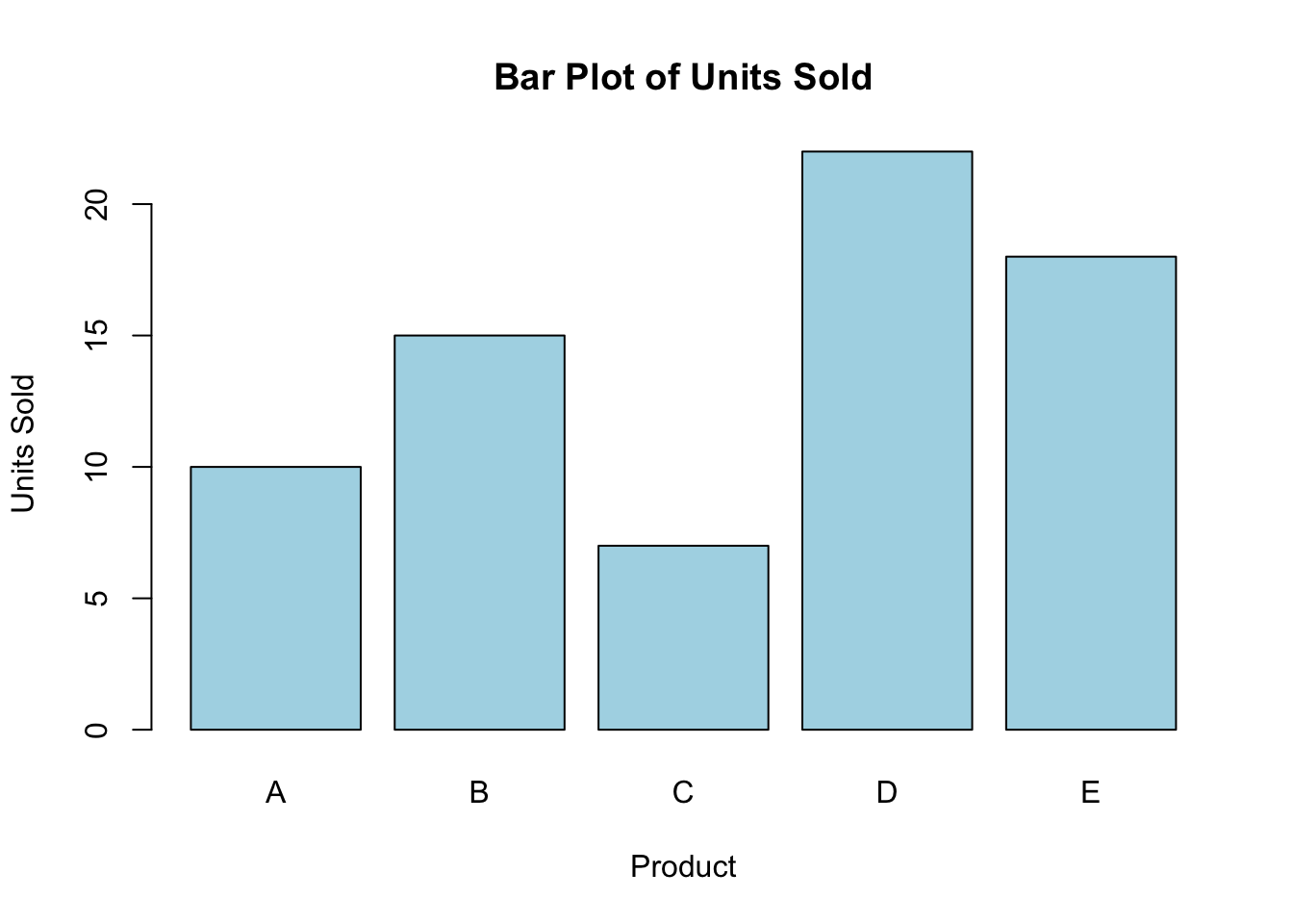
Example: Visualizing Discrete Data (Units Sold)
# Generate a bar plot for discrete data (e.g., number of units sold)units_sold <-c(10, 15, 7, 22, 18)barplot(units_sold, main ="Bar Plot of Units Sold", xlab ="Product", ylab ="Units Sold", col ="lightblue", names.arg =c("A", "B", "C", "D", "E"))
Explanation: Bar plots are useful for visualizing discrete data, where each bar represents the count of a category.
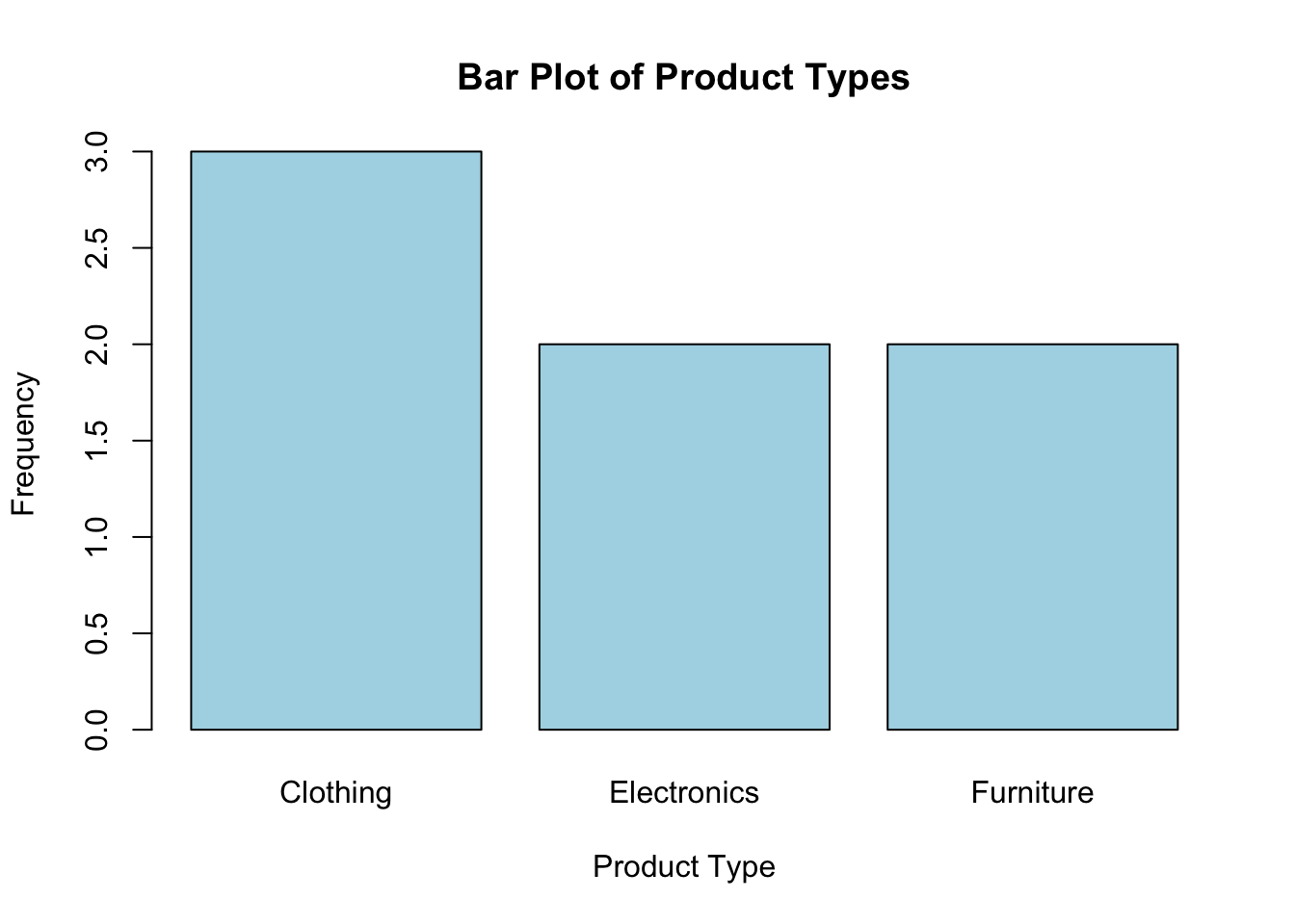
Example: Visualizing Nominal Data (Product Types)
# Generate a bar plot for nominal data (e.g., product types)product_types <-c("Electronics", "Furniture", "Clothing", "Electronics", "Clothing", "Furniture", "Clothing")barplot(table(product_types), main ="Bar Plot of Product Types", xlab ="Product Type", ylab ="Frequency", col ="lightblue")
Explanation: This bar chart visualizes nominal data, where each bar represents the frequency of a product type.
Key Takeaways
You have learned about quantitative (continuous and discrete) and qualitative (nominal and ordinal) data.
Visualizing data using histograms and bar plots in R is crucial for understanding the characteristics of your dataset.
Looking Forward
In the next lecture, we’ll dive deeper into working with quantitative data in R, using practical examples and visualization techniques for continuous and discrete data.